The Missing Step That Makes AI-Built WordPress Plugins Look Professional
Something nagged after the last experiment.
Can GPT-5.6-Luna Max Build a CodeCanyon-Grade WordPress Plugin? showed that Luna Max could build a functional WooCommerce bulk stock manager — per-variation editing, filters, batch operations — for 95% less than the GPT-5.5 build before it. Two models, two builds, same result: working plugins that passed manual verification.
Same weakness, too.
I opened both plugins in the browser after the previous post went live.
They worked. They passed verification. And I caught myself doing that thing where you tilt your head and think… fine, I guess.
Pull up either build and the interfaces look adequate. Functional. Plain. The kind of admin pages that work correctly and carry zero conviction about visual hierarchy or user flow.
That feeling stayed with me.
The code was solid — verification passed — but the output looked like it came from a machine that knew what controls to include and had no intuition about where to put them.
(If you’ve ever handed a project to a developer who nailed every acceptance criterion and missed the soul of the design, you know this particular flavor of disappointment.)
The reason was straightforward:
The requirements document defined what the plugin should DO, down to acceptance criteria for every user story. What it should LOOK like was left entirely to the model’s discretion. And models, given discretion, make safe choices. Like asking someone to furnish a room when you’ve only told them the square footage — they’ll pick reasonable furniture, arrange it sensibly, and the room will never feel like anyone lives there.
The missing step was learning to prototype a WordPress plugin’s interface before generating code — an explicit design phase where you build a throwaway UI, review it, annotate what needs to change, and iterate until the interface feels right. Then you hand that finalized design to the goal pipeline as a visual reference.
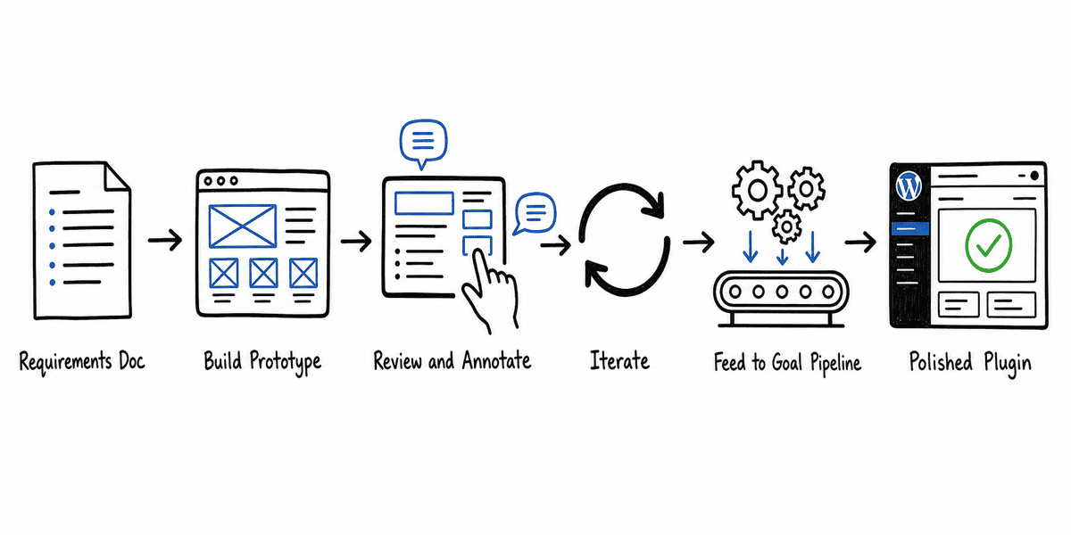
Here’s what happened when I tried it.
.
.
.
The Problem with Skipping Design
Here’s what the previous builds looked like.
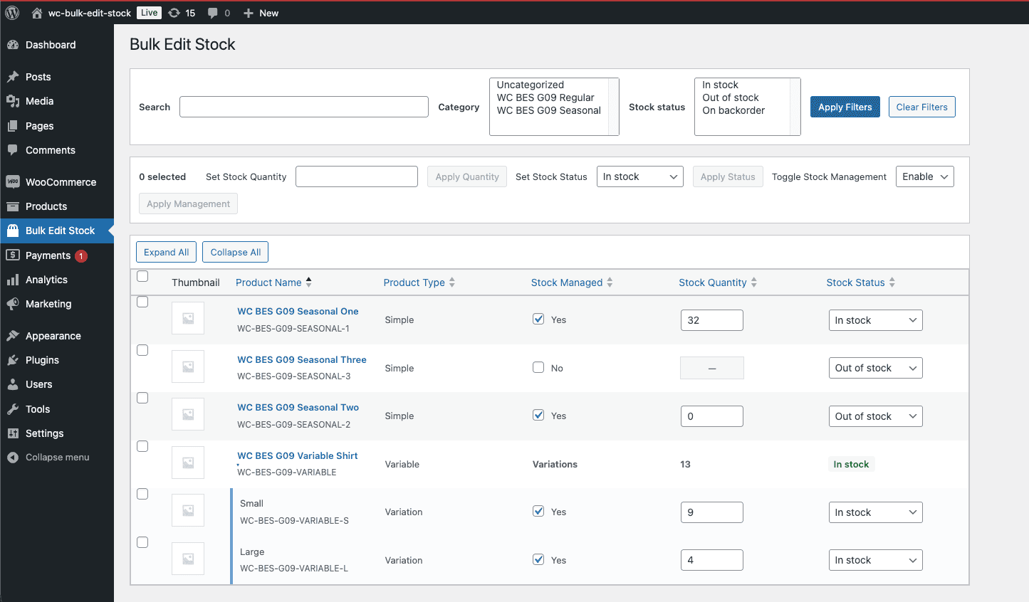
Both are competent.
The grid displays products correctly, the filters work, and inline editing saves to the database. Hand either plugin to a client and they’d use it — but they’d also notice it feels more like a developer’s debugging tool than something designed for daily use.
The gaps show up in details that matter more than they seem to:
- No section headers to group related controls
- No helper text explaining what the filters do
- Pagination at the top, interrupting the scanning flow instead of sitting at the bottom
- Stock status displayed as plain text instead of color-coded indicators
- The controls function.
- The layout offers no guidance on how to use them.
Here’s the thing: A requirements document is functionally complete and visually silent.
A line like “the plugin SHALL display a filterable product grid with inline stock editing” produces a grid. It says nothing about how that grid should be organized, what visual cues should separate sections, or where batch controls should live relative to the data.
When the spec has no visual opinion, the model expresses none either. It picks standard patterns — data table, top pagination, dropdown filters — and moves on to the next acceptance criterion. (Sensible defaults, every one of them. Also completely uninspired.)
Better visual input changes that equation entirely.
.
.
.
The Prototype-First Approach
The concept is straightforward: before running the expensive goal-based build, build a throwaway UI simulation first.
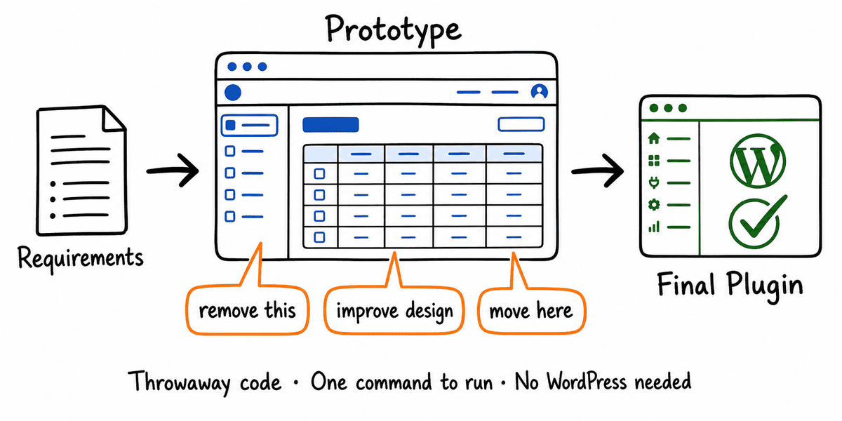
The prototype runs in the browser as a standalone page that reproduces the WordPress admin look and feel — sidebar, admin bar, page headers. Inside that frame, the plugin’s interface takes shape with real interactive controls, backed by sample data instead of a database. No WordPress installation required.
WordPress admin conventions are predictable enough that a simulation looks close to the real thing. (Decades of admin screen consistency will do that.) Design decisions made in the prototype transfer directly to the actual build.
The prototype serves as a visual spec.
When you later run the goal-based build, you tell the model: “follow the UI in the prototype folder.” The model references it during execution and uses it to make layout decisions instead of guessing.
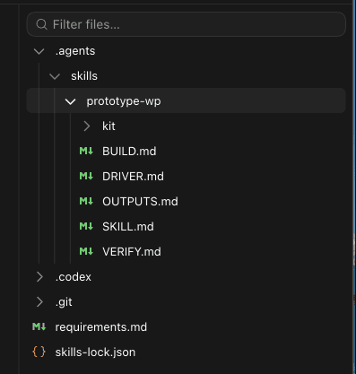
The skill that makes this work is called prototype-wp, derived from Matt Pocock’s prototype skill (github.com/mattpocock/skills, MIT licensed).
His original provides the core framing — throwaway code, one command to run, in-memory state, built for answers rather than production. The WordPress-specific layer adds admin-faithful rendering, verification, and separation between layout and behavior.
.
.
.
Installing the Skill
One command:
npx skills add nathanonn/agent-skills --skill prototype-wp --agent codex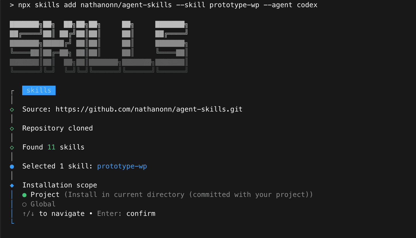
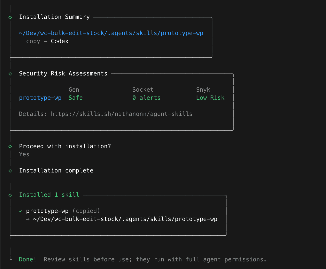
The installer clones the repository, finds the skill, and drops it into your project’s skill directory.
.
.
.
Building the Prototype
Here’s an important workflow detail: run this skill in the Codex app, not the CLI.
The reason comes down to one feature.
The Codex app lets you annotate the generated UI directly — draw on the screen, point at specific elements, leave notes. The CLI gives you text-only interaction. For a workflow where the whole point is visual feedback, that annotation capability changes everything.
(More on this in a moment.)
I pointed Luna Max at the requirements document and asked for a full prototype covering every aspect of the plugin spec.
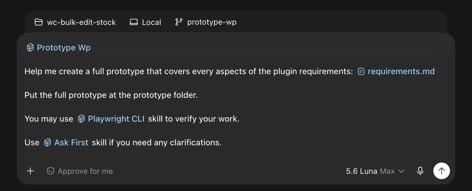
42 minutes later, the prototype was running on a local server.
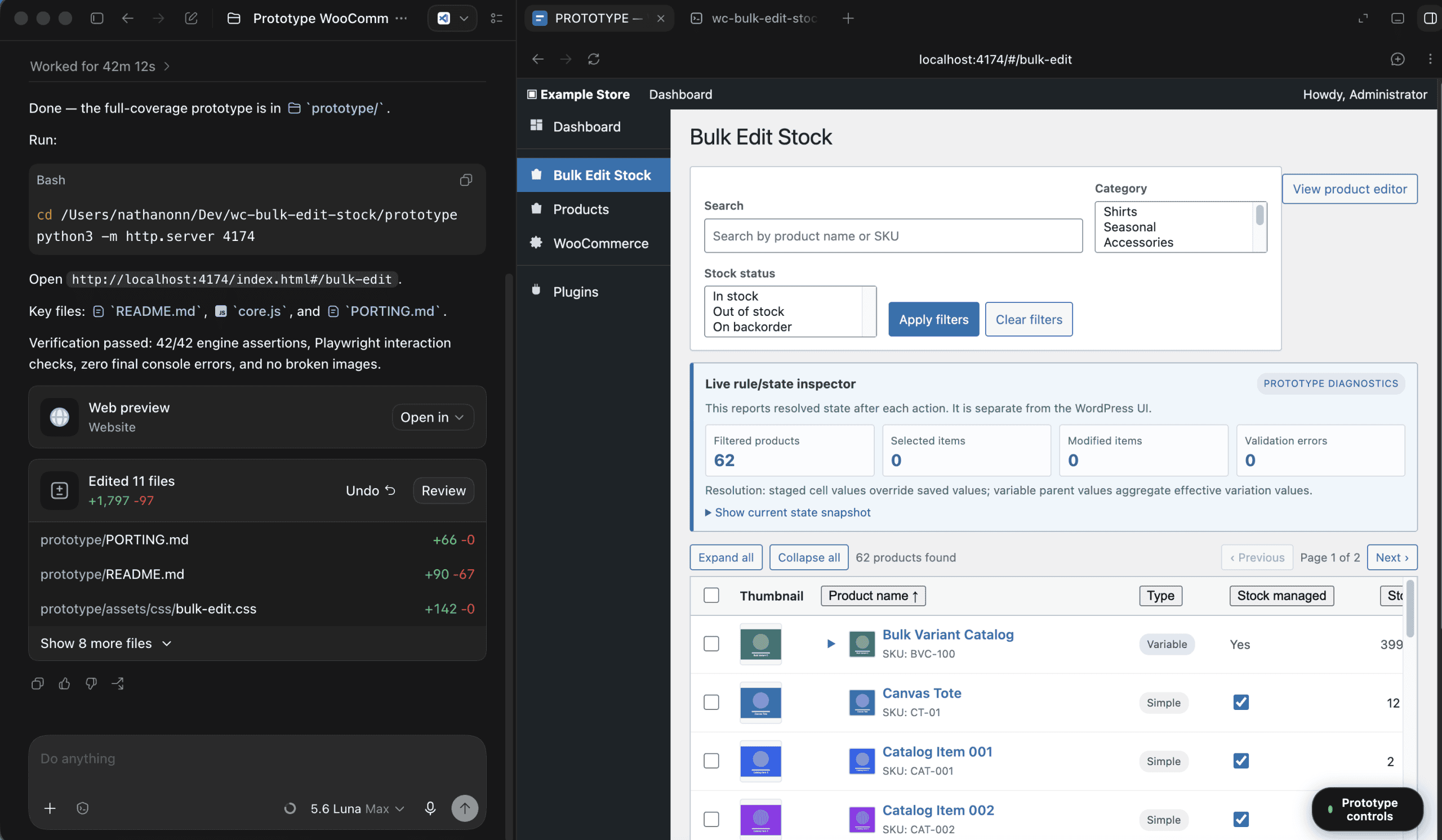
One command starts the server.
None of this code ships — the prototype is disposable by design.
Its only job: does the interface make sense before we spend six hours building the real thing?
.
.
.
Reviewing the Prototype
What the prototype produces is genuinely close to the real WordPress admin experience.
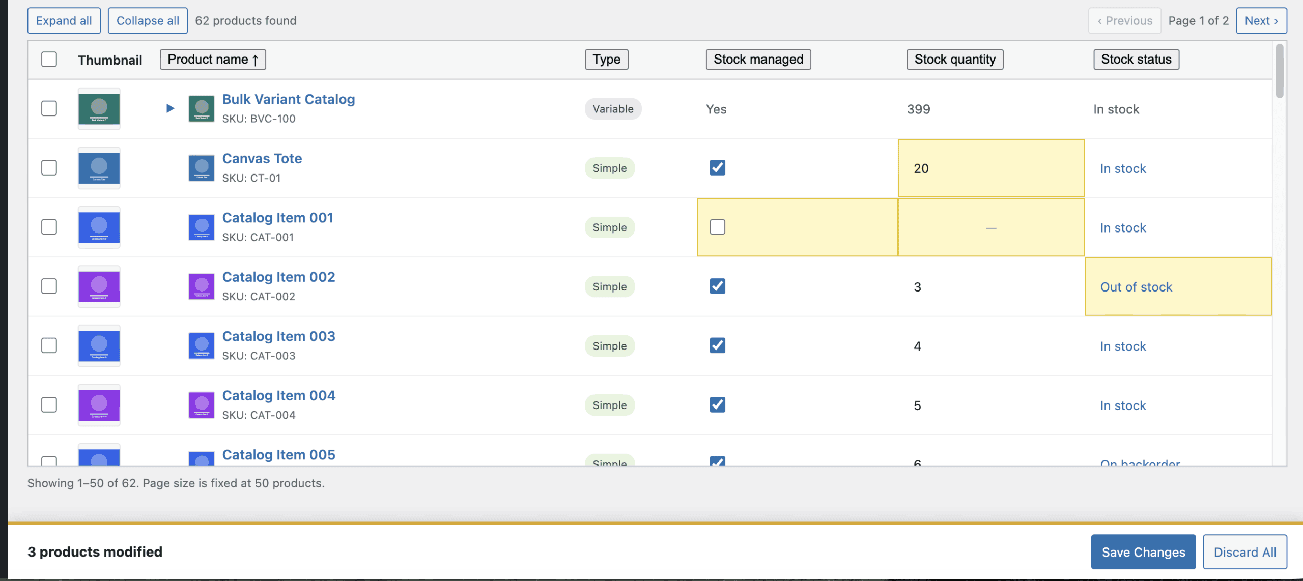
The page looks like a real admin screen. Inside that familiar frame, the plugin interface fills out: search, filters, and a product grid showing 62 sample products.
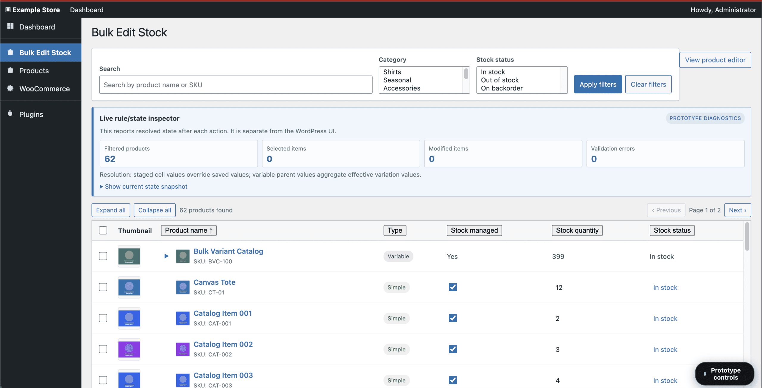
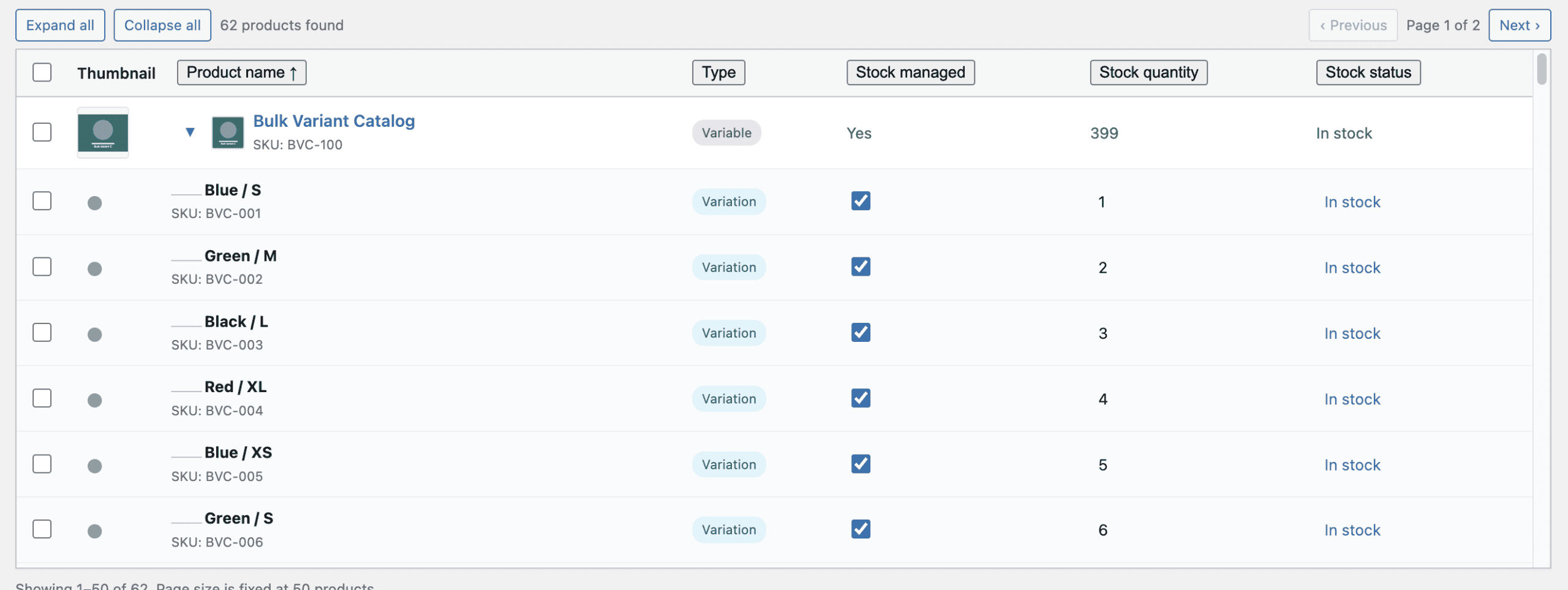
Each product row shows the key stock information at a glance. Variable products get expand/collapse toggles that reveal per-variation rows underneath.
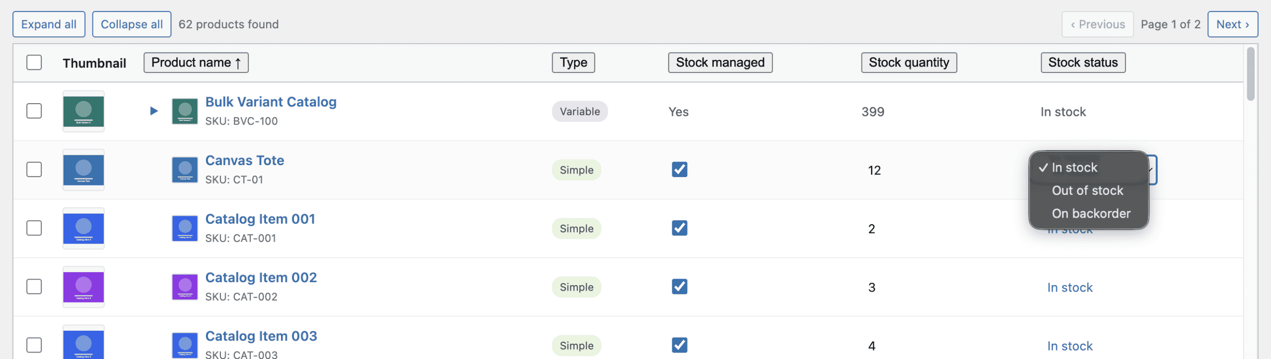
Click any cell and it becomes editable — quantities as number inputs, stock status as a dropdown.
Modified cells highlight in yellow. A footer bar tracks how many products you’ve changed, with Save and Discard buttons.
The prototype also includes a live state inspector for debugging — a prototype-only panel that shows the application state after every action.
At this point, the prototype was ready to evaluate seriously.
But a few things bothered me about the default design.
The filter section looked plain. The pagination sat at the top where it interrupted the scanning flow. A button labeled “View product editor” occupied prime screen real estate without earning it.
Stay with me — because this is where the workflow earns its keep.
.
.
.
The Annotation Workflow — The Real Power
This section is why the post exists.
The Codex app has an annotation feature that works like a designer marking up a mockup.
You point at a specific element on the screen, type a note, and the model sees both the visual context and your instruction. For UI iteration, this is dramatically more useful than describing changes in text — because the model knows exactly which element you’re talking about.
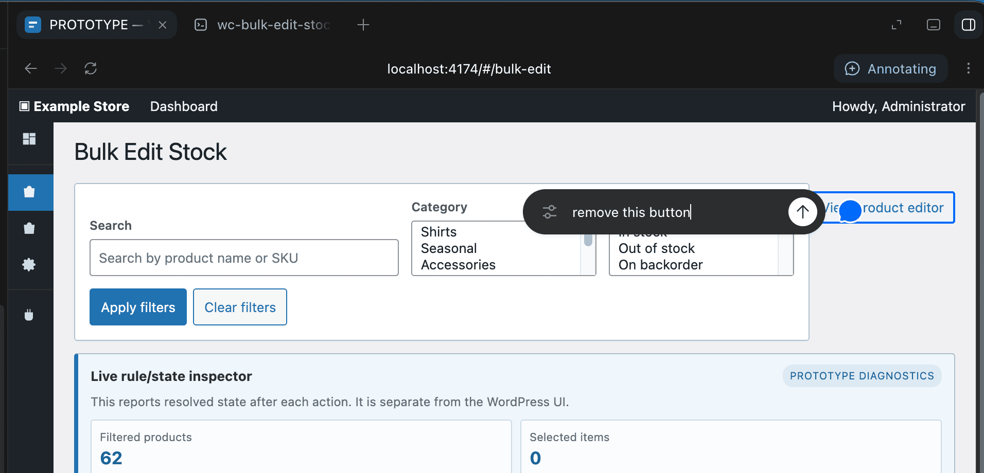
I pointed at the button and typed two words: remove this. That was the whole instruction. No paragraph explaining which element, no CSS selector, no coordinates.
Three annotations total:
- Pointing at the “View product editor” button: “remove this button”
- Pointing at the filter/search section: “the design looks plain. Help me improve this”
- Pointing at the top pagination controls: “remove the pagination to the bottom”
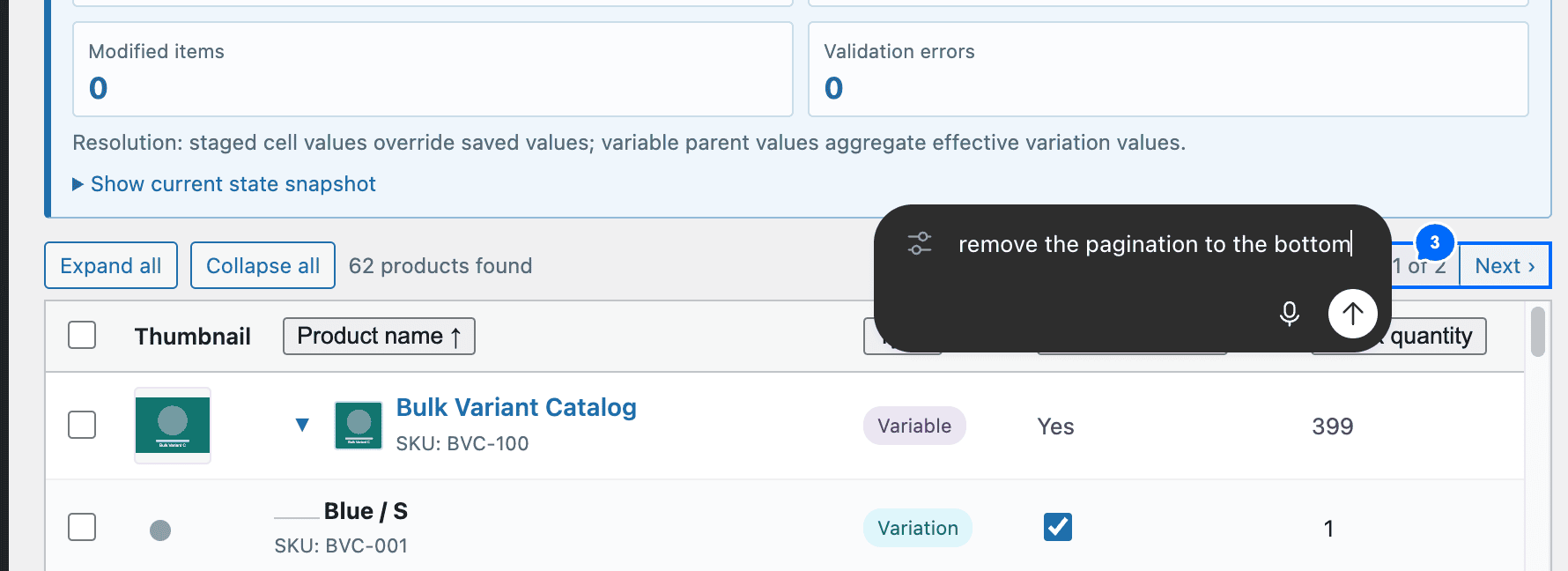
Then I sent all three with a single instruction: “make changes according to the annotations.”
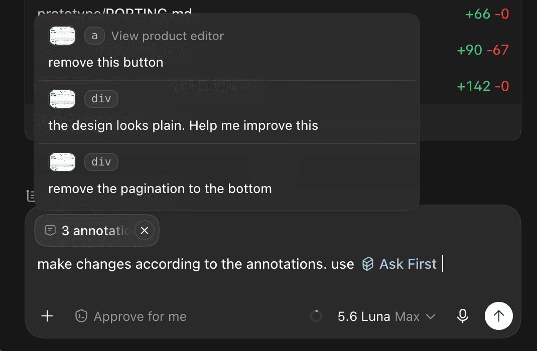
Luna applied every change.
The filter section transformed.
Where there had been a bare row of dropdowns, the updated version had a section header, a descriptive subtitle with helper text, expanded category options, and a note about how filters combine. The unnecessary button vanished. Pagination moved to the bottom.
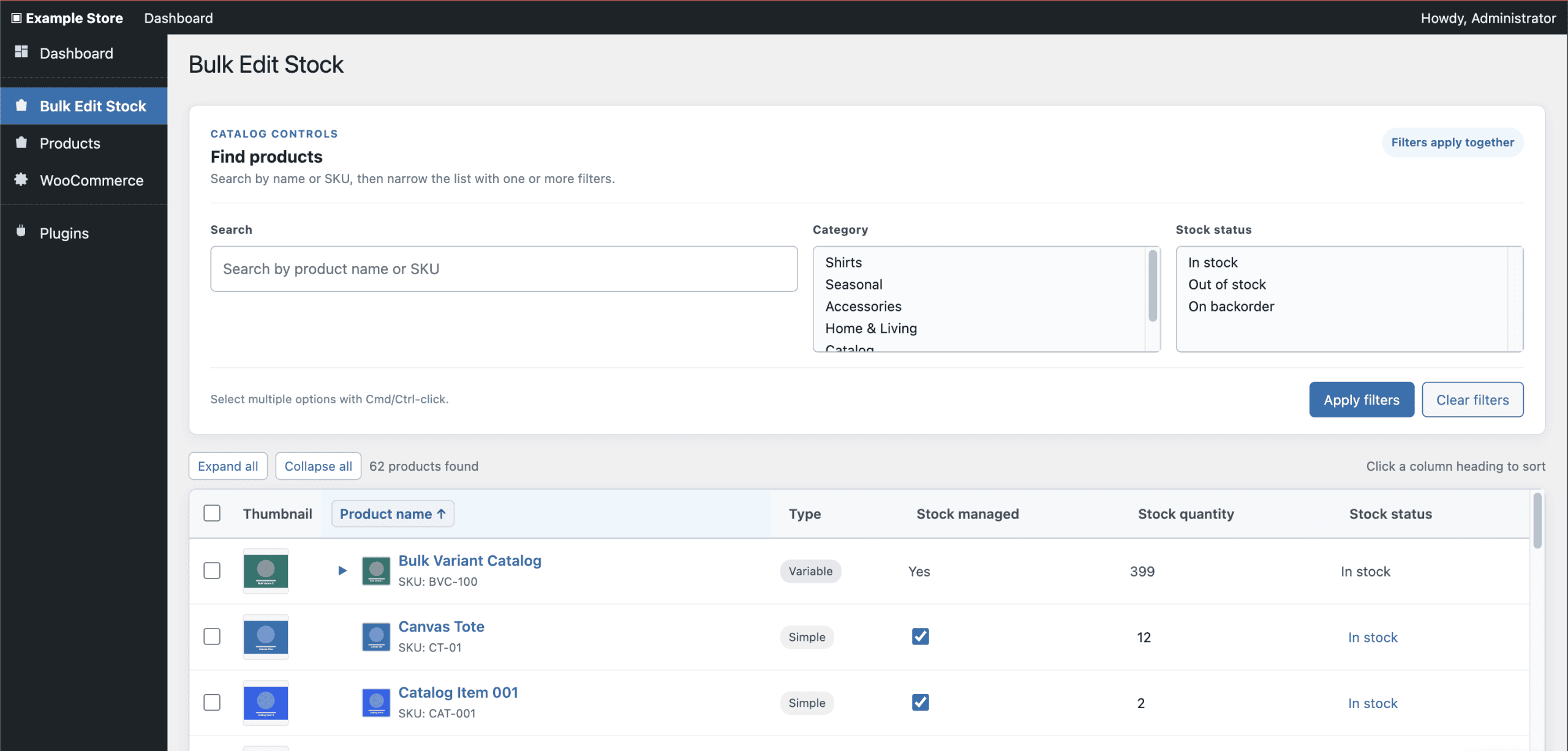
And here’s the kicker: you’re pointing at exactly what you want changed and describing the change in natural language.
The model sees your annotation anchored to a specific location on the rendered page — no ambiguity about which element you mean or what surrounds it. (The difference between circling an item on a restaurant menu and trying to describe the dish to the waiter from memory.)
- Want a different look for the status indicators? Point at one and describe what you’d prefer.
- Want the batch action bar to feel more prominent? Point at it and say so.
Each annotation takes seconds, and the model applies changes with full visual context.
The iteration loop becomes: review the prototype, annotate what bothers you, let the model apply the changes, review again.
A few rounds of this and the UI converges on something you’re actually satisfied with — before a single line of production code gets written.
.
.
.
From Prototype to Production Plugin
Once the prototype felt right, I switched to the Codex CLI.
The goal-based build uses a different skill — the same one from the previous posts — that takes a requirements document and generates a full project scaffold. This time, the prompt included one additional instruction: follow the UI design in the prototype folder. The model could reference the prototype’s layout decisions during goal execution and use them as a visual spec for control placement, section grouping, and styling choices.
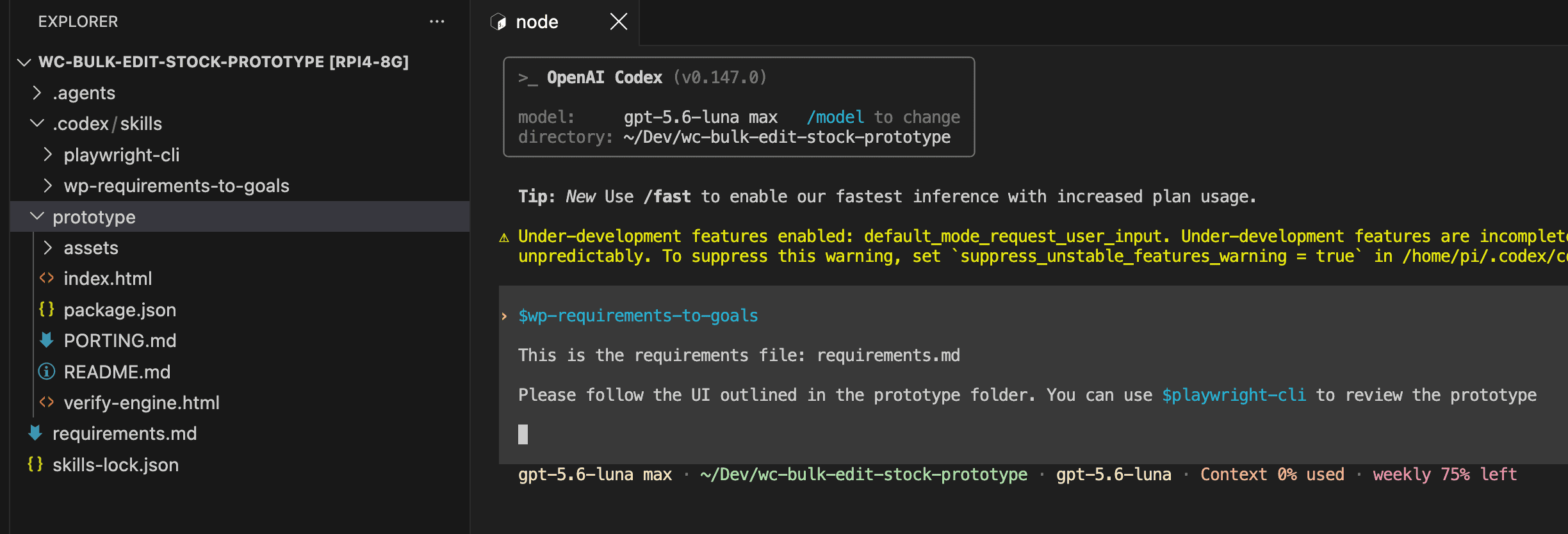
The scaffold phase generated 9 goals in 47 minutes — foundation, user story goals, feature goals, and an integration sweep.
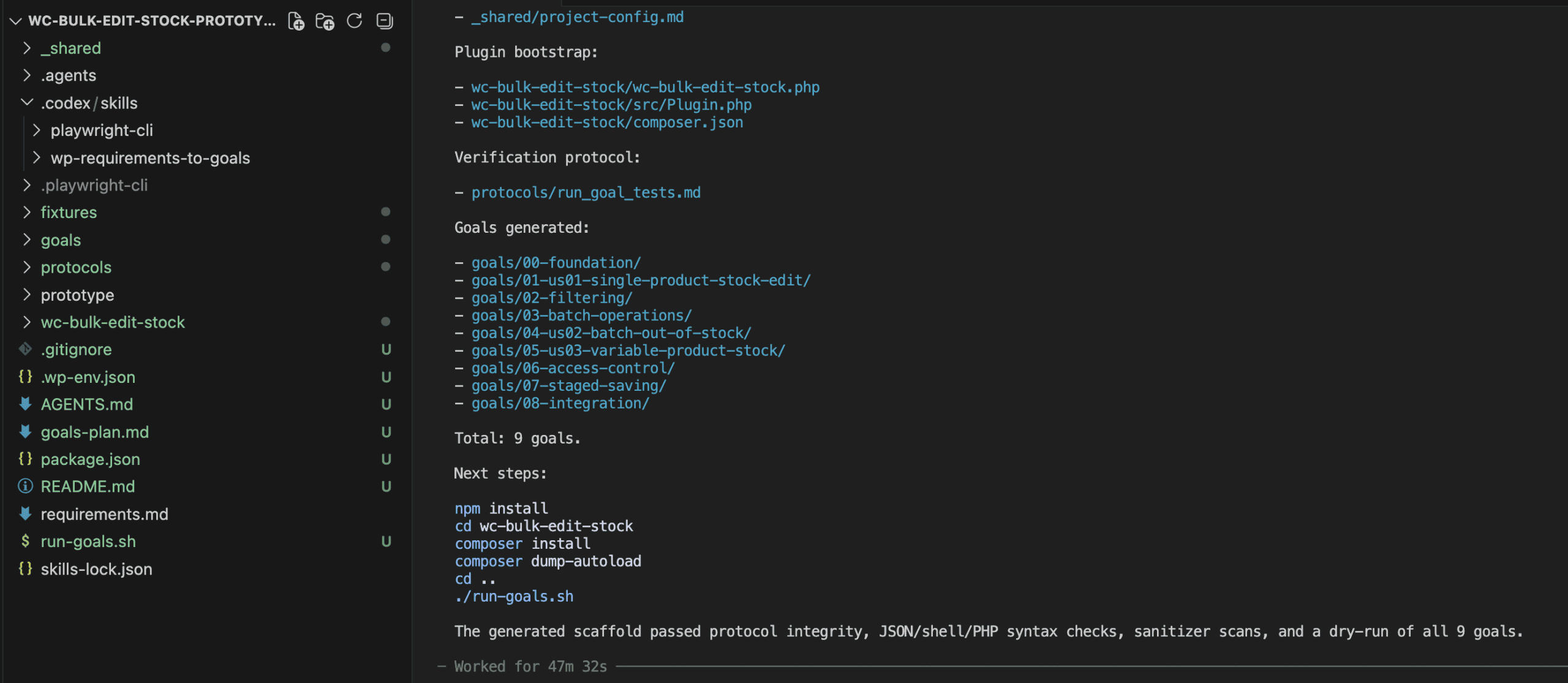
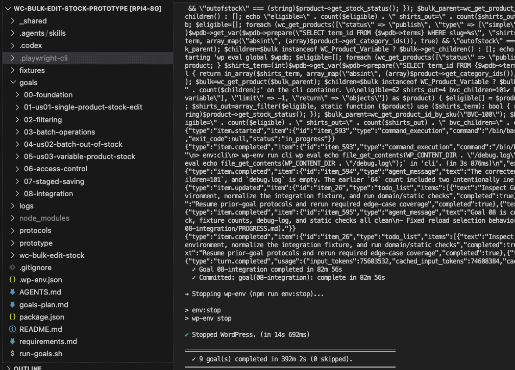
I kicked off the build script before dinner and checked back after a movie. Six and a half hours, zero intervention.
When I opened the finished plugin in the browser, the prototype’s influence was visible immediately.
The design decisions from the annotation phase — section headers, helper text, bottom pagination, colored status badges, batch action bar — carried through to the real plugin.
(The kind of detail that makes the throwaway prototype feel less throwaway and more like the most productive hour of the entire build.)
Of the total time, only the annotation and review — roughly 15 minutes — required active attention.
Everything else ran unattended.
For a build that costs around $7, adding under an hour of design work is a marginal investment with a substantial payoff.
.
.
.
The Result — Prototype vs. No Prototype
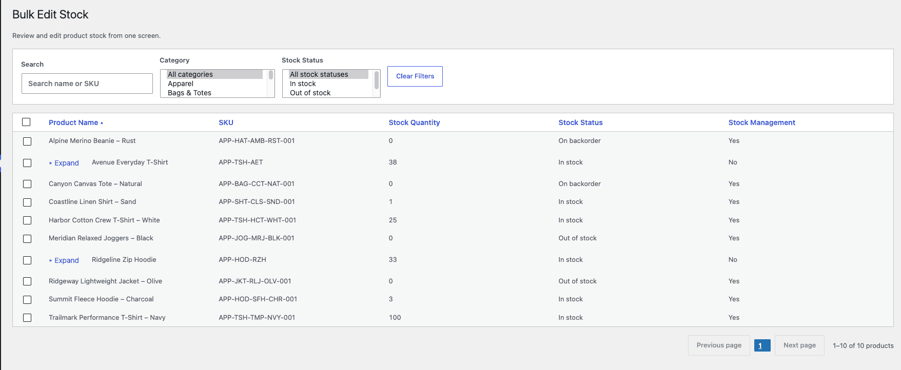
Let me show you what the prototype step produced.
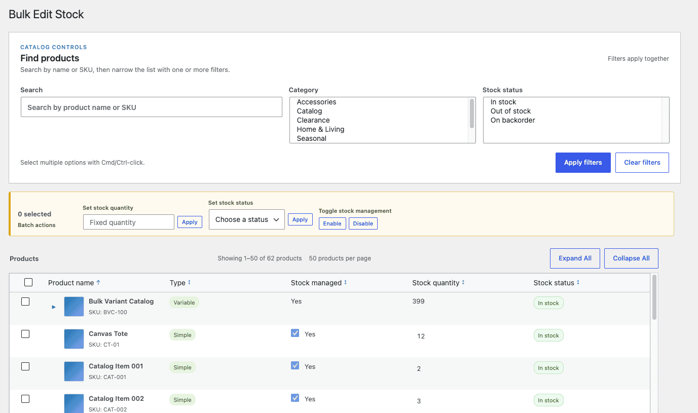
Compare that to the build from the previous post — same requirements document, same model, no prototype step:
When I opened the final plugin, the section headers were there. The status badges were there. I scrolled through it twice because I kept expecting something to be missing.
The differences show up across the entire interface:
- Section headers and helper text — “CATALOG CONTROLS” with a subtitle explaining how to use the filters, instead of bare filter fields on their own
- Batch action bar — Controls for setting stock quantity, stock status, and toggling stock management in bulk
- Bottom pagination — The grid flows naturally into page controls at the end
- Stock status badges — Green and orange indicators that communicate status at a glance
- Sortable columns — Click to reorder by product name, SKU, quantity, or status
- Per-variation editing — Expanding a variable product reveals individual variation rows with editable fields and status dropdowns
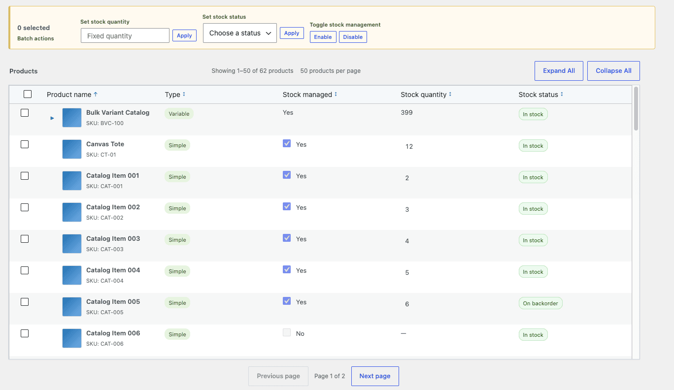
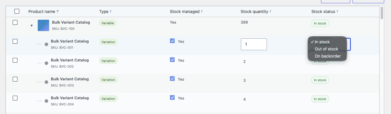
👉 The prototype acted as a visual specification — and every design decision from the annotation phase survived the translation into a real WordPress plugin running on WooCommerce.
That survival rate is the entire argument for this workflow.
A prototype gives the model a visual contract to honor, the same way the requirements document gives it a functional contract. When both inputs exist, the model has answers for “what should this do?” and “what should this look like?” — and the output reflects that clarity.
.
.
.
Use the Skill
Install the prototype skill:
npx skills add nathanonn/agent-skills --skill prototype-wp --agent codexYou’ll find the full repository at github.com/nathanonn/agent-skills.
.
.
.
The Bigger Picture
The bottleneck in AI-assisted plugin development keeps shifting.
Code quality was settled first — the models can write working plugins. Then cost fell by 95% with Luna Max. The remaining gap turned out to be design quality, and the answer was the same kind of answer as always: give the model better input.
A prototype is better input than a requirements document alone.
- The requirements tell the model what the plugin does.
- A prototype shows what it looks like doing it.
And the cost of this extra step: 42 minutes of prototype generation plus annotation time.
For a build that runs six-plus hours unattended, adding under an hour of directed design work is a marginal investment — and the result is a plugin you could actually put in front of users without apologizing for the interface.
When you prototype a WordPress plugin before building it, you’re giving the model a concrete visual target instead of asking it to invent one. The requirements define the contract. The prototype defines the experience.
Together, they produce output that looks like someone planned it — because someone did.

Leave a Comment