How I Remixed a Design System Into Something Original With One Command
In I Extracted a Website’s Entire Design System Using This Skill, I showed how to pull a complete design system from any website. Colors, typography, spacing, components, a visual gallery — everything matching the original.
Then in The Skill That Makes Claude Use Your Design System Without Being Told, I turned that extraction into a self-triggering skill so Claude applies the brand automatically.
But I glossed over something important.
I’d built a landing page with the Doodler system and it looked great — until I realized it looked great because it was someone else’s work. The kind of shortcut that feels clever for about ten minutes.
Picasso reportedly said, “Good artists copy, great artists steal.”
Stealing, in the artistic sense, means absorbing influence and transforming it into something unmistakably yours. Extraction alone is copying. Useful for studying a design you admire, risky if you plan to ship it.
I had a product idea — a developer changelog tool called Devlog — and a design system I loved the feel of, extracted from a template called Doodler.
Chunky outlines, warm pastels, playful card layouts. The kind of visual personality that makes you want to build something immediately. But I couldn’t dress my product in someone else’s visual identity and pretend the look was mine.
Here’s what changed: what if I could remix that design system into something original?
One command.
That’s all it took.
.
.
.
What /design does
Claude Code shipped a built-in command called /design.
You type it followed by a brief, and Claude drafts multiple design options as side-by-side artboards on an interactive canvas — published as an Artifact you can browse, zoom, and edit. Design exploration before any code gets written. (Think of it as sketching five directions on a whiteboard before committing to paint.)
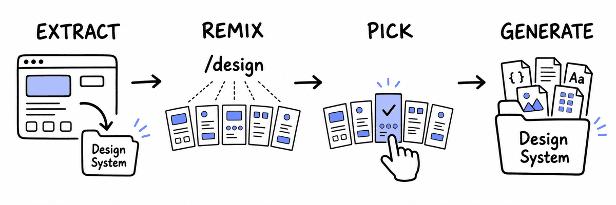
For this project, I used /design to remix the design system into five visual variations of the original, so I could find the one that felt like mine. Here’s how it played out.
The prompt
I opened Claude Code and typed a /design prompt.
Four decisions shaped what came back.
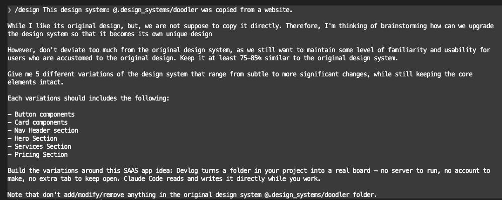
I pointed Claude at the full extraction. The complete token set, component catalog, and reference snippets — everything the skill had pulled from the original site. Claude could study every detail before designing alternatives.
I asked for five variations. Enough spread to notice real differences without drowning in options. (Three would have been fine, but more spread means a better chance of finding the one that clicks.)
I set a similarity constraint: 75-85%. Below 75% and you lose the qualities that attracted you in the first place. Above 85% and you’re still wearing someone else’s look.
I grounded the brief in the actual product. Every variation was designed for Devlog, with its changelog workflows and developer audience front of mind. Variations designed for “a generic landing page” tend to stay generic. Variations designed for a specific product make real decisions.
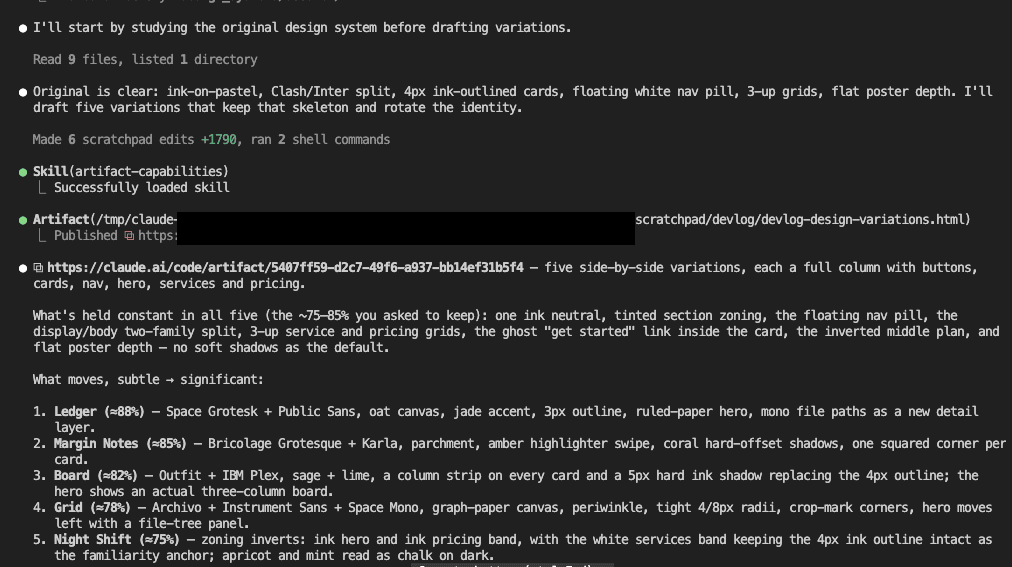
Claude studied the original, drafted five variations, and published them as a single interactive canvas. About two minutes.
.
.
.
Five variations, one canvas
Five named design variations, each rendered as a complete landing page on one scrollable canvas.
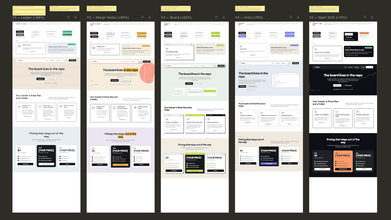
Every variation shares the same page structure: nav, hero, services, and pricing. The visual treatment shifts progressively further from the Doodler original as you move left to right.
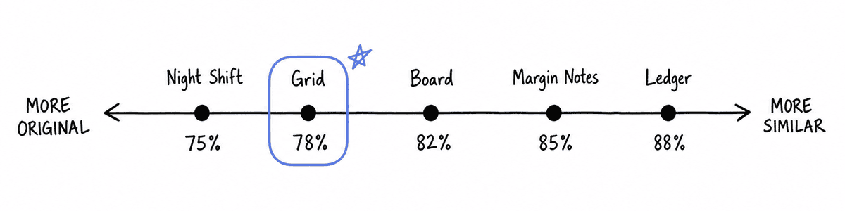
Let me show you what each one brought to the table.
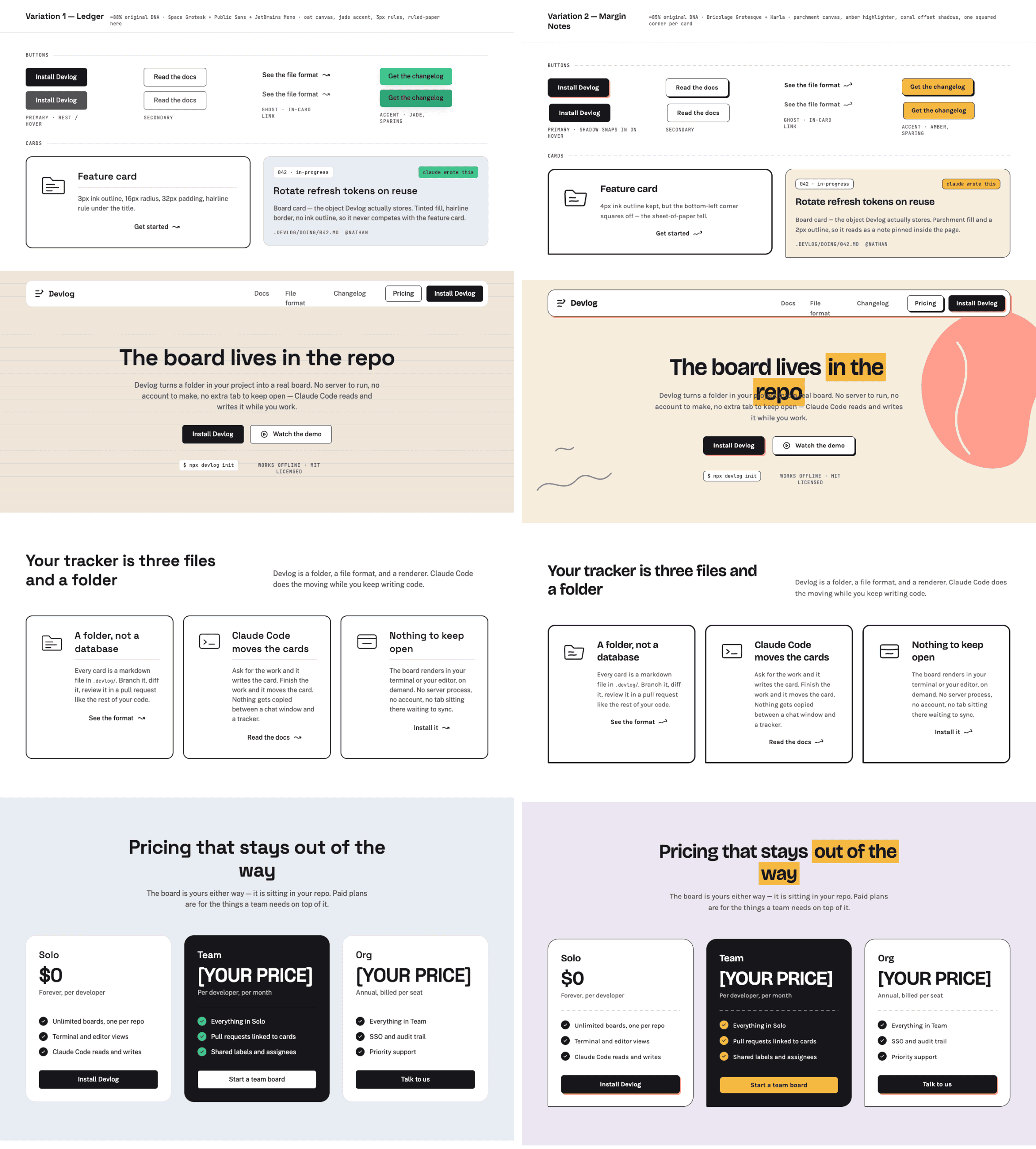
Ledger (~88%) — the closest cousin. Oat canvas, jade accent, 3px outline, and a ruled-paper texture that gives the whole layout a stationery feel.
Margin Notes (~85%) — parchment canvas with amber highlighter swipes on headings, coral hard-offset shadows behind cards, and one deliberately squared corner per card. (That single squared corner was a small move that changed the entire personality of the card.)
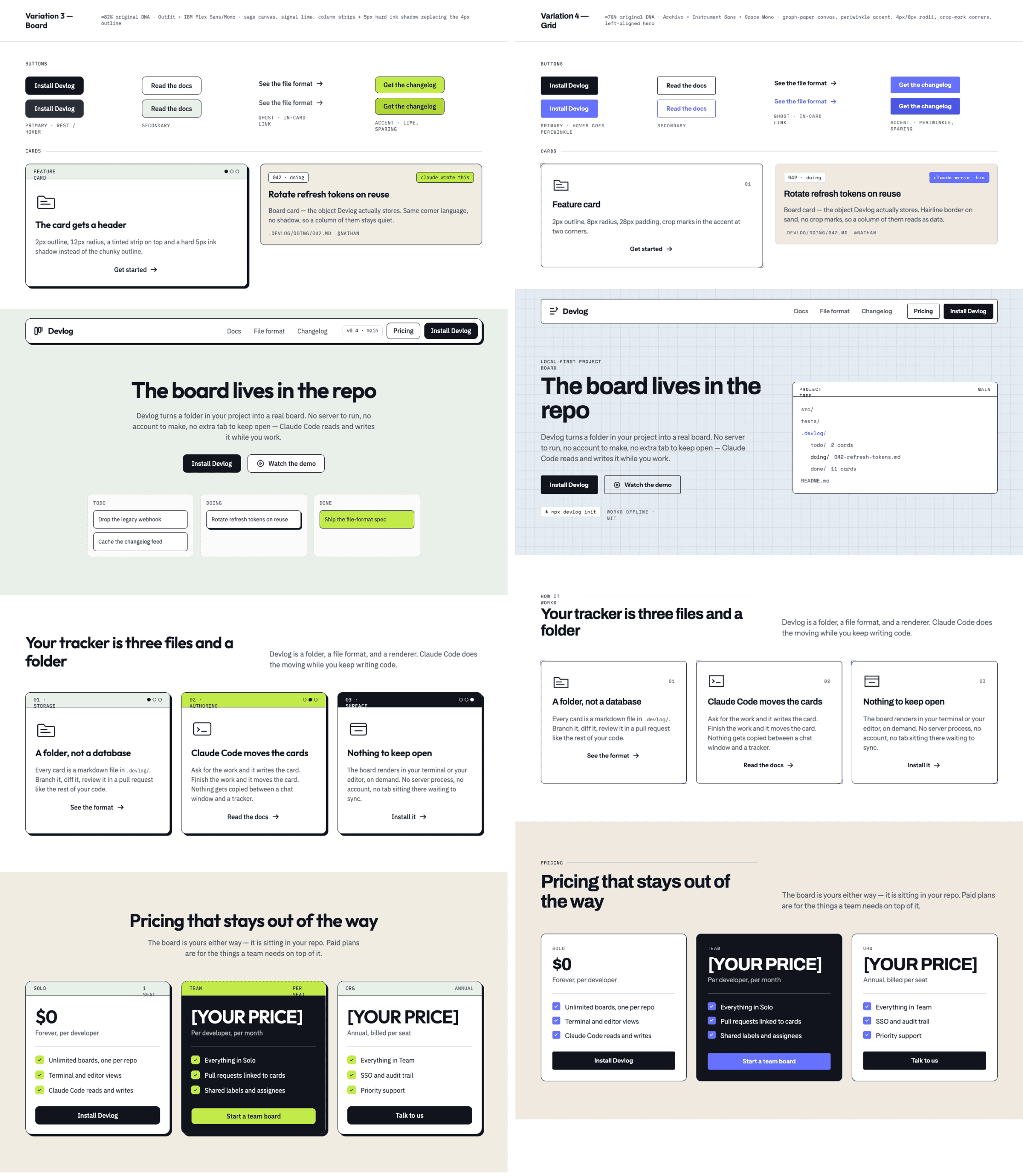
Board (~82%) — sage and lime palette with column strips on cards and a three-column hero that immediately signals “project board.”
Grid (~78%) — graph-paper canvas, periwinkle accent, crop-mark corners on feature cards, and a file-tree panel in the hero showing a real project structure.
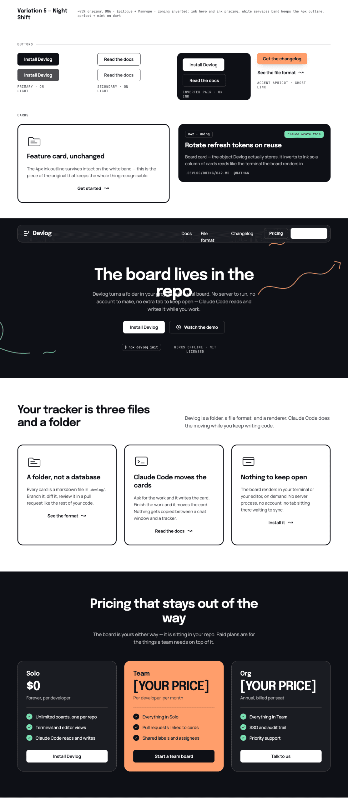
Night Shift (~75%) — the biggest swing. Dark ink hero and pricing band, white services section as the familiarity anchor, apricot and mint reading like chalk on a blackboard.
| Variation | Similarity | Canvas | Accent | Signature move |
|---|---|---|---|---|
| Ledger | ~88% | Oat | Jade | Ruled-paper hero, 3px outline |
| Margin Notes | ~85% | Parchment | Amber | Highlighter swipes, one squared corner |
| Board | ~82% | Sage | Lime | Column strips, hard ink shadow, board hero |
| Grid | ~78% | Graph-paper | Periwinkle | Crop-mark corners, file-tree hero panel |
| Night Shift | ~75% | Ink (dark) | Apricot/Mint | Inverted hero and pricing bands |
I expected five color swaps. What I got were five brands.
Same page structure across all five, but once the palette, type pairing, and border treatment shifted, each variation stood on its own. The similarity constraint gave the creativity a runway.
Stay with me — the best part is picking one.
.
.
.
Picking the winner
I kept coming back to Grid.
I didn’t score them on a spreadsheet. I scrolled through all five and Grid just stopped me — the graph-paper texture and file-tree hero felt like something I would have designed if I’d started from scratch.
(If you’ve ever flipped through a mood board and felt one option pull you forward before your brain could explain why, that’s the moment.)
Here’s the thing: at 78% similarity, Grid sat in a sweet spot.
The graph-paper canvas and crop-mark corners felt like visual language a developer would immediately connect with — blueprints, schematics, engineering paper. And the file-tree panel in the hero showed a project structure that looked like the design already understood what Devlog does.
You could trace the Doodler lineage if you knew where to look, but anyone seeing Grid for the first time would assume it had always been its own brand.
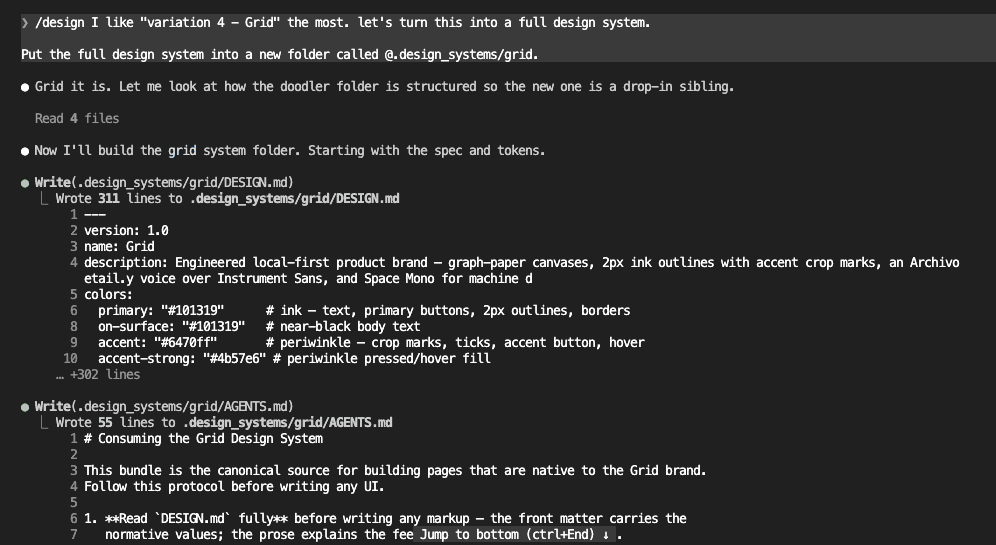
“I like variation 4, Grid, the most. Let’s turn this into a full design system.”
One prompt to go from browsing variations to generating a complete design system.
.
.
.
What came back
Claude took the Grid variation and built a complete design system — the folder mirrors the original Doodler extraction, so it slots directly into the same workflow.
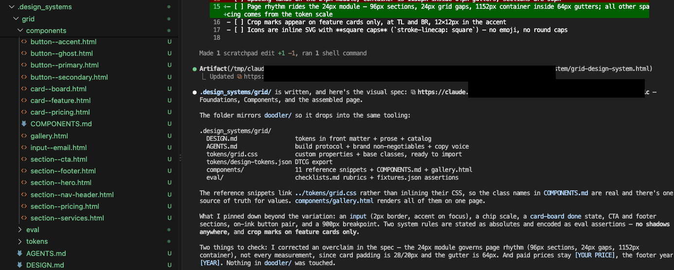
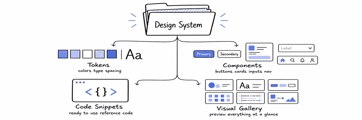
Worth knowing — here’s what the generated system contains:
- Design reference with tokens. Color palette, typography scale, spacing module, shape rules. Two absolutes: no shadows anywhere, crop marks on feature cards only.
- Component catalog. Buttons, cards, inputs, navigation, chips, and section layouts with anatomy notes, variants, and hover/focus states.
- Working code snippets. Reference implementations linking to a shared stylesheet, so the class names in the catalog match real markup.
- Visual gallery. A single-page preview of the entire system at a glance. (I opened it next to the original Doodler site in a side tab. The grid-paper canvas and periwinkle accents looked like they’d always existed — which is exactly the point.)
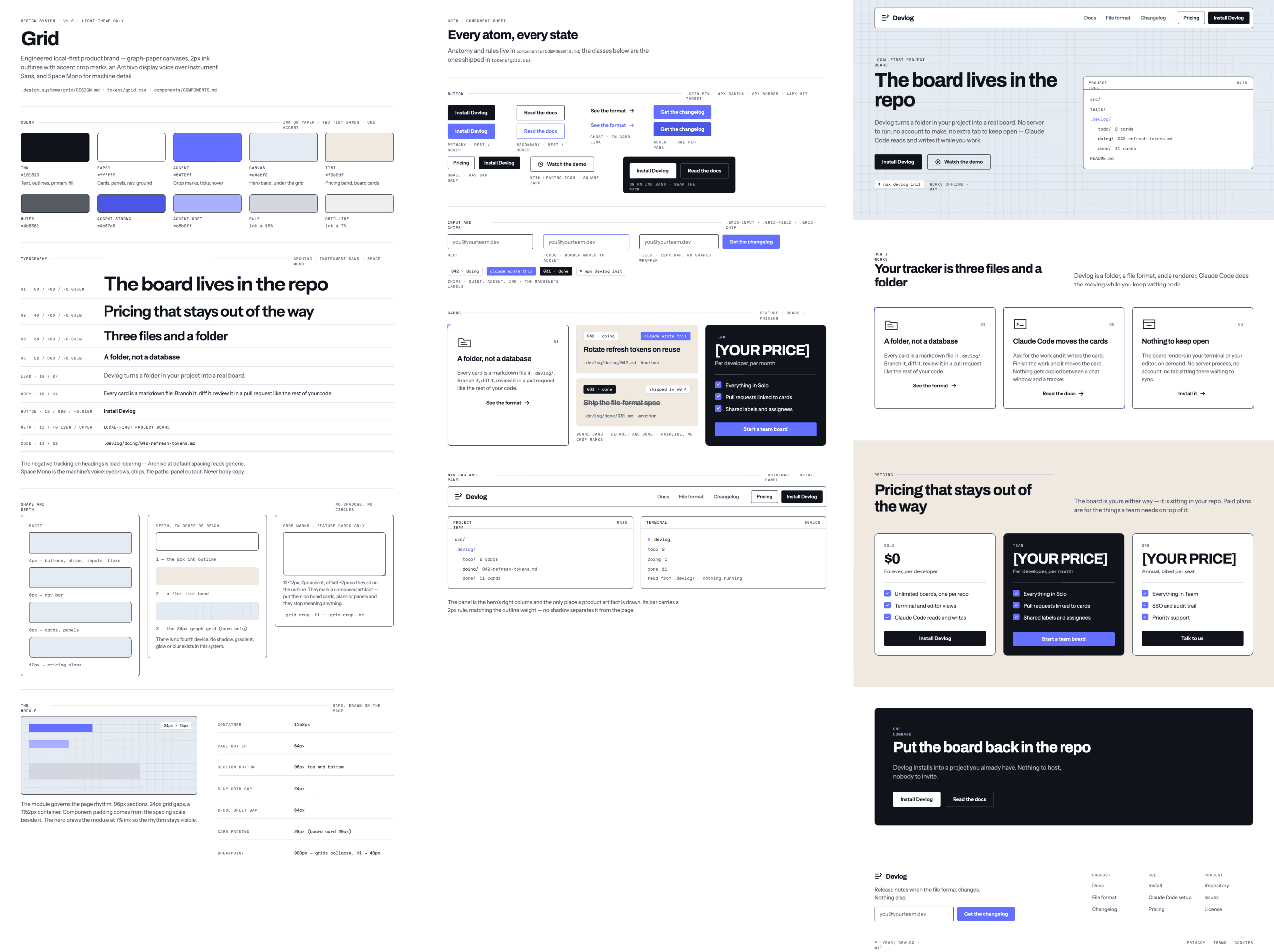
The whole generation took about three minutes. From pointing at a variation on a canvas to holding a complete, structured design system ready to be converted into a skill.
Three minutes.
.
.
.
Your move
And here’s the kicker: the entire remix — extracting Doodler, generating five variations, picking Grid, and getting a complete design system back — took less than ten minutes of my active attention. Claude did the heavy lifting. I made one creative decision that mattered.
The whole thing is four steps:
- Extract a design system from a site you admire
- Remix it into variations using /design
- Browse the canvas and pick the variation that fits your product
- Generate a complete design system from that pick
If you want the generated system to activate automatically, The Skill That Makes Claude Use Your Design System Without Being Told walks through the skill conversion.
👉 Go find a site with a design you admire. Extract it. Remix it with /design. Pick the one that feels right.
Make it yours.

Leave a Comment