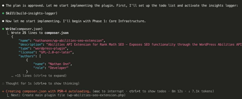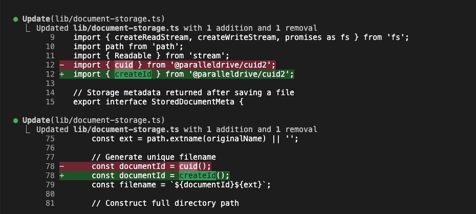
I fire up Claude Code.
New project in mind—a WordPress theme for coworking spaces. And I want to do this right, you know? Start with requirements. Be professional about it. Act like someone who has their act together.
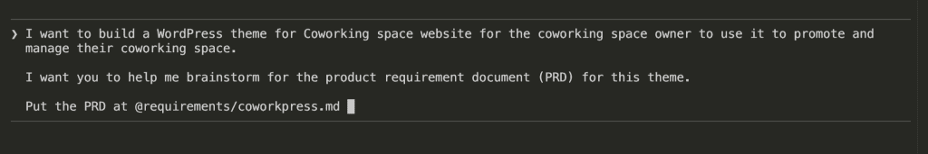
So I type:
I want to build a WordPress theme for Coworking space website
for the coworking space owner to use it to promote and manage
their coworking space.

I want you to help me brainstorm for the product requirement
document (PRD) for this theme.

Put the PRD at @requirements/coworkpress.md
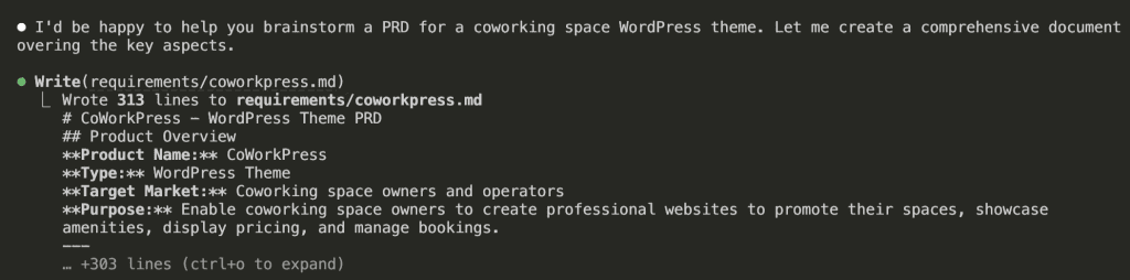
I hit enter, feeling like a real PM.
Claude responds: “I’d be happy to help you brainstorm a PRD for a coworking space WordPress theme. Let me create a comprehensive document covering the key aspects.”
Then it writes. And writes. And writes.
313 lines.
[PRD] CoWorkPress – WordPress Theme
Product Overview
Product Name: CoWorkPress Type: WordPress Theme Target Market: Coworking space owners and operators Purpose: Enable coworking space owners to create professional websites to promote their spaces, showcase amenities, display pricing, and manage bookings.
Problem Statement
Coworking space owners need an affordable, easy-to-use solution to:
- Establish an online presence without hiring developers
- Showcase their space professionally to attract members
- Display pricing and membership options clearly
- Allow potential members to book tours or reserve spaces
- Build community and promote events
Target Users
Primary Users (Site Owners)
- Small coworking space owners - Single location, 10-50 desks
- Boutique coworking operators - 1-3 locations, design-focused spaces
- Community space managers - Non-profit or community-driven spaces
Secondary Users (Site Visitors)
- Freelancers looking for workspace
- Remote workers needing occasional office space
- Startups seeking affordable office solutions
- Corporate teams needing satellite office space
Core Features
1. Homepage Builder
- Hero Section - Full-width image/video with headline and CTA
- Space Highlights - Showcase different workspace types
- Amenities Grid - Visual display of available amenities
- Testimonials - Member reviews and success stories
- Pricing Preview - Quick view of membership options
- Location Map - Interactive map integration
- CTA Sections - Book a tour, Get started buttons
2. Space/Room Showcase
- Gallery System - Photo galleries with lightbox
- Virtual Tour Integration - Support for 360° tours (Matterport, etc.)
- Space Types Display
- Hot desks
- Dedicated desks
- Private offices
- Meeting rooms
- Event spaces
- Capacity & Availability Indicators
- Filtering/Sorting Options
3. Pricing & Membership Plans
- Pricing Table Templates
- Monthly memberships
- Day passes
- Hourly rates
- Meeting room rates
- Plan Comparison Feature
- Custom Pricing Tiers
- Add-on Services Display
- Currency & Tax Settings
4. Booking & Contact System
- Tour Booking Form - Schedule space visits
- Contact Forms - General inquiries
- Meeting Room Booking (Basic)
- Calendar view
- Time slot selection
- Integration hooks for booking plugins
- Lead Capture Forms
- Email Notifications
5. Amenities Showcase
- Icon-based Amenities Grid
- Pre-built Amenity Icons
- WiFi, Printing, Coffee, Kitchen
- Phone booths, Lockers, Parking
- Mail handling, Reception
- 24/7 access, Security
- Custom Amenity Support
6. Location & Multi-Location Support
- Single Location
- Address display
- Google Maps integration
- Directions/transit info
- Operating hours
- Multi-Location (Future/Premium)
- Location selector
- Location-specific pages
- Location comparison
7. Community & Events
- Events Calendar
- Upcoming events display
- Event registration
- Integration with event plugins
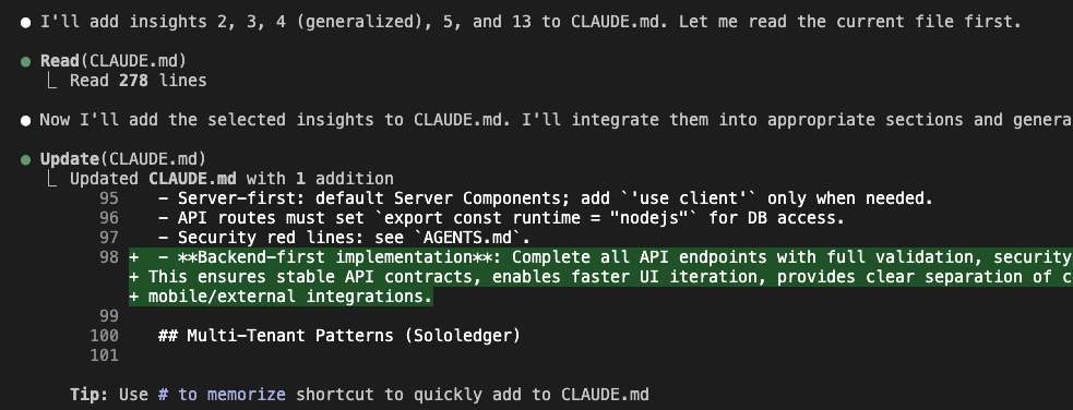
- Member Directory (Optional)
- Blog/News Section
- Community Perks Display
8. Trust & Social Proof
- Testimonial Sections
- Client/Company Logos
- Press Mentions
- Statistics Counter (Members served, sqft, etc.)
- Certifications/Awards Display
Technical Requirements
WordPress Compatibility
- Minimum WordPress Version: 6.0+
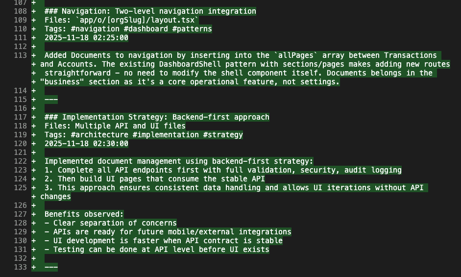
- PHP Version: 8.0+
- Full Site Editing (FSE) Support - Block-based theme
- Gutenberg Compatible - Custom blocks for coworking features
Performance
- PageSpeed Score: 90+ on mobile
- Lightweight - < 100KB CSS, < 50KB JS (minified)
- Lazy Loading - Images and videos
- Optimized Assets - WebP support, responsive images
Responsive Design
- Mobile-First Approach
- Breakpoints:
- Mobile: < 768px
- Tablet: 768px - 1024px
- Desktop: > 1024px
- Touch-Friendly - Navigation, galleries, forms
Accessibility
- WCAG 2.1 AA Compliance
- Keyboard Navigation
- Screen Reader Support
- Sufficient Color Contrast
- Alt Text Support
SEO
- Schema.org Markup - LocalBusiness, Place
- Clean HTML Structure
- Optimized Heading Hierarchy
- Fast Loading Times
- Social Meta Tags (Open Graph, Twitter Cards)
Design System
Visual Style
- Modern & Professional - Clean, minimal aesthetic
- Flexible Color System - Primary, secondary, accent colors
- Typography
- Google Fonts integration
- System font fallbacks
- Readable body text (16px+)
Pre-built Templates
- Homepage Variations (3-5 layouts)
- About Page
- Spaces/Rooms Page
- Pricing Page
- Contact Page
- Single Space/Room Template
- Events Page
- Blog Templates
Customization Options
- Global Colors - Via WordPress Customizer/FSE
- Typography Settings
- Header Layouts (2-3 options)
- Footer Layouts (2-3 options)
- Button Styles
- Section Spacing Controls
Plugin Integrations
Required/Bundled
- None (theme should work standalone)
Recommended Integrations
- Forms: WPForms, Contact Form 7, Gravity Forms
- Booking: Amelia, BookingPress, Simply Schedule Appointments
- Maps: Google Maps, Mapbox
- SEO: Yoast SEO, Rank Math
- Analytics: Google Analytics, Plausible
- Page Builders: Elementor, Beaver Builder (optional compatibility)
Future/Premium Integrations
- Stripe/WooCommerce for payments
- CRM integrations (HubSpot, etc.)
- Coworking management software APIs (Nexudus, Cobot, OfficeRnD)
Content Requirements
Demo Content
- Sample homepage with realistic coworking imagery
- Sample spaces with descriptions
- Placeholder testimonials
- Sample pricing plans
- Demo blog posts
Documentation
- Quick Start Guide
- Theme Options Documentation
- Block Usage Guide
- Customization Tutorials
- FAQ Section
Success Metrics
For Theme (Business)
- Downloads/Sales numbers
- User reviews and ratings
- Support ticket volume
- Renewal/upgrade rate
For End Users (Coworking Owners)
- Time to launch (< 1 day for basic site)
- Lead generation improvement
- Tour booking conversion
- Member acquisition cost reduction
Phases & Roadmap
Phase 1 - MVP (v1.0)
- [ ] Core theme structure (FSE-based)
- [ ] Homepage template with essential sections
- [ ] Spaces showcase (custom post type)
- [ ] Basic pricing table block
- [ ] Amenities block
- [ ] Contact/Tour booking form integration
- [ ] Responsive design
- [ ] Basic customization options
Phase 2 - Enhanced (v1.5)
- [ ] Additional homepage layouts
- [ ] Events integration
- [ ] Testimonials management
- [ ] Gallery enhancements
- [ ] Multi-location basic support
- [ ] Performance optimizations
Phase 3 - Premium Features (v2.0)
- [ ] Advanced booking system
- [ ] Member portal template
- [ ] Coworking software integrations
- [ ] Advanced analytics dashboard
- [ ] White-label options
Competitive Analysis
Existing Solutions
| Solution | Type | Pros | Cons |
|---|---|---|---|
| Flavor Theme | WP Theme | Coworking-specific | Outdated, not FSE |
| Flavor Theme | WP Theme | Modern | Generic, needs customization |
| Flavor Theme | Template | Beautiful | Not WordPress |
| Flavor Theme | Template | Feature-rich | Requires coding |
Differentiation
- WordPress-native - No complex setup
- FSE/Block-based - Modern, future-proof
- Coworking-specific - Purpose-built features
- Lightweight - Fast performance
- Affordable - Accessible for small operators
Open Questions
- Pricing Model - One-time purchase vs. subscription?
- Free vs. Premium - Freemium model with premium add-ons?
- Booking Depth - Build custom booking or rely on plugin integrations?
- Multi-location - Core feature or premium add-on?
- Community Features - Include member directory/forum?
- E-commerce - Direct payment processing for memberships?
Notes & Ideas
- Consider integration with popular coworking management platforms
- Virtual tour integration could be a key differentiator
- Mobile app companion for members (future consideration)
- Community marketplace for member services
- Analytics for space utilization (premium feature)
Product Overview
Product Name: CoWorkPress Type: WordPress Theme Target Market: Coworking space owners and operators Purpose: Enable coworking space owners to create professional websites to promote their spaces, showcase amenities, display pricing, and manage bookings.
Problem Statement
Coworking space owners need an affordable, easy-to-use solution to:
- Establish an online presence without hiring developers
- Showcase their space professionally to attract members
- Display pricing and membership options clearly
- Allow potential members to book tours or reserve spaces
- Build community and promote events
Target Users
Primary Users (Site Owners)
- Small coworking space owners - Single location, 10-50 desks
- Boutique coworking operators - 1-3 locations, design-focused spaces
- Community space managers - Non-profit or community-driven spaces
Secondary Users (Site Visitors)
- Freelancers looking for workspace
- Remote workers needing occasional office space
- Startups seeking affordable office solutions
- Corporate teams needing satellite office space
Core Features
1. Homepage Builder
- Hero Section - Full-width image/video with headline and CTA
- Space Highlights - Showcase different workspace types
- Amenities Grid - Visual display of available amenities
- Testimonials - Member reviews and success stories
- Pricing Preview - Quick view of membership options
- Location Map - Interactive map integration
- CTA Sections - Book a tour, Get started buttons
2. Space/Room Showcase
- Gallery System - Photo galleries with lightbox
- Virtual Tour Integration - Support for 360° tours (Matterport, etc.)
- Space Types Display
- Hot desks
- Dedicated desks
- Private offices
- Meeting rooms
- Event spaces
- Capacity & Availability Indicators
- Filtering/Sorting Options
3. Pricing & Membership Plans
- Pricing Table Templates
- Monthly memberships
- Day passes
- Hourly rates
- Meeting room rates
- Plan Comparison Feature
- Custom Pricing Tiers
- Add-on Services Display
- Currency & Tax Settings
4. Booking & Contact System
- Tour Booking Form - Schedule space visits
- Contact Forms - General inquiries
- Meeting Room Booking (Basic)
- Calendar view
- Time slot selection
- Integration hooks for booking plugins
- Lead Capture Forms
- Email Notifications
5. Amenities Showcase
- Icon-based Amenities Grid
- Pre-built Amenity Icons
- WiFi, Printing, Coffee, Kitchen
- Phone booths, Lockers, Parking
- Mail handling, Reception
- 24/7 access, Security
- Custom Amenity Support
6. Location & Multi-Location Support
- Single Location
- Address display
- Google Maps integration
- Directions/transit info
- Operating hours
- Multi-Location (Future/Premium)
- Location selector
- Location-specific pages
- Location comparison
7. Community & Events
- Events Calendar
- Upcoming events display
- Event registration
- Integration with event plugins
- Member Directory (Optional)
- Blog/News Section
- Community Perks Display
8. Trust & Social Proof
- Testimonial Sections
- Client/Company Logos
- Press Mentions
- Statistics Counter (Members served, sqft, etc.)
- Certifications/Awards Display
Technical Requirements
WordPress Compatibility
- Minimum WordPress Version: 6.0+
- PHP Version: 8.0+
- Full Site Editing (FSE) Support - Block-based theme
- Gutenberg Compatible - Custom blocks for coworking features
Performance
- PageSpeed Score: 90+ on mobile
- Lightweight - < 100KB CSS, < 50KB JS (minified)
- Lazy Loading - Images and videos
- Optimized Assets - WebP support, responsive images
Responsive Design
- Mobile-First Approach
- Breakpoints:
- Mobile: < 768px
- Tablet: 768px - 1024px
- Desktop: > 1024px
- Touch-Friendly - Navigation, galleries, forms
Accessibility
- WCAG 2.1 AA Compliance
- Keyboard Navigation
- Screen Reader Support
- Sufficient Color Contrast
- Alt Text Support
SEO
- Schema.org Markup - LocalBusiness, Place
- Clean HTML Structure
- Optimized Heading Hierarchy
- Fast Loading Times
- Social Meta Tags (Open Graph, Twitter Cards)
Design System
Visual Style
- Modern & Professional - Clean, minimal aesthetic
- Flexible Color System - Primary, secondary, accent colors
- Typography
- Google Fonts integration
- System font fallbacks
- Readable body text (16px+)
Pre-built Templates
- Homepage Variations (3-5 layouts)
- About Page
- Spaces/Rooms Page
- Pricing Page
- Contact Page
- Single Space/Room Template
- Events Page
- Blog Templates
Customization Options
- Global Colors - Via WordPress Customizer/FSE
- Typography Settings
- Header Layouts (2-3 options)
- Footer Layouts (2-3 options)
- Button Styles
- Section Spacing Controls
Plugin Integrations
Required/Bundled
- None (theme should work standalone)
Recommended Integrations
- Forms: WPForms, Contact Form 7, Gravity Forms
- Booking: Amelia, BookingPress, Simply Schedule Appointments
- Maps: Google Maps, Mapbox
- SEO: Yoast SEO, Rank Math
- Analytics: Google Analytics, Plausible
- Page Builders: Elementor, Beaver Builder (optional compatibility)
Future/Premium Integrations
- Stripe/WooCommerce for payments
- CRM integrations (HubSpot, etc.)
- Coworking management software APIs (Nexudus, Cobot, OfficeRnD)
Content Requirements
Demo Content
- Sample homepage with realistic coworking imagery
- Sample spaces with descriptions
- Placeholder testimonials
- Sample pricing plans
- Demo blog posts
Documentation
- Quick Start Guide
- Theme Options Documentation
- Block Usage Guide
- Customization Tutorials
- FAQ Section
Success Metrics
For Theme (Business)
- Downloads/Sales numbers
- User reviews and ratings
- Support ticket volume
- Renewal/upgrade rate
For End Users (Coworking Owners)
- Time to launch (< 1 day for basic site)
- Lead generation improvement
- Tour booking conversion
- Member acquisition cost reduction
Phases & Roadmap
Phase 1 - MVP (v1.0)
- [ ] Core theme structure (FSE-based)
- [ ] Homepage template with essential sections
- [ ] Spaces showcase (custom post type)
- [ ] Basic pricing table block
- [ ] Amenities block
- [ ] Contact/Tour booking form integration
- [ ] Responsive design
- [ ] Basic customization options
Phase 2 - Enhanced (v1.5)
- [ ] Additional homepage layouts
- [ ] Events integration
- [ ] Testimonials management
- [ ] Gallery enhancements
- [ ] Multi-location basic support
- [ ] Performance optimizations
Phase 3 - Premium Features (v2.0)
- [ ] Advanced booking system
- [ ] Member portal template
- [ ] Coworking software integrations
- [ ] Advanced analytics dashboard
- [ ] White-label options
Competitive Analysis
Existing Solutions
| Solution | Type | Pros | Cons |
|---|---|---|---|
| Flavor Theme | WP Theme | Coworking-specific | Outdated, not FSE |
| Flavor Theme | WP Theme | Modern | Generic, needs customization |
| Flavor Theme | Template | Beautiful | Not WordPress |
| Flavor Theme | Template | Feature-rich | Requires coding |
Differentiation
- WordPress-native - No complex setup
- FSE/Block-based - Modern, future-proof
- Coworking-specific - Purpose-built features
- Lightweight - Fast performance
- Affordable - Accessible for small operators
Open Questions
- Pricing Model - One-time purchase vs. subscription?
- Free vs. Premium - Freemium model with premium add-ons?
- Booking Depth - Build custom booking or rely on plugin integrations?
- Multi-location - Core feature or premium add-on?
- Community Features - Include member directory/forum?
- E-commerce - Direct payment processing for memberships?
Notes & Ideas
- Consider integration with popular coworking management platforms
- Virtual tour integration could be a key differentiator
- Mobile app companion for members (future consideration)
- Community marketplace for member services
- Analytics for space utilization (premium feature)
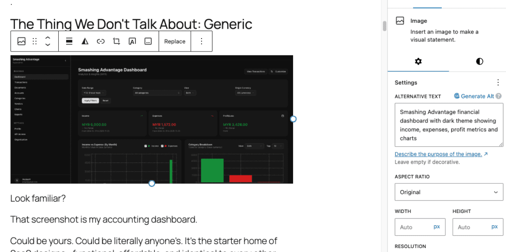
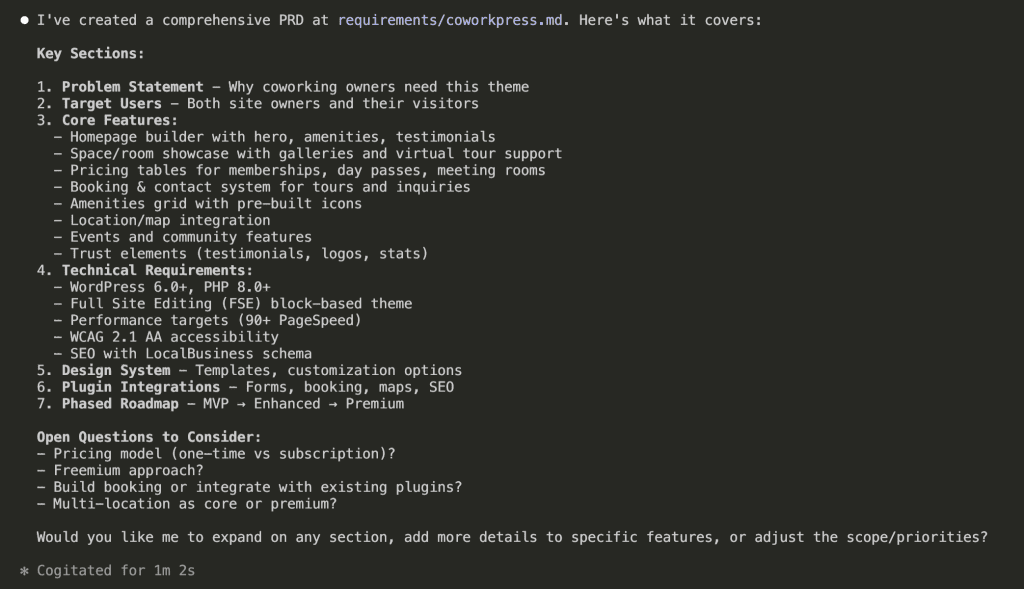
At first glance, it looks thorough. Professional, even. Like something a senior engineer would put together after three cups of coffee and a really productive morning.
But here’s where things get squirrely.
Look closer at what Claude produced:
- WordPress 6.0+ and PHP 8.0+ version requirements
- Full Site Editing (FSE) block-based architecture decisions
- Performance targets: 90+ PageSpeed, < 100KB CSS, < 50KB JS
- Specific responsive breakpoints (768px, 1024px)
- Plugin recommendations: WPForms, Amelia, Yoast SEO
- A three-phase development roadmap with version numbers
Wait.
Hold on.
I haven’t even started coding yet—haven’t written a single line—and I’ve already “decided” on performance budgets, responsive breakpoints, and plugin integrations?
Huh.
.
.
.
The Problem: Requirements That Aren’t Actually Requirements
Here’s what happened (and stay with me, because this is the part that changes everything): I asked Claude for requirements. Claude gave me implementation decisions.
Those 313 lines contain:
- Technical stack choices I haven’t made yet
- Performance constraints that might change
- Architecture patterns I haven’t validated
- Integration approaches I haven’t researched
And now this entire document sits in my context window—taking up space, influencing every future conversation. Every time I ask Claude to help me build something, it references these premature decisions like they’re gospel.
The PRD became a constraint instead of a guide.
Here’s the thing. Claude conflates two very different things:
- What you want to build (requirements)
- How to build it (implementation)
And honestly? That’s not Claude’s fault. It’s mine. I didn’t tell it otherwise.
But here’s the real insight—the one that made me completely rethink how I approach Claude Code requirements:
User perspective yields better AI output.
(I know, I know. That sounds like something you’d find on a motivational poster in a Silicon Valley bathroom. But hear me out.)
When you describe what users experience, Claude understands context. It grasps the why behind features. It catches edge cases you’d miss while you’re busy thinking about database schemas.
When you describe technical implementation? Claude follows a checklist. No context. No judgment. Just execution.
So what if I asked differently?
.
.
.
The Reframe: Making Claude Interview You First
I tried again. Same project. Different approach.
This time, I asked for a Business Requirements Document—focused on user stories and business logic, not technical specs.
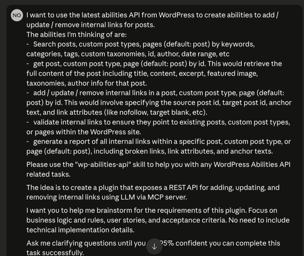
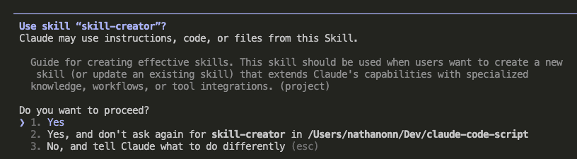
But here’s the key change (and this is the part you’ll want to screenshot): I told Claude to interview me first.
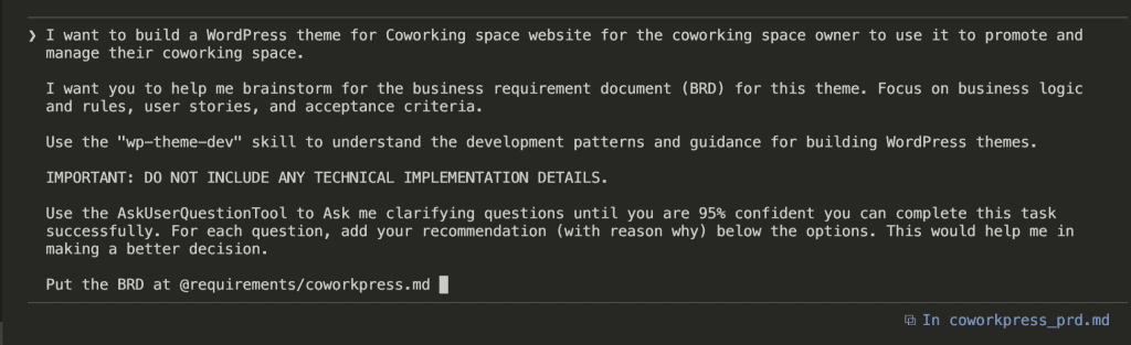
The exact prompt:
I want to build a WordPress theme for Coworking space website
for the coworking space owner to use it to promote and manage
their coworking space.
I want you to help me brainstorm for the business requirement
document (BRD) for this theme. Focus on business logic and
rules, user stories, and acceptance criteria.
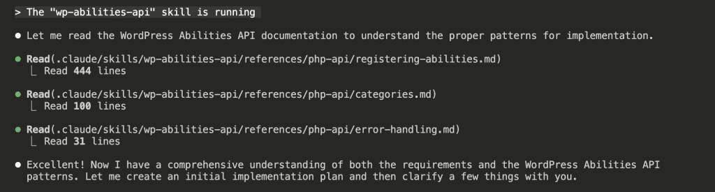
Use the "wp-theme-dev" skill to understand the development
patterns and guidance for building WordPress themes.
IMPORTANT: DO NOT INCLUDE ANY TECHNICAL IMPLEMENTATION DETAILS.
Use the AskUserQuestionTool to Ask me clarifying questions
until you are 95% confident you can complete this task
successfully. For each question, add your recommendation
(with reason why) below the options. This would help me
in making a better decision.
Put the BRD at @requirements/coworkpress.md
Three things matter here:
- “Focus on business logic, user stories, and acceptance criteria” — This sets explicit scope. No wandering into implementation land.
- “DO NOT INCLUDE ANY TECHNICAL IMPLEMENTATION DETAILS” — A hard boundary. (Yes, I’m yelling. Sometimes Claude needs yelling.)
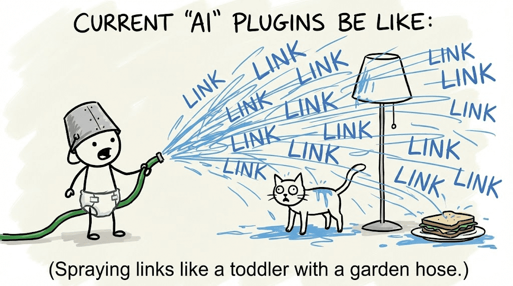
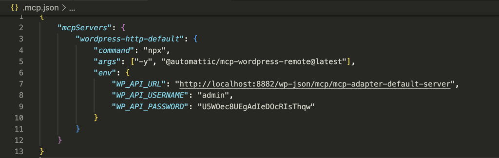
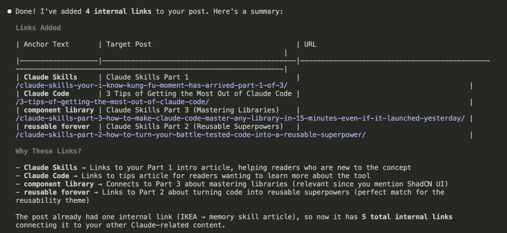
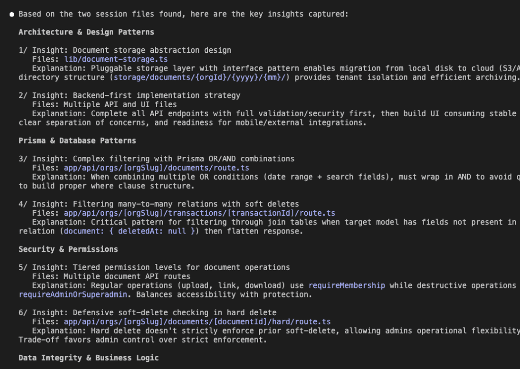
- “Ask me clarifying questions until you are 95% confident” — This is the magic ingredient. The secret sauce. The thing that changes everything.
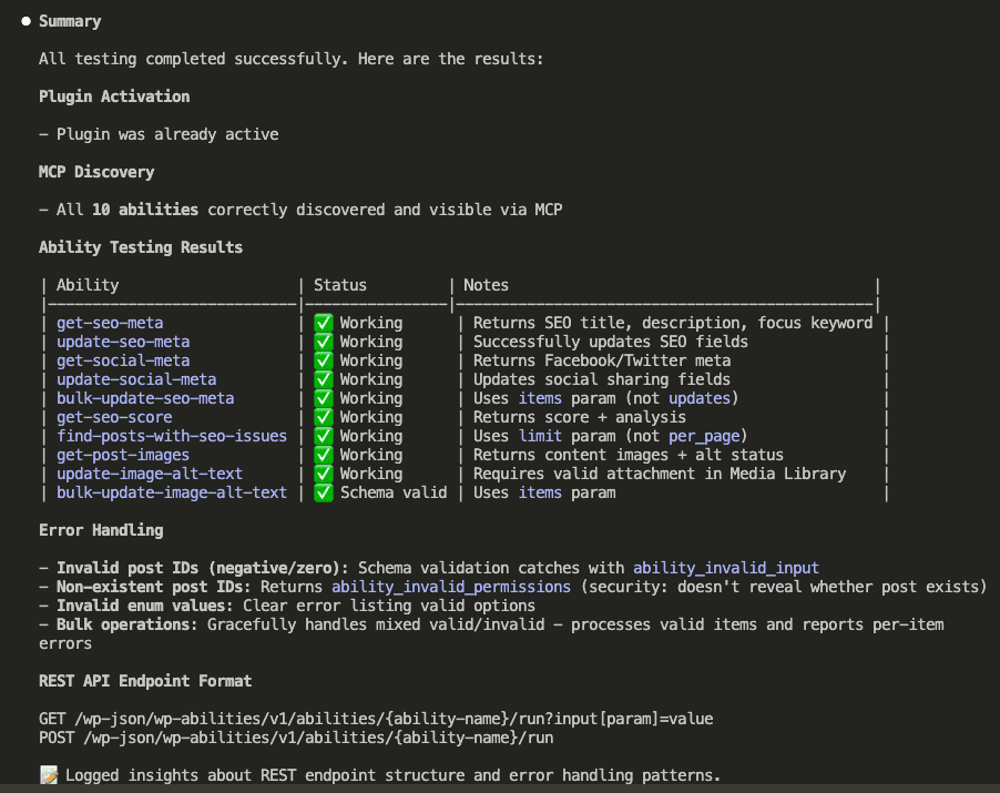
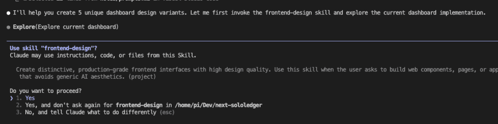
That last part triggers AskUserQuestionTool—a built-in Claude Code feature that lets Claude pause and interview you before generating anything.
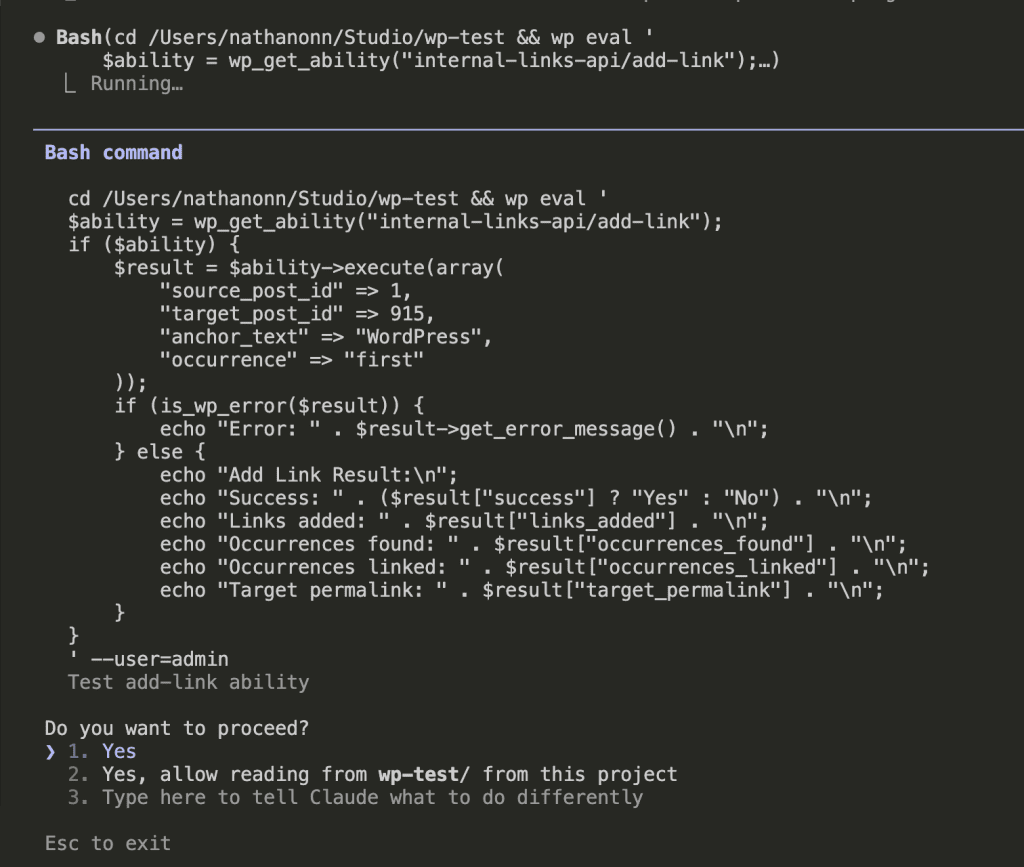
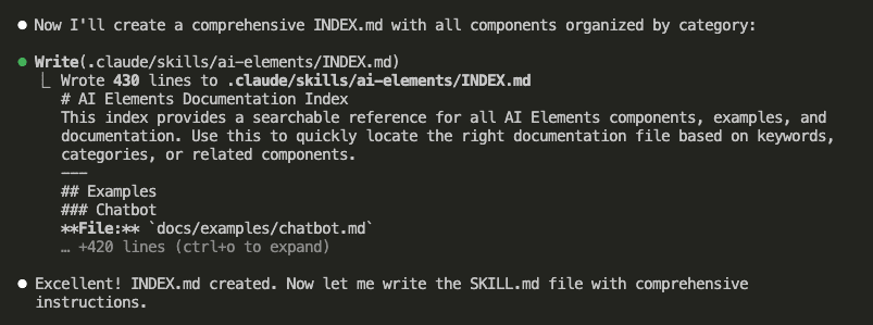
![Flowchart titled 'THE ASKUSERQUESTION FLOW' illustrating an interactive process between a user and an AI, Claude, to improve output. The flow starts with 'Your Prompt' 🗣️ leading to 'Claude Asks Questions' 🤖. This step points to 'You Answer (Options + Your Input)' ⌨️, which then leads to a decision diamond: '95% Confident?' 🤔. If 'No', an arrow loops back to '[Ask More]' 👀 and then to 'Claude Asks Questions'. If 'Yes', an arrow points to '[Generate BRD]' 📄. Finally, '[Generate BRD]' leads to the ultimate goal: 'Better Output' 💪✅. The boxes are connected by arrows on a light grey background.](https://www.nathanonn.com/wp-content/uploads/2026/01/image-10.png)
What happened next?
It changed how I start every single project.
.
.
.
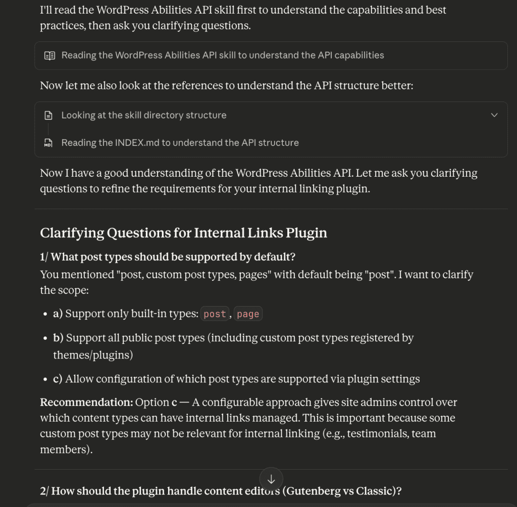
The Interview Begins
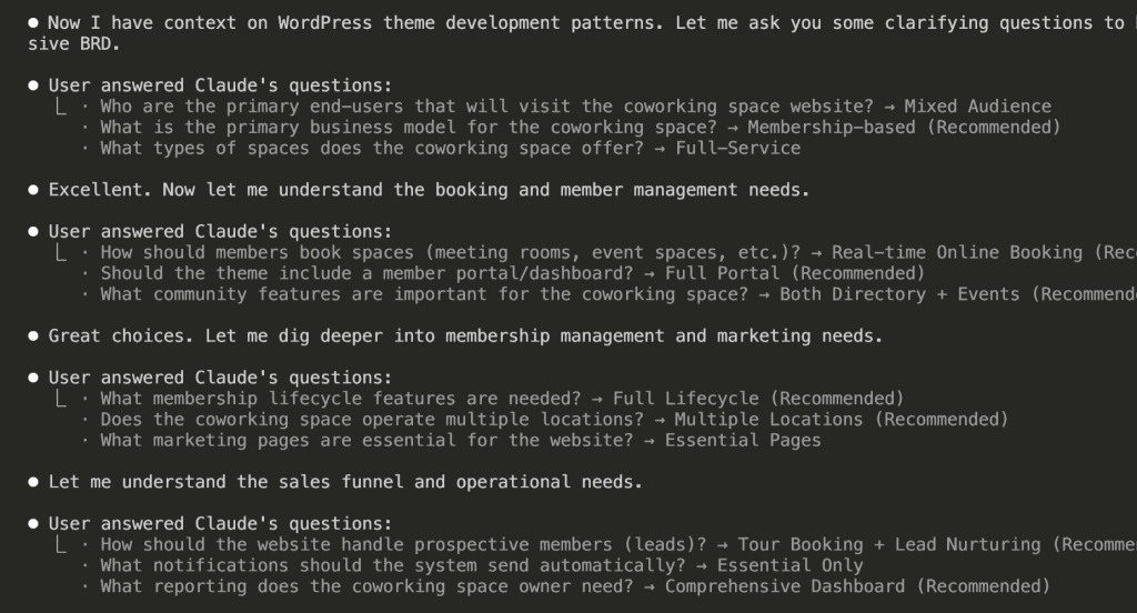
Claude didn’t start writing.
It started asking.
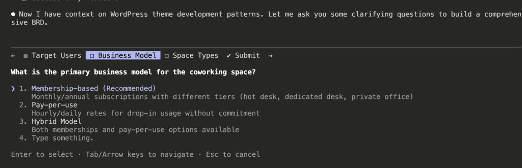
Look at that interface. (Isn’t it beautiful?) Claude organized its questions into themes:
- Target Users
- Business Model
- Space Types
And each question comes with options—plus Claude’s recommendation with reasoning. It’s like having a really thoughtful product manager who actually wants to understand what you’re building before they start building it.
For the business model question, Claude recommended Membership-based because “Monthly/annual subscriptions with different tiers (hot desk, dedicated desk, private office)” represents the most common coworking model.
I selected the recommendation. Next question.
.
.
.
Round 2: Booking and Member Management
After answering the first batch, Claude moved deeper.
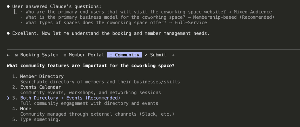
Now it’s asking about:
- Booking systems (meeting rooms, event spaces)
- Member portal requirements
- Community features
Notice how Claude builds on previous answers. Because I said “membership-based” earlier, it now asks about member-specific features like portals and directories.
The questions aren’t random. They follow a logical thread—like a conversation with someone who’s actually paying attention.
I selected Both Directory + Events for community features. Claude recommended it because “Full community engagement with directory and events” maximizes the value proposition for members.
(Smart cookie, that Claude.)
.
.
.
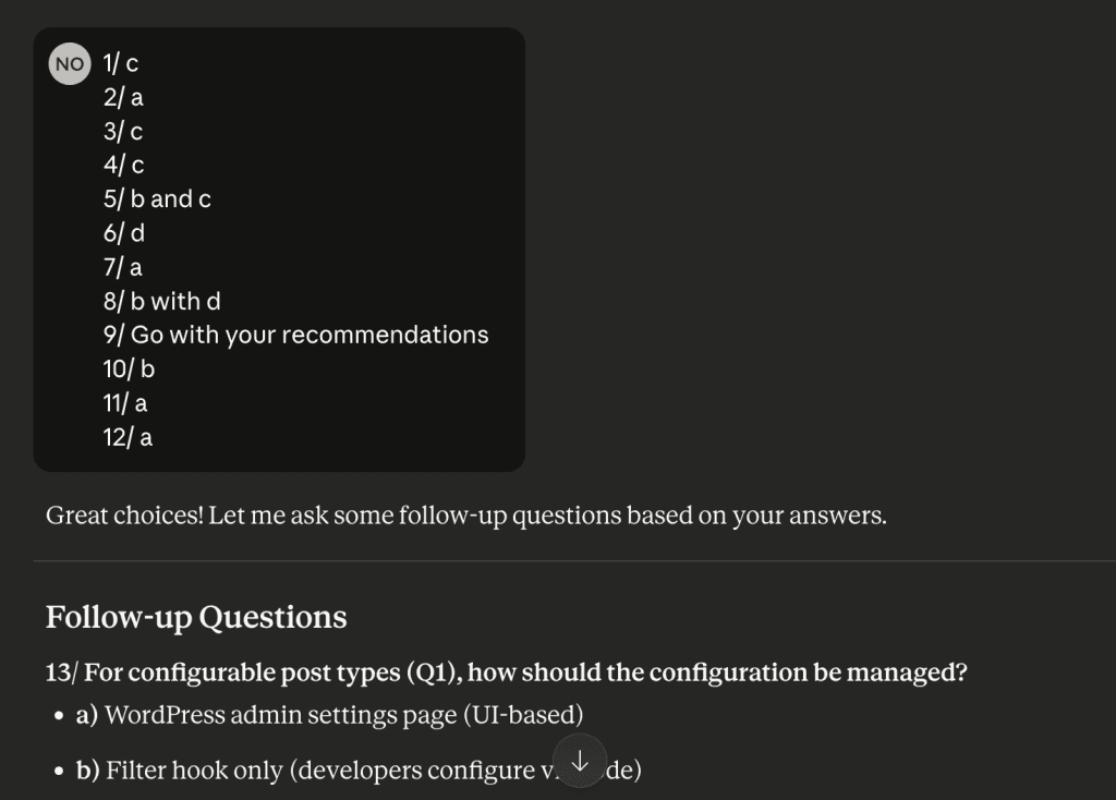
Round 3: Operations and Scale
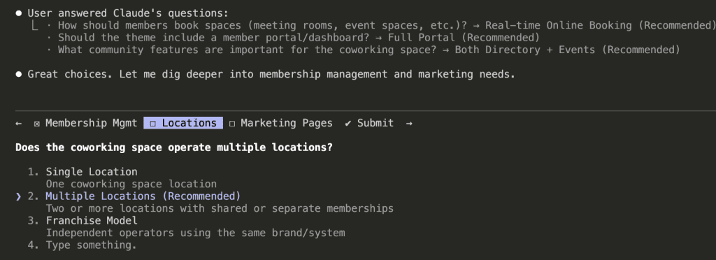
The questions got more specific:
- Membership lifecycle (upgrades, downgrades, cancellations)
- Multi-location support
- Marketing page requirements
Claude recommended Multiple Locations because “Two or more locations with shared or separate memberships” covers both current single-location spaces and future expansion.
It’s thinking about growth—not just current state.
That’s… actually really thoughtful?
.
.
.
Round 4: Sales Funnel and Operations
Now Claude explored:
- Lead capture and nurturing
- Notification preferences
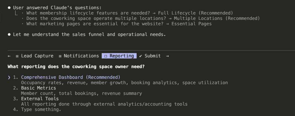
- Reporting needs
For reporting, I went with Comprehensive Dashboard—occupancy rates, revenue, member growth, booking analytics, space utilization.
Claude’s reasoning: space owners need visibility into their business health, and a comprehensive dashboard reduces the need for external tools.
(I mean, yes. Exactly. Thank you for understanding.)
.
.
.
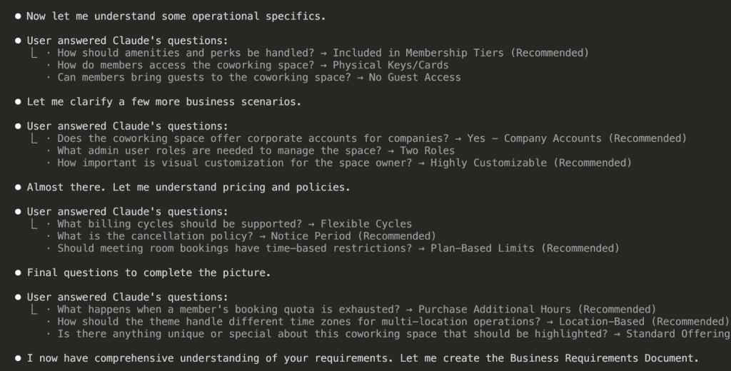
Round 5: Policies and Edge Cases
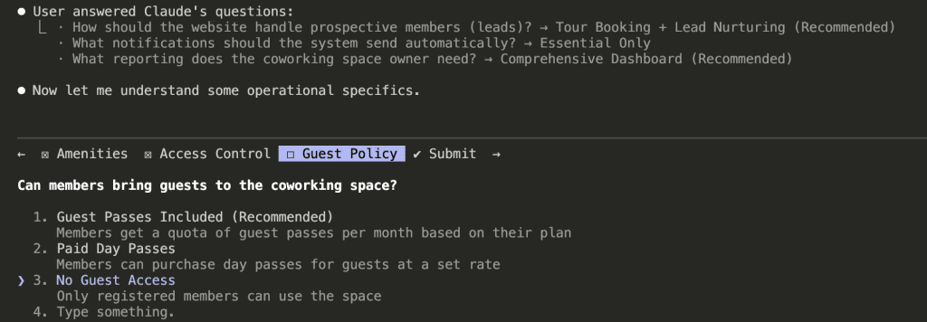
The final rounds covered operational details:
- Amenities handling
- Access control methods
- Guest policies
And here’s where it gets interesting.
These questions catch edge cases I wouldn’t have thought about until I was knee-deep in development—cursing at my screen at 11 PM, wondering why I didn’t think of this earlier.
Guest policy? I hadn’t considered it. But it affects:
- Pricing structure
- Access control logic
- Liability considerations
- Member value perception
Claude surfaced this decision before I started building.
Before I wrote a single line of code.
Before I had to refactor anything.
.
.
.
21 Questions Later: The Full Picture
After 7 rounds, Claude had asked 21 questions across multiple categories.
Look at the coverage:
Business Model & Users
- Target audience: Mixed (freelancers, startups, corporate)
- Business model: Membership-based with tiers
- Space types: Full-service (hot desks, dedicated, private offices, meeting rooms)
Features & Functionality
- Booking: Real-time online system
- Member portal: Full dashboard with profile, bookings, billing
- Community: Directory + events calendar
Operations & Scale
- Multiple locations with location-based time zones
- Two admin roles (Admin + Staff)
- Comprehensive reporting dashboard
Policies & Rules
- Flexible billing (monthly/quarterly/annual)
- 30-day cancellation notice
- Plan-based meeting room quotas
- No guest access
- Corporate accounts supported
Claude now has context. Real context. Not assumptions—actual decisions I made.
“I now have comprehensive understanding of your requirements. Let me create the Business Requirements Document.”
Yes. Yes you do. Finally.
.
.
.
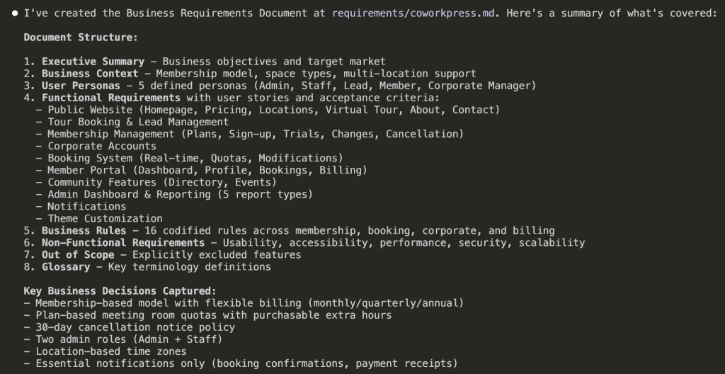
The Output: A Document I Can Actually Build From
[BRD] CoworkPress – WordPress theme
Document Information
| Field | Value |
|---|---|
| Project Name | CoworkPress |
| Document Type | Business Requirements Document (BRD) |
| Version | 1.0 |
| Created | 2026-01-13 |
| Status | Draft |
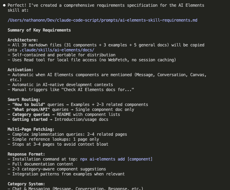
1. Executive Summary
CoworkPress is a WordPress theme designed for coworking space owners to promote and manage their coworking business. The theme enables owners to showcase their spaces, manage memberships, handle bookings, and build community—all through a highly customizable, professional website.
1.1 Business Objectives
- Enable coworking space owners to establish a professional online presence
- Streamline membership management and billing operations
- Provide real-time booking capabilities for spaces and resources
- Support multi-location operations under a single platform
- Deliver comprehensive business analytics and reporting
- Foster community engagement through member directories and events
1.2 Target Market
Primary User (Theme Buyer): Coworking space owners and operators managing one or more locations
End Users (Website Visitors):
- Freelancers and remote workers seeking flexible workspace
- Small teams and startups needing dedicated desks or private offices
- Enterprise clients looking for satellite offices or meeting spaces
2. Business Context
2.1 Business Model
The coworking space operates on a membership-based model with flexible billing cycles (monthly, quarterly, annual). Revenue is generated through:
- Recurring membership subscriptions
- Additional hour purchases when quotas are exhausted
- Corporate accounts managing multiple employee memberships
2.2 Space Offerings
| Space Type | Description |
|---|---|
| Hot Desks | Shared open workspace with no assigned seating |
| Dedicated Desks | Reserved desk space for consistent use |
| Private Offices | Enclosed offices for teams or individuals |
| Meeting Rooms | Bookable conference and collaboration spaces |
| Event Spaces | Larger venues for workshops, seminars, and gatherings |
2.3 Multi-Location Operations
The business supports multiple physical locations, each operating in its own time zone. Memberships may be location-specific or provide access across locations depending on the plan.
3. User Personas
3.1 Coworking Space Owner (Admin)
Goals:
- Manage all aspects of the coworking business from a single dashboard
- Track business performance through analytics and reporting
- Customize the website to match brand identity
- Oversee memberships, bookings, and staff operations
Permissions: Full system access including financial data, member management, settings, and reporting
3.2 Front Desk Staff
Goals:
- Assist members with day-to-day inquiries
- Manage bookings and check-ins
- Handle basic member account updates
- Process tour requests and follow-ups
Permissions: Limited access—cannot access financial reports, billing settings, or system configuration
3.3 Prospective Member (Lead)
Goals:
- Explore available spaces and amenities
- Understand pricing and membership options
- Schedule a tour of the facility
- Compare plans to find the right fit
Journey: Website visitor → Tour booking → Lead nurturing → Member conversion
3.4 Individual Member
Goals:
- Book meeting rooms and resources within quota
- View upcoming bookings and membership status
- Access invoices and billing history
- Connect with other members through directory
- Attend community events
Permissions: Access to member portal, personal bookings, own profile, community features
3.5 Corporate Account Manager
Goals:
- Manage employee memberships under company account
- View consolidated billing for all employees
- Add or remove team members from the plan
- Track company-wide space usage
Permissions: Access to company dashboard, employee management, corporate billing
4. Functional Requirements
4.1 Public Website
4.1.1 Homepage
User Stories:
- As a visitor, I want to immediately understand what the coworking space offers so I can decide if it meets my needs
- As a visitor, I want to see the different locations available so I can find one near me
- As a visitor, I want clear calls-to-action so I know how to take the next step
Acceptance Criteria:
- [ ] Hero section communicates value proposition clearly
- [ ] Location selector/showcase displays all available spaces
- [ ] Membership tiers are summarized with pricing
- [ ] Prominent CTAs for tour booking and sign-up
- [ ] Testimonials or social proof elements are visible
- [ ] Mobile-responsive layout
4.1.2 Pricing Page
User Stories:
- As a visitor, I want to compare membership plans side-by-side so I can choose the right one
- As a visitor, I want to understand what's included in each tier so there are no surprises
- As a corporate buyer, I want to see corporate account options so I can evaluate for my team
Acceptance Criteria:
- [ ] All membership tiers displayed with clear pricing
- [ ] Monthly, quarterly, and annual pricing shown with any discounts
- [ ] Amenities included in each tier clearly listed
- [ ] Meeting room hour quotas displayed per plan
- [ ] Corporate account option highlighted
- [ ] CTA to sign up or contact sales for each tier
4.1.3 Locations Page
User Stories:
- As a visitor, I want to see all locations so I can find the most convenient one
- As a visitor, I want to view details about each location so I can assess the facilities
Acceptance Criteria:
- [ ] All locations listed with address and contact information
- [ ] Each location shows available space types
- [ ] Operating hours displayed per location
- [ ] Photo gallery or visual representation of each space
- [ ] Link to book a tour at specific location
4.1.4 Virtual Tour Page
User Stories:
- As a remote visitor, I want to experience the space virtually so I can evaluate without visiting in person
- As a decision-maker, I want to share a virtual tour with my team so we can discuss together
Acceptance Criteria:
- [ ] 360-degree tour or video walkthrough available
- [ ] Key amenities and features highlighted
- [ ] Easy to navigate between different areas
- [ ] Works on mobile devices
- [ ] Option to schedule in-person tour after viewing
4.1.5 About Page
User Stories:
- As a visitor, I want to learn about the company and team so I can trust the brand
- As a visitor, I want to understand the coworking philosophy so I know if it aligns with my values
Acceptance Criteria:
- [ ] Company story and mission clearly presented
- [ ] Team members or leadership showcased (optional)
- [ ] Community values or culture highlighted
- [ ] Contact information accessible
4.1.6 Contact Page
User Stories:
- As a visitor, I want to easily reach the team with questions so I can get answers before committing
- As a visitor, I want location-specific contact options so I reach the right team
Acceptance Criteria:
- [ ] Contact form with required fields (name, email, message)
- [ ] Phone number and email displayed
- [ ] Location selector if multiple locations exist
- [ ] Map integration showing physical location(s)
- [ ] Expected response time communicated
4.2 Tour Booking & Lead Management
4.2.1 Tour Scheduling
User Stories:
- As a prospective member, I want to book a tour online so I can visit at a convenient time
- As a staff member, I want to see scheduled tours so I can prepare for visitors
- As an admin, I want tour data captured so I can follow up with leads
Acceptance Criteria:
- [ ] Calendar interface showing available tour slots
- [ ] Location selection for multi-location operations
- [ ] Lead information captured (name, email, phone, company, needs)
- [ ] Confirmation email sent to prospect after booking
- [ ] Tour appears in staff/admin dashboard
- [ ] Reminder sent 24 hours before scheduled tour
4.2.2 Lead Nurturing
User Stories:
- As a staff member, I want to track lead status so I know who to follow up with
- As an admin, I want to see conversion metrics so I can improve sales process
Acceptance Criteria:
- [ ] Lead status tracking (new, toured, follow-up, converted, lost)
- [ ] Notes field for staff to record interactions
- [ ] Follow-up reminders for staff
- [ ] Lead source tracking (how they found us)
- [ ] Basic lead-to-member conversion reporting
4.3 Membership Management
4.3.1 Membership Plans
User Stories:
- As an admin, I want to create and manage membership plans so I can offer different options
- As a member, I want to clearly understand my plan benefits so I know what I'm paying for
Business Rules:
- Each plan has a name, description, price, and billing cycle options
- Plans include specific amenities (bundled, not à la carte)
- Plans define meeting room hour quotas per billing period
- Plans may be location-specific or cross-location
- Pricing supports monthly, quarterly, and annual cycles
Acceptance Criteria:
- [ ] Admin can create, edit, and deactivate plans
- [ ] Each plan specifies included amenities
- [ ] Meeting room quotas defined per plan
- [ ] Billing cycles with pricing for each cycle length
- [ ] Plans can be restricted to specific locations or allow all
4.3.2 Member Sign-up
User Stories:
- As a prospective member, I want to sign up for a membership online so I can start using the space
- As an admin, I want to manually add members so I can onboard people who signed up offline
Acceptance Criteria:
- [ ] Online sign-up form with plan selection
- [ ] Required information: name, email, phone, billing address
- [ ] Payment information collected securely
- [ ] Welcome email sent upon successful sign-up
- [ ] Account created and accessible immediately
- [ ] Admin can manually create member accounts
4.3.3 Free Trial
User Stories:
- As a prospective member, I want to try the space before committing so I can make an informed decision
- As an admin, I want to offer trials to increase conversions without revenue loss
Business Rules:
- Trial duration is configurable by admin
- Trial may be limited to certain plans
- Automatic conversion to paid if not cancelled
- Only one trial per person (prevent abuse)
Acceptance Criteria:
- [ ] Admin can enable/disable trial period per plan
- [ ] Trial duration configurable (e.g., 7 days, 14 days)
- [ ] Member notified before trial ends
- [ ] Automatic conversion to paid plan after trial
- [ ] Trial status clearly shown in member portal
- [ ] System prevents multiple trials per email/person
4.3.4 Plan Changes
User Stories:
- As a member, I want to upgrade my plan so I can get more benefits
- As a member, I want to downgrade my plan so I can reduce costs
- As a member, I want to pause my membership temporarily so I don't lose my spot
Business Rules:
- Upgrades take effect immediately, prorated billing applied
- Downgrades take effect at next billing cycle
- Pause duration has minimum and maximum limits
- Paused memberships don't accrue quota or incur charges
Acceptance Criteria:
- [ ] Member can request upgrade through portal
- [ ] Upgrade applied immediately with prorated charge
- [ ] Member can request downgrade through portal
- [ ] Downgrade scheduled for next billing cycle
- [ ] Member can request pause with date range
- [ ] Pause limits enforced (min/max duration)
- [ ] All changes logged for audit trail
4.3.5 Cancellation
User Stories:
- As a member, I want to cancel my membership so I can stop payments
- As an admin, I want a cancellation policy enforced so I can manage churn
Business Rules:
- 30-day notice period required
- Membership remains active until end of current billing cycle
- Member retains access until membership end date
- Cancellation reason captured for business insights
Acceptance Criteria:
- [ ] Member can initiate cancellation through portal
- [ ] 30-day notice clearly communicated
- [ ] Cancellation date calculated (end of billing cycle after notice)
- [ ] Confirmation email sent with end date
- [ ] Cancellation reason collected (optional)
- [ ] Admin can override cancellation policy if needed
4.4 Corporate Accounts
4.4.1 Company Account Setup
User Stories:
- As a corporate buyer, I want a company account so I can manage all employees under one umbrella
- As an admin, I want to offer corporate accounts so I can attract larger clients
Acceptance Criteria:
- [ ] Company account with organization name and billing contact
- [ ] Single invoice for all employee memberships
- [ ] Primary contact designated as account manager
- [ ] Company-wide membership plan selection
4.4.2 Employee Management
User Stories:
- As a corporate account manager, I want to add employees so they can access the space
- As a corporate account manager, I want to remove employees so we don't pay for people who left
- As an employee, I want to use my company membership so I can work from the coworking space
Acceptance Criteria:
- [ ] Account manager can add employees by email
- [ ] Employee receives invitation to create profile
- [ ] Account manager can deactivate employee access
- [ ] Employee count limited by corporate plan
- [ ] Each employee has their own profile but company billing
- [ ] Account manager can view all employee bookings
4.5 Booking System
4.5.1 Resource Types
Business Rules:
- Bookable resources: Meeting rooms, event spaces
- Non-bookable resources: Hot desks (first-come), dedicated desks (assigned), private offices (leased)
- Each bookable resource has capacity, amenities, and hourly rate
4.5.2 Real-time Booking
User Stories:
- As a member, I want to see available time slots so I can book when I need
- As a member, I want to book a room instantly so I don't have to wait for confirmation
- As a member, I want to book at any of my accessible locations so I can work where convenient
Acceptance Criteria:
- [ ] Calendar view shows real-time availability
- [ ] Booking completes immediately upon submission
- [ ] Location filter for multi-location members
- [ ] Resource filter (room type, capacity, amenities)
- [ ] Time slot selection with duration options
- [ ] Booking confirmation displayed immediately
- [ ] Confirmation email sent to member
4.5.3 Quota Management
User Stories:
- As a member, I want to see my remaining hours so I can plan my bookings
- As a member, I want to purchase extra hours when my quota runs out so I can continue booking
Business Rules:
- Quotas reset at the start of each billing cycle
- Unused quota does not roll over
- Additional hours can be purchased at a fixed rate
- Quota is deducted upon booking confirmation
Acceptance Criteria:
- [ ] Member dashboard shows remaining quota
- [ ] Warning displayed when quota is low
- [ ] Booking prevented when quota exhausted (unless purchasing extra)
- [ ] Option to purchase additional hours during booking
- [ ] Additional hours charged immediately
- [ ] Quota usage history visible to member
4.5.4 Booking Modifications
User Stories:
- As a member, I want to cancel a booking so I can get my hours back
- As a member, I want to reschedule a booking so I can change my plans
Business Rules:
- Cancellations allowed up to X hours before start time (configurable)
- Late cancellations do not refund quota
- Rescheduling treated as cancel + new booking
Acceptance Criteria:
- [ ] Member can cancel upcoming bookings
- [ ] Quota refunded if cancelled within allowed window
- [ ] No refund for late cancellations
- [ ] Member can reschedule (if new slot available)
- [ ] Cancellation policy clearly displayed
- [ ] Cancelled bookings logged for reporting
4.6 Member Portal
4.6.1 Dashboard
User Stories:
- As a member, I want a personalized dashboard so I can see everything relevant to me
- As a member, I want quick access to common actions so I can be efficient
Acceptance Criteria:
- [ ] Welcome message with member name
- [ ] Upcoming bookings summary
- [ ] Quota remaining display
- [ ] Membership status and renewal date
- [ ] Quick action buttons (book room, view invoices, etc.)
- [ ] Recent activity feed
4.6.2 Profile Management
User Stories:
- As a member, I want to update my profile so my information stays current
- As a member, I want to control my directory visibility so I maintain privacy
Acceptance Criteria:
- [ ] Edit personal information (name, phone, bio)
- [ ] Upload profile photo
- [ ] Add business/company information
- [ ] Add skills/expertise for directory
- [ ] Toggle directory visibility (opt-in/opt-out)
- [ ] Change password
4.6.3 Booking Management
User Stories:
- As a member, I want to see all my bookings so I can manage my schedule
- As a member, I want to filter bookings so I can find specific ones
Acceptance Criteria:
- [ ] List of upcoming bookings with details
- [ ] Past bookings history
- [ ] Filter by location, date range, resource type
- [ ] Cancel or reschedule actions available
- [ ] Calendar view option
4.6.4 Billing & Invoices
User Stories:
- As a member, I want to view my invoices so I can track expenses
- As a member, I want to download invoices so I can submit for reimbursement
- As a member, I want to update payment method so I don't have service interruption
Acceptance Criteria:
- [ ] List of all invoices with status (paid, pending, overdue)
- [ ] Invoice details (line items, dates, amounts)
- [ ] Download invoice as PDF
- [ ] View/update payment method
- [ ] Billing history summary
4.6.5 Membership Management
User Stories:
- As a member, I want to see my membership details so I know my benefits
- As a member, I want to manage my membership so I can make changes
Acceptance Criteria:
- [ ] Current plan name and price displayed
- [ ] List of included amenities
- [ ] Quota allocation and usage
- [ ] Renewal/next billing date
- [ ] Options to upgrade, downgrade, pause, or cancel
4.7 Community Features
4.7.1 Member Directory
User Stories:
- As a member, I want to discover other members so I can network
- As a member, I want to find members with specific skills so I can collaborate
- As a member, I want to control my listing so I maintain privacy
Business Rules:
- Directory is opt-in (members choose to be listed)
- Only accessible to logged-in members
- Members control what information is visible
Acceptance Criteria:
- [ ] Searchable directory of opted-in members
- [ ] Filter by location, industry, skills
- [ ] Member profile cards with photo, name, company, bio
- [ ] Contact button (email or in-app message)
- [ ] Members can opt-in/out at any time
- [ ] Only visible to authenticated members
4.7.2 Events Calendar
User Stories:
- As a member, I want to see upcoming events so I can participate
- As a member, I want to RSVP to events so organizers know I'm coming
- As an admin, I want to create events so I can build community
Acceptance Criteria:
- [ ] Calendar view of upcoming events
- [ ] Event details (title, description, date, time, location, capacity)
- [ ] RSVP functionality with attendee limit
- [ ] Filter events by location and type
- [ ] Admin can create, edit, and cancel events
- [ ] Event reminder notifications
4.8 Admin Dashboard & Reporting
4.8.1 Admin Dashboard
User Stories:
- As an admin, I want an overview of business health so I can make informed decisions
- As an admin, I want quick access to key metrics so I don't have to dig through reports
Acceptance Criteria:
- [ ] Total active members count
- [ ] New members this month
- [ ] Revenue this month (and comparison to last month)
- [ ] Occupancy rate across locations
- [ ] Upcoming tours and recent leads
- [ ] Quick action buttons for common tasks
4.8.2 Membership Reports
User Stories:
- As an admin, I want to track member growth so I can measure marketing effectiveness
- As an admin, I want to understand churn so I can improve retention
Acceptance Criteria:
- [ ] Member count over time (graph)
- [ ] New members by period
- [ ] Cancellations by period
- [ ] Churn rate calculation
- [ ] Member breakdown by plan type
- [ ] Export data for external analysis
4.8.3 Revenue Reports
User Stories:
- As an admin, I want to track revenue so I can monitor financial health
- As an admin, I want to understand revenue sources so I can optimize pricing
Acceptance Criteria:
- [ ] Total revenue by period
- [ ] Revenue breakdown by plan type
- [ ] Additional hours revenue
- [ ] Revenue by location
- [ ] Month-over-month comparison
- [ ] Export for accounting
4.8.4 Booking & Utilization Reports
User Stories:
- As an admin, I want to see space utilization so I can optimize resources
- As an admin, I want to identify peak times so I can plan staffing
Acceptance Criteria:
- [ ] Bookings by resource and time period
- [ ] Utilization rate per room/space
- [ ] Peak hours/days analysis
- [ ] No-show tracking
- [ ] Revenue from bookings
- [ ] Location comparison
4.8.5 Lead & Conversion Reports
User Stories:
- As an admin, I want to track lead sources so I can invest in effective channels
- As an admin, I want to measure conversion rates so I can improve sales process
Acceptance Criteria:
- [ ] Leads by source
- [ ] Tour completion rate
- [ ] Lead-to-member conversion rate
- [ ] Average time to conversion
- [ ] Lost lead reasons
4.9 Notifications
4.9.1 Email Notifications
User Stories:
- As a member, I want booking confirmations so I have a record
- As a member, I want payment receipts so I can track expenses
Required Notifications:
| Trigger | Recipient | Content |
|---|---|---|
| Booking confirmed | Member | Booking details, location, time |
| Booking cancelled | Member | Cancellation confirmation |
| Payment processed | Member | Receipt with amount and date |
| Payment failed | Member | Alert with retry instructions |
| Membership renewal upcoming | Member | Reminder with renewal date |
Acceptance Criteria:
- [ ] All required notifications sent automatically
- [ ] Emails branded with coworking space identity
- [ ] Unsubscribe option for non-critical notifications
- [ ] Admin can customize email templates
4.10 Theme Customization
4.10.1 Visual Customization
User Stories:
- As a space owner, I want to match my website to my brand so visitors have a consistent experience
- As a space owner, I want to customize without coding so I can make changes myself
Acceptance Criteria:
- [ ] Brand colors configurable (primary, secondary, accent)
- [ ] Logo upload for header and footer
- [ ] Favicon upload
- [ ] Font selection from curated options
- [ ] Homepage layout options
- [ ] Footer content customizable
- [ ] All changes preview before publishing
5. Business Rules Summary
5.1 Membership Rules
| Rule | Description |
|---|---|
| MEM-001 | Members must provide valid payment method to activate membership |
| MEM-002 | Free trials limited to one per person based on email |
| MEM-003 | Upgrades take effect immediately with prorated billing |
| MEM-004 | Downgrades take effect at next billing cycle |
| MEM-005 | Cancellations require 30-day notice |
| MEM-006 | Cancelled memberships remain active until end of billing cycle |
| MEM-007 | Paused memberships do not accrue quota or charges |
5.2 Booking Rules
| Rule | Description |
|---|---|
| BKG-001 | Bookings deduct from quota at time of confirmation |
| BKG-002 | Cancellations refund quota only if within allowed window |
| BKG-003 | Members cannot book more than their remaining quota unless purchasing extra |
| BKG-004 | Quotas reset at start of each billing cycle |
| BKG-005 | Unused quota does not roll over |
| BKG-006 | All bookings display in location's local time zone |
5.3 Corporate Account Rules
| Rule | Description |
|---|---|
| CORP-001 | Corporate accounts receive single consolidated invoice |
| CORP-002 | Account manager can add/remove employees |
| CORP-003 | Employee count limited by corporate plan |
| CORP-004 | Employees share company quota or have individual quotas (configurable) |
5.4 Billing Rules
| Rule | Description |
|---|---|
| BILL-001 | Billing cycles: monthly, quarterly, annual |
| BILL-002 | Annual plans may include discount (configurable) |
| BILL-003 | Failed payments trigger retry and member notification |
| BILL-004 | Membership suspended after X failed payment attempts |
| BILL-005 | Additional hour purchases charged immediately |
6. Non-Functional Requirements
6.1 Usability
- Website must be mobile-responsive
- Member portal accessible on mobile devices
- Booking process completable in under 2 minutes
- Admin interface intuitive without extensive training
6.2 Accessibility
- Theme should follow WCAG 2.1 AA guidelines
- All interactive elements keyboard accessible
- Proper color contrast for readability
- Alt text for images
6.3 Performance
- Public pages load within 3 seconds
- Booking availability updates in real-time
- Dashboard loads within 5 seconds
6.4 Security
- Member data protected with secure authentication
- Payment information handled by PCI-compliant processor
- Admin actions logged for audit trail
- Personal data export capability (GDPR compliance)
6.5 Scalability
- Support for multiple locations
- Handle hundreds of concurrent members
- Booking system supports high-demand periods
7. Out of Scope
The following are explicitly NOT included in this theme:
- Digital access control integration (key cards, QR codes, mobile app)
- Guest pass management
- À la carte amenity purchases
- Franchise/white-label multi-tenant operations
- Native mobile applications
- Third-party calendar sync (Google, Outlook)
- Chat/messaging between members
- Automated marketing campaigns
- Inventory management for physical supplies
8. Glossary
| Term | Definition |
|---|---|
| Hot Desk | Shared workspace with no assigned seating |
| Dedicated Desk | Reserved desk assigned to a specific member |
| Private Office | Enclosed office space for individual or team use |
| Quota | Allocated meeting room hours included in membership |
| Billing Cycle | Period between recurring payments (monthly, quarterly, annual) |
| Lead | Prospective member who has shown interest but not signed up |
| Conversion | When a lead becomes a paying member |
| Churn | When a member cancels their membership |
| Utilization | Percentage of available time a resource is booked |
Document Information
| Field | Value |
|---|---|
| Project Name | CoworkPress |
| Document Type | Business Requirements Document (BRD) |
| Version | 1.0 |
| Created | 2026-01-13 |
| Status | Draft |
1. Executive Summary
CoworkPress is a WordPress theme designed for coworking space owners to promote and manage their coworking business. The theme enables owners to showcase their spaces, manage memberships, handle bookings, and build community—all through a highly customizable, professional website.
1.1 Business Objectives
- Enable coworking space owners to establish a professional online presence
- Streamline membership management and billing operations
- Provide real-time booking capabilities for spaces and resources
- Support multi-location operations under a single platform
- Deliver comprehensive business analytics and reporting
- Foster community engagement through member directories and events
1.2 Target Market
Primary User (Theme Buyer): Coworking space owners and operators managing one or more locations
End Users (Website Visitors):
- Freelancers and remote workers seeking flexible workspace
- Small teams and startups needing dedicated desks or private offices
- Enterprise clients looking for satellite offices or meeting spaces
2. Business Context
2.1 Business Model
The coworking space operates on a membership-based model with flexible billing cycles (monthly, quarterly, annual). Revenue is generated through:
- Recurring membership subscriptions
- Additional hour purchases when quotas are exhausted
- Corporate accounts managing multiple employee memberships
2.2 Space Offerings
| Space Type | Description |
|---|---|
| Hot Desks | Shared open workspace with no assigned seating |
| Dedicated Desks | Reserved desk space for consistent use |
| Private Offices | Enclosed offices for teams or individuals |
| Meeting Rooms | Bookable conference and collaboration spaces |
| Event Spaces | Larger venues for workshops, seminars, and gatherings |
2.3 Multi-Location Operations
The business supports multiple physical locations, each operating in its own time zone. Memberships may be location-specific or provide access across locations depending on the plan.
3. User Personas
3.1 Coworking Space Owner (Admin)
Goals:
- Manage all aspects of the coworking business from a single dashboard
- Track business performance through analytics and reporting
- Customize the website to match brand identity
- Oversee memberships, bookings, and staff operations
Permissions: Full system access including financial data, member management, settings, and reporting
3.2 Front Desk Staff
Goals:
- Assist members with day-to-day inquiries
- Manage bookings and check-ins
- Handle basic member account updates
- Process tour requests and follow-ups
Permissions: Limited access—cannot access financial reports, billing settings, or system configuration
3.3 Prospective Member (Lead)
Goals:
- Explore available spaces and amenities
- Understand pricing and membership options
- Schedule a tour of the facility
- Compare plans to find the right fit
Journey: Website visitor → Tour booking → Lead nurturing → Member conversion
3.4 Individual Member
Goals:
- Book meeting rooms and resources within quota
- View upcoming bookings and membership status
- Access invoices and billing history
- Connect with other members through directory
- Attend community events
Permissions: Access to member portal, personal bookings, own profile, community features
3.5 Corporate Account Manager
Goals:
- Manage employee memberships under company account
- View consolidated billing for all employees
- Add or remove team members from the plan
- Track company-wide space usage
Permissions: Access to company dashboard, employee management, corporate billing
4. Functional Requirements
4.1 Public Website
4.1.1 Homepage
User Stories:
- As a visitor, I want to immediately understand what the coworking space offers so I can decide if it meets my needs
- As a visitor, I want to see the different locations available so I can find one near me
- As a visitor, I want clear calls-to-action so I know how to take the next step
Acceptance Criteria:
- [ ] Hero section communicates value proposition clearly
- [ ] Location selector/showcase displays all available spaces
- [ ] Membership tiers are summarized with pricing
- [ ] Prominent CTAs for tour booking and sign-up
- [ ] Testimonials or social proof elements are visible
- [ ] Mobile-responsive layout
4.1.2 Pricing Page
User Stories:
- As a visitor, I want to compare membership plans side-by-side so I can choose the right one
- As a visitor, I want to understand what's included in each tier so there are no surprises
- As a corporate buyer, I want to see corporate account options so I can evaluate for my team
Acceptance Criteria:
- [ ] All membership tiers displayed with clear pricing
- [ ] Monthly, quarterly, and annual pricing shown with any discounts
- [ ] Amenities included in each tier clearly listed
- [ ] Meeting room hour quotas displayed per plan
- [ ] Corporate account option highlighted
- [ ] CTA to sign up or contact sales for each tier
4.1.3 Locations Page
User Stories:
- As a visitor, I want to see all locations so I can find the most convenient one
- As a visitor, I want to view details about each location so I can assess the facilities
Acceptance Criteria:
- [ ] All locations listed with address and contact information
- [ ] Each location shows available space types
- [ ] Operating hours displayed per location
- [ ] Photo gallery or visual representation of each space
- [ ] Link to book a tour at specific location
4.1.4 Virtual Tour Page
User Stories:
- As a remote visitor, I want to experience the space virtually so I can evaluate without visiting in person
- As a decision-maker, I want to share a virtual tour with my team so we can discuss together
Acceptance Criteria:
- [ ] 360-degree tour or video walkthrough available
- [ ] Key amenities and features highlighted
- [ ] Easy to navigate between different areas
- [ ] Works on mobile devices
- [ ] Option to schedule in-person tour after viewing
4.1.5 About Page
User Stories:
- As a visitor, I want to learn about the company and team so I can trust the brand
- As a visitor, I want to understand the coworking philosophy so I know if it aligns with my values
Acceptance Criteria:
- [ ] Company story and mission clearly presented
- [ ] Team members or leadership showcased (optional)
- [ ] Community values or culture highlighted
- [ ] Contact information accessible
4.1.6 Contact Page
User Stories:
- As a visitor, I want to easily reach the team with questions so I can get answers before committing
- As a visitor, I want location-specific contact options so I reach the right team
Acceptance Criteria:
- [ ] Contact form with required fields (name, email, message)
- [ ] Phone number and email displayed
- [ ] Location selector if multiple locations exist
- [ ] Map integration showing physical location(s)
- [ ] Expected response time communicated
4.2 Tour Booking & Lead Management
4.2.1 Tour Scheduling
User Stories:
- As a prospective member, I want to book a tour online so I can visit at a convenient time
- As a staff member, I want to see scheduled tours so I can prepare for visitors
- As an admin, I want tour data captured so I can follow up with leads
Acceptance Criteria:
- [ ] Calendar interface showing available tour slots
- [ ] Location selection for multi-location operations
- [ ] Lead information captured (name, email, phone, company, needs)
- [ ] Confirmation email sent to prospect after booking
- [ ] Tour appears in staff/admin dashboard
- [ ] Reminder sent 24 hours before scheduled tour
4.2.2 Lead Nurturing
User Stories:
- As a staff member, I want to track lead status so I know who to follow up with
- As an admin, I want to see conversion metrics so I can improve sales process
Acceptance Criteria:
- [ ] Lead status tracking (new, toured, follow-up, converted, lost)
- [ ] Notes field for staff to record interactions
- [ ] Follow-up reminders for staff
- [ ] Lead source tracking (how they found us)
- [ ] Basic lead-to-member conversion reporting
4.3 Membership Management
4.3.1 Membership Plans
User Stories:
- As an admin, I want to create and manage membership plans so I can offer different options
- As a member, I want to clearly understand my plan benefits so I know what I'm paying for
Business Rules:
- Each plan has a name, description, price, and billing cycle options
- Plans include specific amenities (bundled, not à la carte)
- Plans define meeting room hour quotas per billing period
- Plans may be location-specific or cross-location
- Pricing supports monthly, quarterly, and annual cycles
Acceptance Criteria:
- [ ] Admin can create, edit, and deactivate plans
- [ ] Each plan specifies included amenities
- [ ] Meeting room quotas defined per plan
- [ ] Billing cycles with pricing for each cycle length
- [ ] Plans can be restricted to specific locations or allow all
4.3.2 Member Sign-up
User Stories:
- As a prospective member, I want to sign up for a membership online so I can start using the space
- As an admin, I want to manually add members so I can onboard people who signed up offline
Acceptance Criteria:
- [ ] Online sign-up form with plan selection
- [ ] Required information: name, email, phone, billing address
- [ ] Payment information collected securely
- [ ] Welcome email sent upon successful sign-up
- [ ] Account created and accessible immediately
- [ ] Admin can manually create member accounts
4.3.3 Free Trial
User Stories:
- As a prospective member, I want to try the space before committing so I can make an informed decision
- As an admin, I want to offer trials to increase conversions without revenue loss
Business Rules:
- Trial duration is configurable by admin
- Trial may be limited to certain plans
- Automatic conversion to paid if not cancelled
- Only one trial per person (prevent abuse)
Acceptance Criteria:
- [ ] Admin can enable/disable trial period per plan
- [ ] Trial duration configurable (e.g., 7 days, 14 days)
- [ ] Member notified before trial ends
- [ ] Automatic conversion to paid plan after trial
- [ ] Trial status clearly shown in member portal
- [ ] System prevents multiple trials per email/person
4.3.4 Plan Changes
User Stories:
- As a member, I want to upgrade my plan so I can get more benefits
- As a member, I want to downgrade my plan so I can reduce costs
- As a member, I want to pause my membership temporarily so I don't lose my spot
Business Rules:
- Upgrades take effect immediately, prorated billing applied
- Downgrades take effect at next billing cycle
- Pause duration has minimum and maximum limits
- Paused memberships don't accrue quota or incur charges
Acceptance Criteria:
- [ ] Member can request upgrade through portal
- [ ] Upgrade applied immediately with prorated charge
- [ ] Member can request downgrade through portal
- [ ] Downgrade scheduled for next billing cycle
- [ ] Member can request pause with date range
- [ ] Pause limits enforced (min/max duration)
- [ ] All changes logged for audit trail
4.3.5 Cancellation
User Stories:
- As a member, I want to cancel my membership so I can stop payments
- As an admin, I want a cancellation policy enforced so I can manage churn
Business Rules:
- 30-day notice period required
- Membership remains active until end of current billing cycle
- Member retains access until membership end date
- Cancellation reason captured for business insights
Acceptance Criteria:
- [ ] Member can initiate cancellation through portal
- [ ] 30-day notice clearly communicated
- [ ] Cancellation date calculated (end of billing cycle after notice)
- [ ] Confirmation email sent with end date
- [ ] Cancellation reason collected (optional)
- [ ] Admin can override cancellation policy if needed
4.4 Corporate Accounts
4.4.1 Company Account Setup
User Stories:
- As a corporate buyer, I want a company account so I can manage all employees under one umbrella
- As an admin, I want to offer corporate accounts so I can attract larger clients
Acceptance Criteria:
- [ ] Company account with organization name and billing contact
- [ ] Single invoice for all employee memberships
- [ ] Primary contact designated as account manager
- [ ] Company-wide membership plan selection
4.4.2 Employee Management
User Stories:
- As a corporate account manager, I want to add employees so they can access the space
- As a corporate account manager, I want to remove employees so we don't pay for people who left
- As an employee, I want to use my company membership so I can work from the coworking space
Acceptance Criteria:
- [ ] Account manager can add employees by email
- [ ] Employee receives invitation to create profile
- [ ] Account manager can deactivate employee access
- [ ] Employee count limited by corporate plan
- [ ] Each employee has their own profile but company billing
- [ ] Account manager can view all employee bookings
4.5 Booking System
4.5.1 Resource Types
Business Rules:
- Bookable resources: Meeting rooms, event spaces
- Non-bookable resources: Hot desks (first-come), dedicated desks (assigned), private offices (leased)
- Each bookable resource has capacity, amenities, and hourly rate
4.5.2 Real-time Booking
User Stories:
- As a member, I want to see available time slots so I can book when I need
- As a member, I want to book a room instantly so I don't have to wait for confirmation
- As a member, I want to book at any of my accessible locations so I can work where convenient
Acceptance Criteria:
- [ ] Calendar view shows real-time availability
- [ ] Booking completes immediately upon submission
- [ ] Location filter for multi-location members
- [ ] Resource filter (room type, capacity, amenities)
- [ ] Time slot selection with duration options
- [ ] Booking confirmation displayed immediately
- [ ] Confirmation email sent to member
4.5.3 Quota Management
User Stories:
- As a member, I want to see my remaining hours so I can plan my bookings
- As a member, I want to purchase extra hours when my quota runs out so I can continue booking
Business Rules:
- Quotas reset at the start of each billing cycle
- Unused quota does not roll over
- Additional hours can be purchased at a fixed rate
- Quota is deducted upon booking confirmation
Acceptance Criteria:
- [ ] Member dashboard shows remaining quota
- [ ] Warning displayed when quota is low
- [ ] Booking prevented when quota exhausted (unless purchasing extra)
- [ ] Option to purchase additional hours during booking
- [ ] Additional hours charged immediately
- [ ] Quota usage history visible to member
4.5.4 Booking Modifications
User Stories:
- As a member, I want to cancel a booking so I can get my hours back
- As a member, I want to reschedule a booking so I can change my plans
Business Rules:
- Cancellations allowed up to X hours before start time (configurable)
- Late cancellations do not refund quota
- Rescheduling treated as cancel + new booking
Acceptance Criteria:
- [ ] Member can cancel upcoming bookings
- [ ] Quota refunded if cancelled within allowed window
- [ ] No refund for late cancellations
- [ ] Member can reschedule (if new slot available)
- [ ] Cancellation policy clearly displayed
- [ ] Cancelled bookings logged for reporting
4.6 Member Portal
4.6.1 Dashboard
User Stories:
- As a member, I want a personalized dashboard so I can see everything relevant to me
- As a member, I want quick access to common actions so I can be efficient
Acceptance Criteria:
- [ ] Welcome message with member name
- [ ] Upcoming bookings summary
- [ ] Quota remaining display
- [ ] Membership status and renewal date
- [ ] Quick action buttons (book room, view invoices, etc.)
- [ ] Recent activity feed
4.6.2 Profile Management
User Stories:
- As a member, I want to update my profile so my information stays current
- As a member, I want to control my directory visibility so I maintain privacy
Acceptance Criteria:
- [ ] Edit personal information (name, phone, bio)
- [ ] Upload profile photo
- [ ] Add business/company information
- [ ] Add skills/expertise for directory
- [ ] Toggle directory visibility (opt-in/opt-out)
- [ ] Change password
4.6.3 Booking Management
User Stories:
- As a member, I want to see all my bookings so I can manage my schedule
- As a member, I want to filter bookings so I can find specific ones
Acceptance Criteria:
- [ ] List of upcoming bookings with details
- [ ] Past bookings history
- [ ] Filter by location, date range, resource type
- [ ] Cancel or reschedule actions available
- [ ] Calendar view option
4.6.4 Billing & Invoices
User Stories:
- As a member, I want to view my invoices so I can track expenses
- As a member, I want to download invoices so I can submit for reimbursement
- As a member, I want to update payment method so I don't have service interruption
Acceptance Criteria:
- [ ] List of all invoices with status (paid, pending, overdue)
- [ ] Invoice details (line items, dates, amounts)
- [ ] Download invoice as PDF
- [ ] View/update payment method
- [ ] Billing history summary
4.6.5 Membership Management
User Stories:
- As a member, I want to see my membership details so I know my benefits
- As a member, I want to manage my membership so I can make changes
Acceptance Criteria:
- [ ] Current plan name and price displayed
- [ ] List of included amenities
- [ ] Quota allocation and usage
- [ ] Renewal/next billing date
- [ ] Options to upgrade, downgrade, pause, or cancel
4.7 Community Features
4.7.1 Member Directory
User Stories:
- As a member, I want to discover other members so I can network
- As a member, I want to find members with specific skills so I can collaborate
- As a member, I want to control my listing so I maintain privacy
Business Rules:
- Directory is opt-in (members choose to be listed)
- Only accessible to logged-in members
- Members control what information is visible
Acceptance Criteria:
- [ ] Searchable directory of opted-in members
- [ ] Filter by location, industry, skills
- [ ] Member profile cards with photo, name, company, bio
- [ ] Contact button (email or in-app message)
- [ ] Members can opt-in/out at any time
- [ ] Only visible to authenticated members
4.7.2 Events Calendar
User Stories:
- As a member, I want to see upcoming events so I can participate
- As a member, I want to RSVP to events so organizers know I'm coming
- As an admin, I want to create events so I can build community
Acceptance Criteria:
- [ ] Calendar view of upcoming events
- [ ] Event details (title, description, date, time, location, capacity)
- [ ] RSVP functionality with attendee limit
- [ ] Filter events by location and type
- [ ] Admin can create, edit, and cancel events
- [ ] Event reminder notifications
4.8 Admin Dashboard & Reporting
4.8.1 Admin Dashboard
User Stories:
- As an admin, I want an overview of business health so I can make informed decisions
- As an admin, I want quick access to key metrics so I don't have to dig through reports
Acceptance Criteria:
- [ ] Total active members count
- [ ] New members this month
- [ ] Revenue this month (and comparison to last month)
- [ ] Occupancy rate across locations
- [ ] Upcoming tours and recent leads
- [ ] Quick action buttons for common tasks
4.8.2 Membership Reports
User Stories:
- As an admin, I want to track member growth so I can measure marketing effectiveness
- As an admin, I want to understand churn so I can improve retention
Acceptance Criteria:
- [ ] Member count over time (graph)
- [ ] New members by period
- [ ] Cancellations by period
- [ ] Churn rate calculation
- [ ] Member breakdown by plan type
- [ ] Export data for external analysis
4.8.3 Revenue Reports
User Stories:
- As an admin, I want to track revenue so I can monitor financial health
- As an admin, I want to understand revenue sources so I can optimize pricing
Acceptance Criteria:
- [ ] Total revenue by period
- [ ] Revenue breakdown by plan type
- [ ] Additional hours revenue
- [ ] Revenue by location
- [ ] Month-over-month comparison
- [ ] Export for accounting
4.8.4 Booking & Utilization Reports
User Stories:
- As an admin, I want to see space utilization so I can optimize resources
- As an admin, I want to identify peak times so I can plan staffing
Acceptance Criteria:
- [ ] Bookings by resource and time period
- [ ] Utilization rate per room/space
- [ ] Peak hours/days analysis
- [ ] No-show tracking
- [ ] Revenue from bookings
- [ ] Location comparison
4.8.5 Lead & Conversion Reports
User Stories:
- As an admin, I want to track lead sources so I can invest in effective channels
- As an admin, I want to measure conversion rates so I can improve sales process
Acceptance Criteria:
- [ ] Leads by source
- [ ] Tour completion rate
- [ ] Lead-to-member conversion rate
- [ ] Average time to conversion
- [ ] Lost lead reasons
4.9 Notifications
4.9.1 Email Notifications
User Stories:
- As a member, I want booking confirmations so I have a record
- As a member, I want payment receipts so I can track expenses
Required Notifications:
| Trigger | Recipient | Content |
|---|---|---|
| Booking confirmed | Member | Booking details, location, time |
| Booking cancelled | Member | Cancellation confirmation |
| Payment processed | Member | Receipt with amount and date |
| Payment failed | Member | Alert with retry instructions |
| Membership renewal upcoming | Member | Reminder with renewal date |
Acceptance Criteria:
- [ ] All required notifications sent automatically
- [ ] Emails branded with coworking space identity
- [ ] Unsubscribe option for non-critical notifications
- [ ] Admin can customize email templates
4.10 Theme Customization
4.10.1 Visual Customization
User Stories:
- As a space owner, I want to match my website to my brand so visitors have a consistent experience
- As a space owner, I want to customize without coding so I can make changes myself
Acceptance Criteria:
- [ ] Brand colors configurable (primary, secondary, accent)
- [ ] Logo upload for header and footer
- [ ] Favicon upload
- [ ] Font selection from curated options
- [ ] Homepage layout options
- [ ] Footer content customizable
- [ ] All changes preview before publishing
5. Business Rules Summary
5.1 Membership Rules
| Rule | Description |
|---|---|
| MEM-001 | Members must provide valid payment method to activate membership |
| MEM-002 | Free trials limited to one per person based on email |
| MEM-003 | Upgrades take effect immediately with prorated billing |
| MEM-004 | Downgrades take effect at next billing cycle |
| MEM-005 | Cancellations require 30-day notice |
| MEM-006 | Cancelled memberships remain active until end of billing cycle |
| MEM-007 | Paused memberships do not accrue quota or charges |
5.2 Booking Rules
| Rule | Description |
|---|---|
| BKG-001 | Bookings deduct from quota at time of confirmation |
| BKG-002 | Cancellations refund quota only if within allowed window |
| BKG-003 | Members cannot book more than their remaining quota unless purchasing extra |
| BKG-004 | Quotas reset at start of each billing cycle |
| BKG-005 | Unused quota does not roll over |
| BKG-006 | All bookings display in location's local time zone |
5.3 Corporate Account Rules
| Rule | Description |
|---|---|
| CORP-001 | Corporate accounts receive single consolidated invoice |
| CORP-002 | Account manager can add/remove employees |
| CORP-003 | Employee count limited by corporate plan |
| CORP-004 | Employees share company quota or have individual quotas (configurable) |
5.4 Billing Rules
| Rule | Description |
|---|---|
| BILL-001 | Billing cycles: monthly, quarterly, annual |
| BILL-002 | Annual plans may include discount (configurable) |
| BILL-003 | Failed payments trigger retry and member notification |
| BILL-004 | Membership suspended after X failed payment attempts |
| BILL-005 | Additional hour purchases charged immediately |
6. Non-Functional Requirements
6.1 Usability
- Website must be mobile-responsive
- Member portal accessible on mobile devices
- Booking process completable in under 2 minutes
- Admin interface intuitive without extensive training
6.2 Accessibility
- Theme should follow WCAG 2.1 AA guidelines
- All interactive elements keyboard accessible
- Proper color contrast for readability
- Alt text for images
6.3 Performance
- Public pages load within 3 seconds
- Booking availability updates in real-time
- Dashboard loads within 5 seconds
6.4 Security
- Member data protected with secure authentication
- Payment information handled by PCI-compliant processor
- Admin actions logged for audit trail
- Personal data export capability (GDPR compliance)
6.5 Scalability
- Support for multiple locations
- Handle hundreds of concurrent members
- Booking system supports high-demand periods
7. Out of Scope
The following are explicitly NOT included in this theme:
- Digital access control integration (key cards, QR codes, mobile app)
- Guest pass management
- À la carte amenity purchases
- Franchise/white-label multi-tenant operations
- Native mobile applications
- Third-party calendar sync (Google, Outlook)
- Chat/messaging between members
- Automated marketing campaigns
- Inventory management for physical supplies
8. Glossary
| Term | Definition |
|---|---|
| Hot Desk | Shared workspace with no assigned seating |
| Dedicated Desk | Reserved desk assigned to a specific member |
| Private Office | Enclosed office space for individual or team use |
| Quota | Allocated meeting room hours included in membership |
| Billing Cycle | Period between recurring payments (monthly, quarterly, annual) |
| Lead | Prospective member who has shown interest but not signed up |
| Conversion | When a lead becomes a paying member |
| Churn | When a member cancels their membership |
| Utilization | Percentage of available time a resource is booked |
Compare this to the PRD output.
The BRD contains:
- Executive Summary with clear business objectives
- 5 defined user personas (Admin, Staff, Lead, Member, Corporate Manager)
- Functional requirements as user stories with acceptance criteria
- 16 codified business rules
- Non-functional requirements (usability, accessibility, performance)
- Explicit “Out of Scope” section
- Glossary of terms
The BRD does NOT contain:
- Database schemas
- API endpoint specifications
- PHP version requirements
- CSS bundle size limits
- Framework choices
No premature implementation decisions. Just clear requirements I can build against.
And because Claude interviewed me first, these requirements reflect my decisions—not Claude’s assumptions.
That’s the difference.
.
.
.
👉 The Prompt Template (Copy-Paste This)
Here’s the exact prompt structure you can steal (please steal it—that’s why I’m sharing it):
I want to build [YOUR PROJECT DESCRIPTION].

I want you to help me brainstorm for the business requirement
document (BRD) for this [project type]. Focus on business logic
and rules, user stories, and acceptance criteria.

[Optional: Use the "[skill-name]" skill to understand the
development patterns and guidance for building [technology].]

IMPORTANT: DO NOT INCLUDE ANY TECHNICAL IMPLEMENTATION DETAILS.

Use the AskUserQuestionTool to Ask me clarifying questions
until you are 95% confident you can complete this task
successfully. For each question, add your recommendation
(with reason why) below the options. This would help me
in making a better decision.

Put the BRD at @[your-path]/[filename].md
Why each piece matters:
- “Focus on business logic, user stories, and acceptance criteria” Forces Claude to think from user perspective, not implementation. This is where the magic happens.
- “DO NOT INCLUDE ANY TECHNICAL IMPLEMENTATION DETAILS” Hard boundary that keeps the document clean. (Again with the yelling. It works.)
- “95% confident” Gives Claude a threshold—it keeps asking until it has enough information. No more guessing.
- “Add your recommendation (with reason why)” Claude explains its thinking, helping you make informed decisions instead of random choices.
.
.
.
Where Do Technical Details Go?
Okay, so if technical specs don’t belong in your requirements, where do they live?
Two places:
- Project rules — Your
.claude/rules/directory - Agent skills — Reusable patterns Claude loads on-demand
I covered this in detail in my previous issue on self-evolving Claude Code rules. (If you missed it, go read it. I’ll wait.)
The key insight: Claude loads skills when it needs them.
Instead of burning context on every technical decision upfront, Claude reads skill descriptions at session start. When it encounters a database task, then it loads your database rules. When it’s building an API, then it loads your API patterns.
Your requirements stay clean. Your context window stays focused. Technical standards still get applied—just at the right moment.
Think of it as separation of concerns for your AI workflow:
- Requirements (BRD) = What you want to build (the what and why)
- Project rules & skills = How to build it (the how)
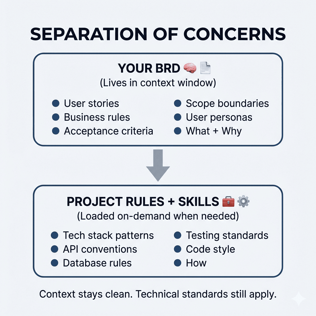
Simple. Elegant. Actually works.
.
.
.
👉 The Real Lesson
The difference between mediocre AI output and genuinely great output often comes down to one thing:
Did you let the AI assume, or did you make it ask?
When you hand Claude a prompt and let it run, it fills gaps with assumptions. Sometimes those assumptions are good. Often? They’re not. And you won’t know until you’re three hours into building the wrong thing.
When you force Claude to interview you first—to surface decisions, explore edge cases, and validate understanding—you get output that reflects your vision. Not Claude’s best guess.
21 questions took about 5 minutes to answer.
Those 5 minutes saved me from 313 lines of premature decisions and gave me requirements I can actually build against.
That’s a pretty good trade.
Your turn:
Next time you start a project, don’t ask Claude for a PRD.
Ask it to interview you first.
Then watch what happens.
![TOKEN CONSUMPTION: BEFORE vs AFTER". The top section, "THE CLAUDE.md TRAP (Before) ❌", shows a large, full dark bar labeled "2,000 lines = ~4k tokens". Below it are labels for code modules: [security][database][api][hooks][i18n][testing][deploy][...]. Text states "Every message loads EVERYTHING" and "Simple UI task? Still paying for ALL of it. ⚠️". The bottom section, "THE INDEXED SKILL (After) ✅", shows a small dark bar for "Index/descriptions = ~500 tokens (always loaded)". Below it, a separate, segmented gray bar represents "+ security.md = ~800 tokens (only if needed)". Text states "Load index first, references only when needed" and "Simple UI task? Pay only for the index. ✅". A legend indicates that dark bars mean "Tokens consumed" and gray bars mean "Loaded on-demand". A final callout box with a lightbulb icon states, "Key Takeaway: Indexing significantly reduces token costs by loading only what's necessary!](https://www.nathanonn.com/wp-content/uploads/2026/01/image-5.png)
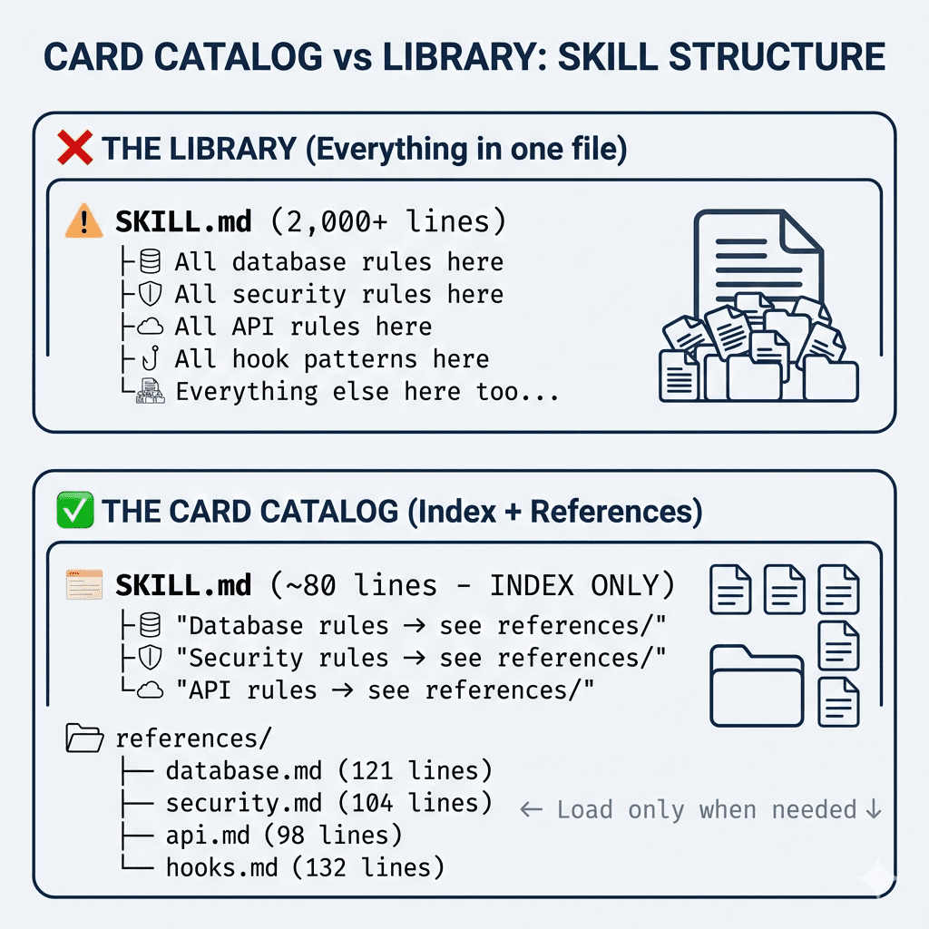
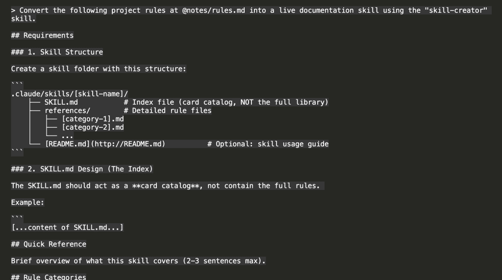
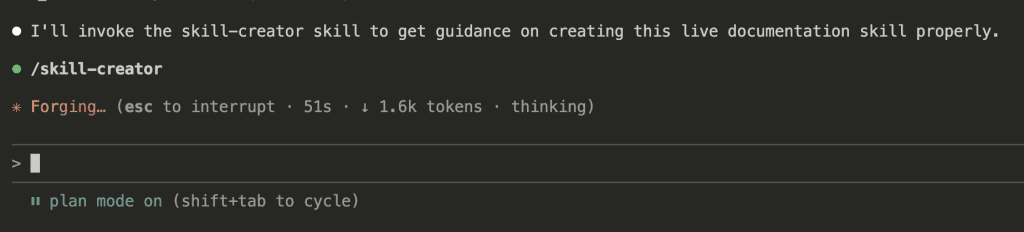
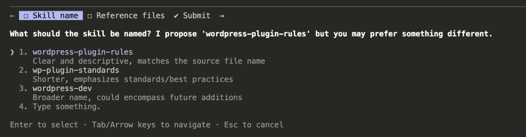
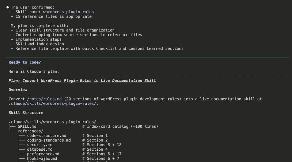

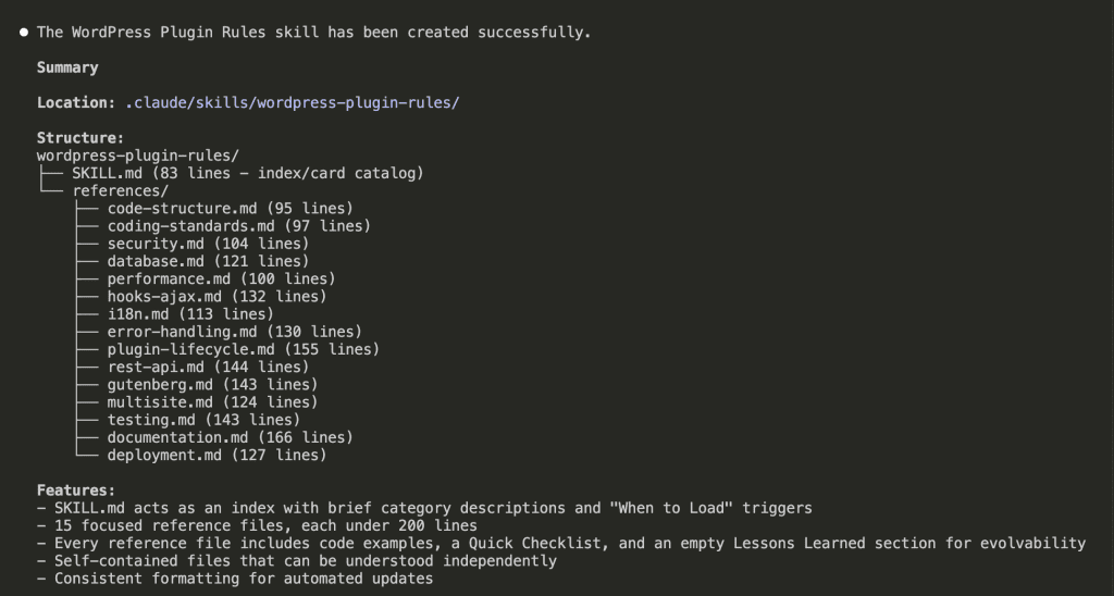
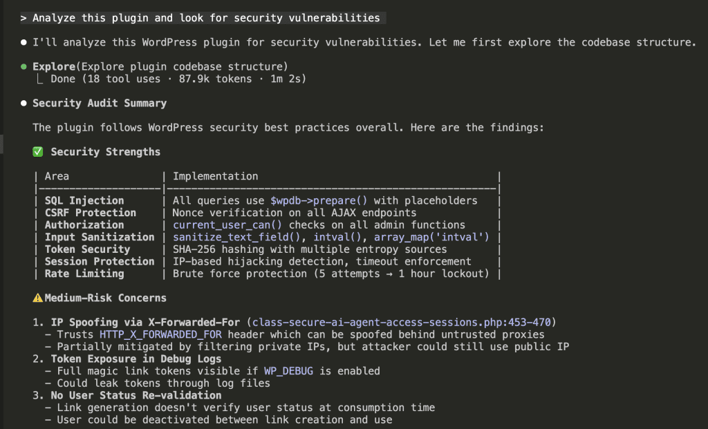
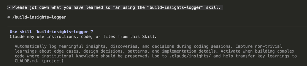

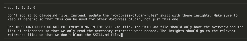
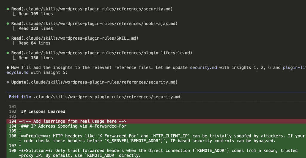
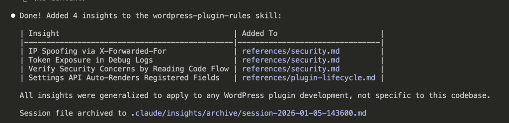
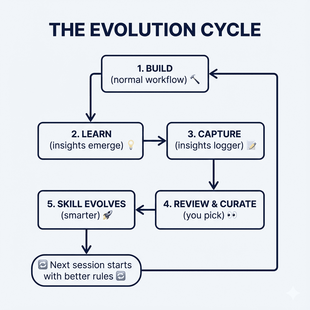

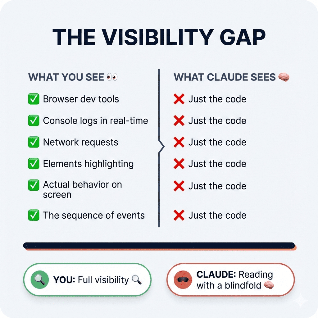
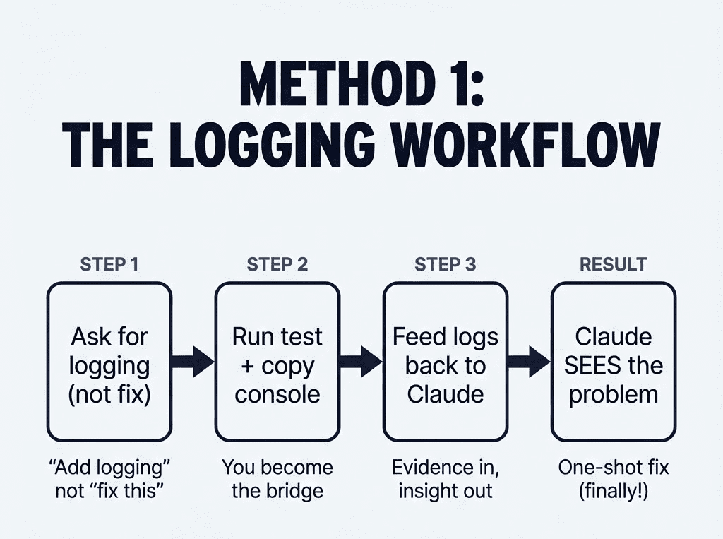

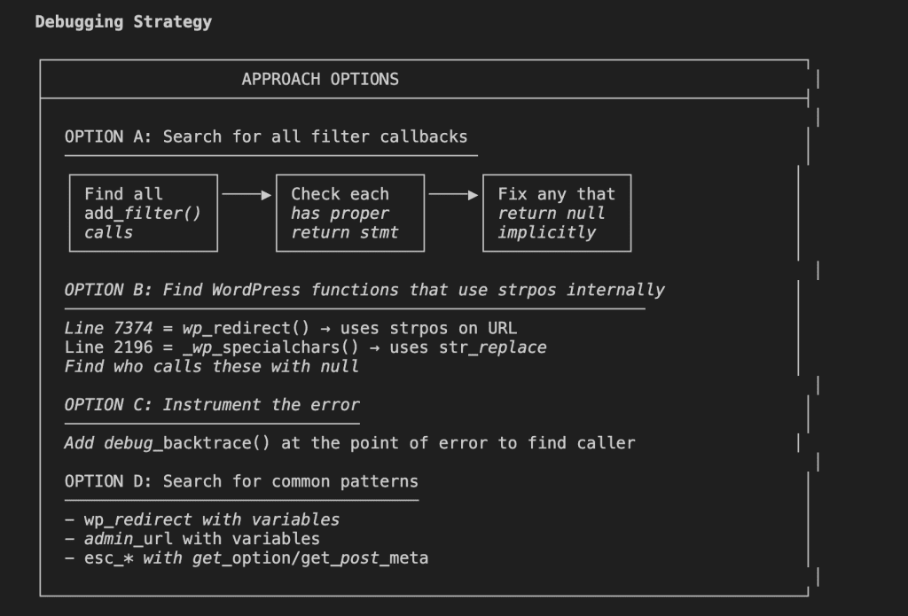
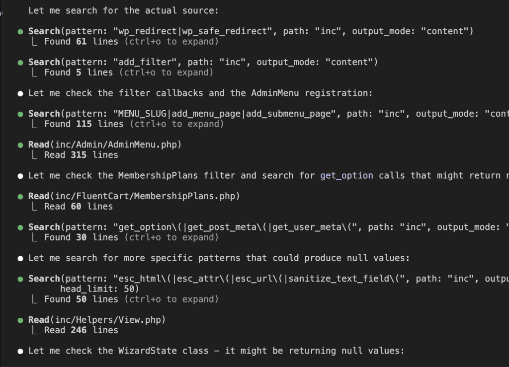
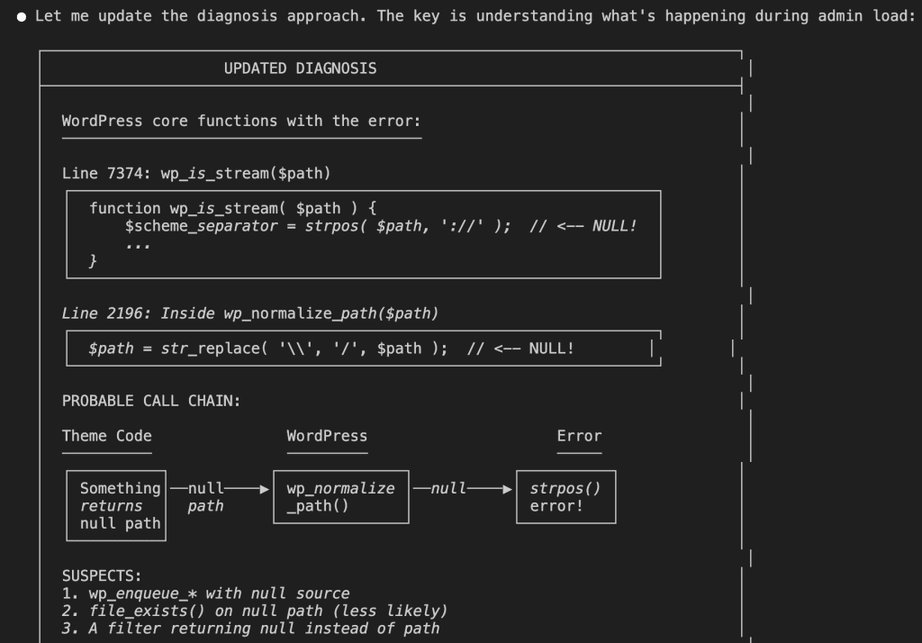
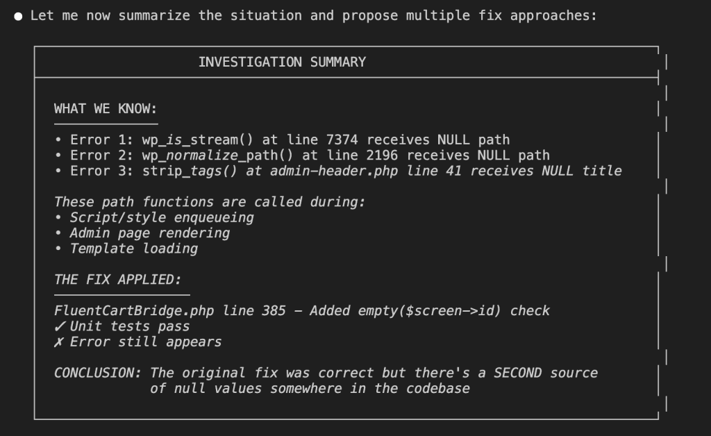
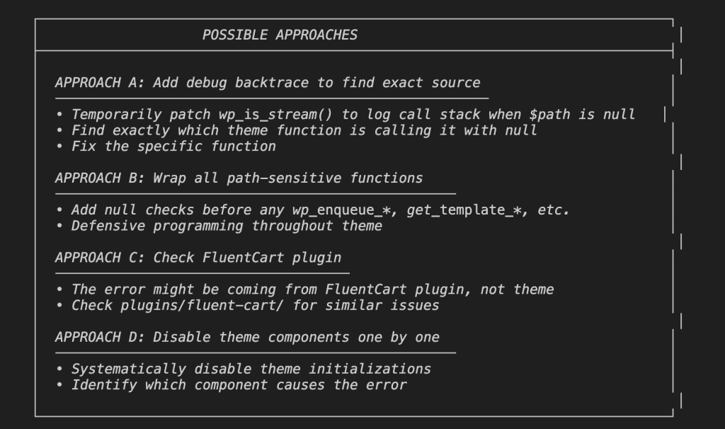
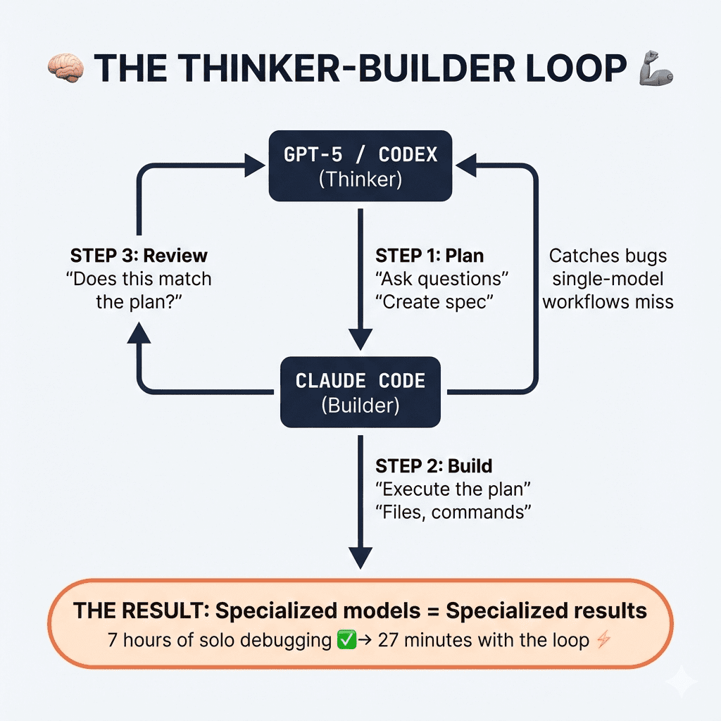

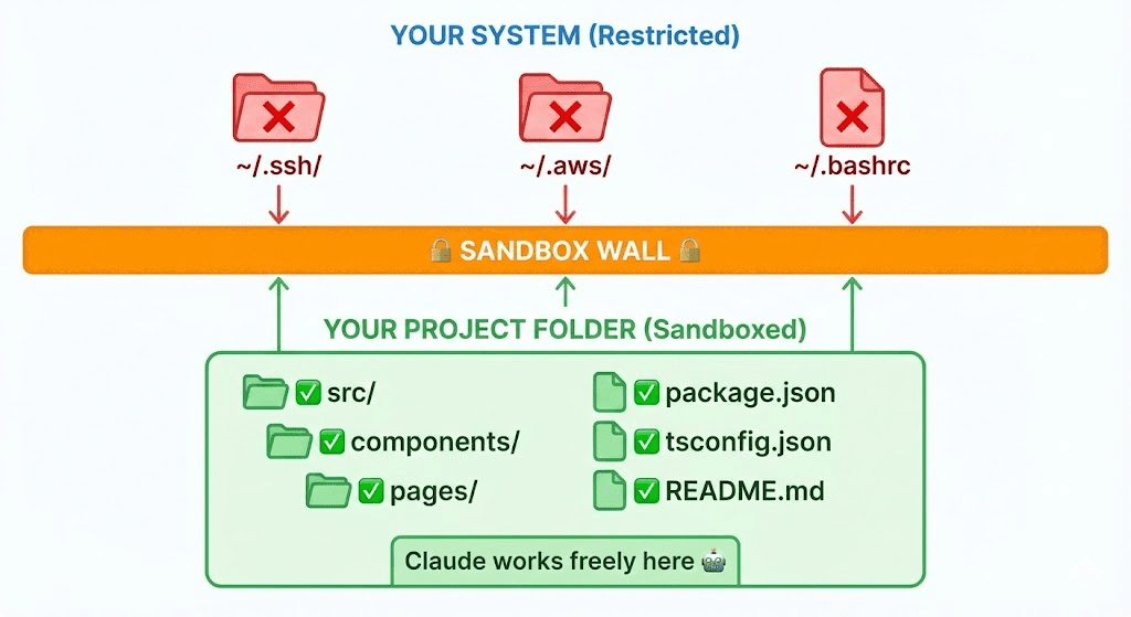
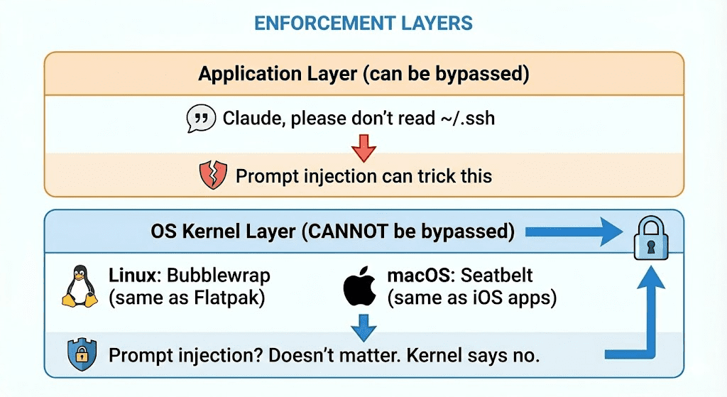
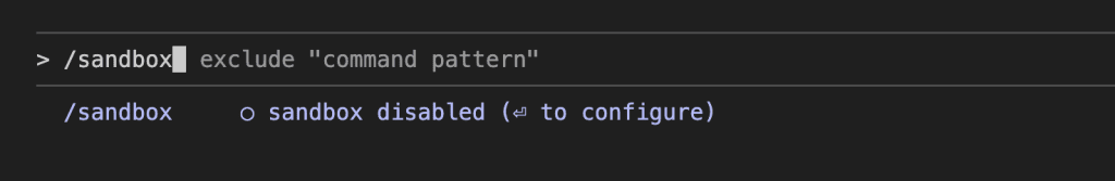
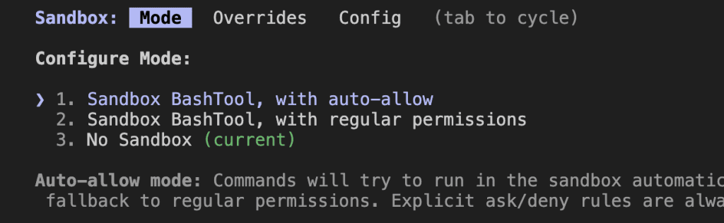

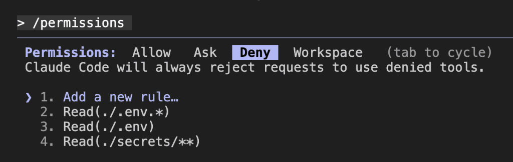
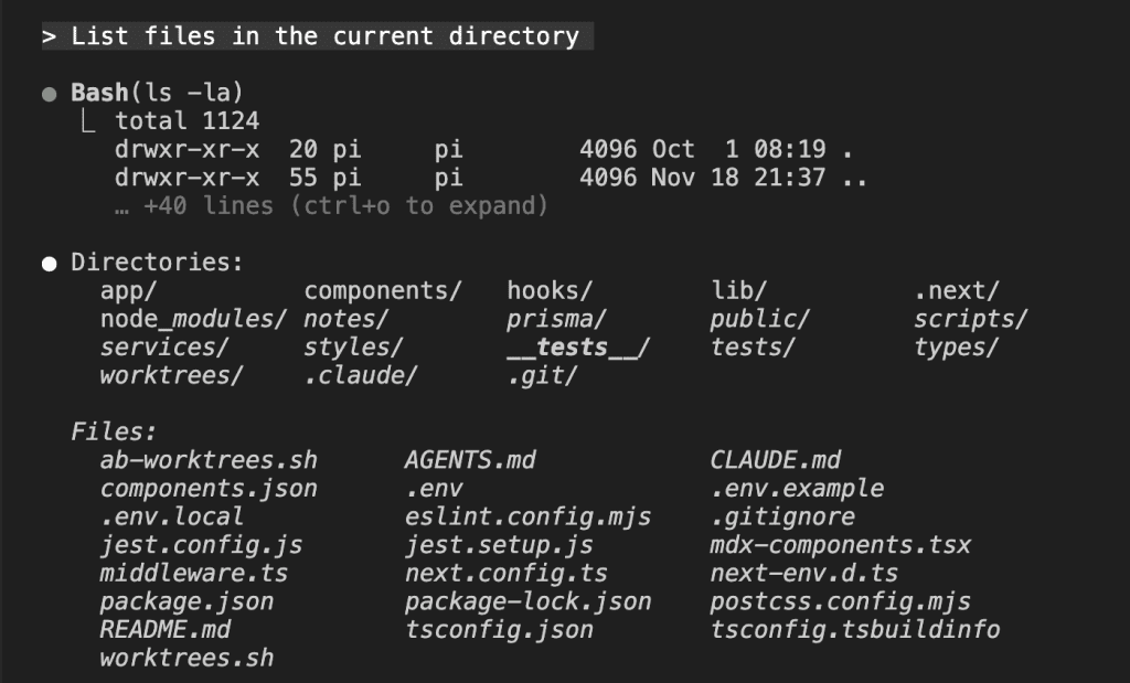
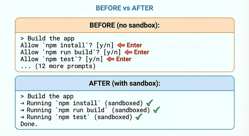

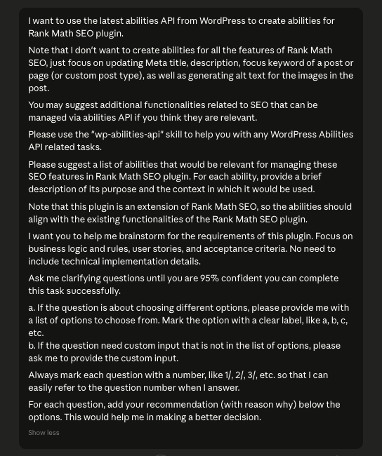