I Extracted a Website’s Entire Design System Using This Skill
I ran the token extraction on a site I’d been eyeing using the “extract-design-md” skill.
The colors landed perfectly — exact hex codes, correct font weights, spacing on point. I felt good about it.
Then I put my page next to the original, and every single component was a stranger wearing the right outfit.
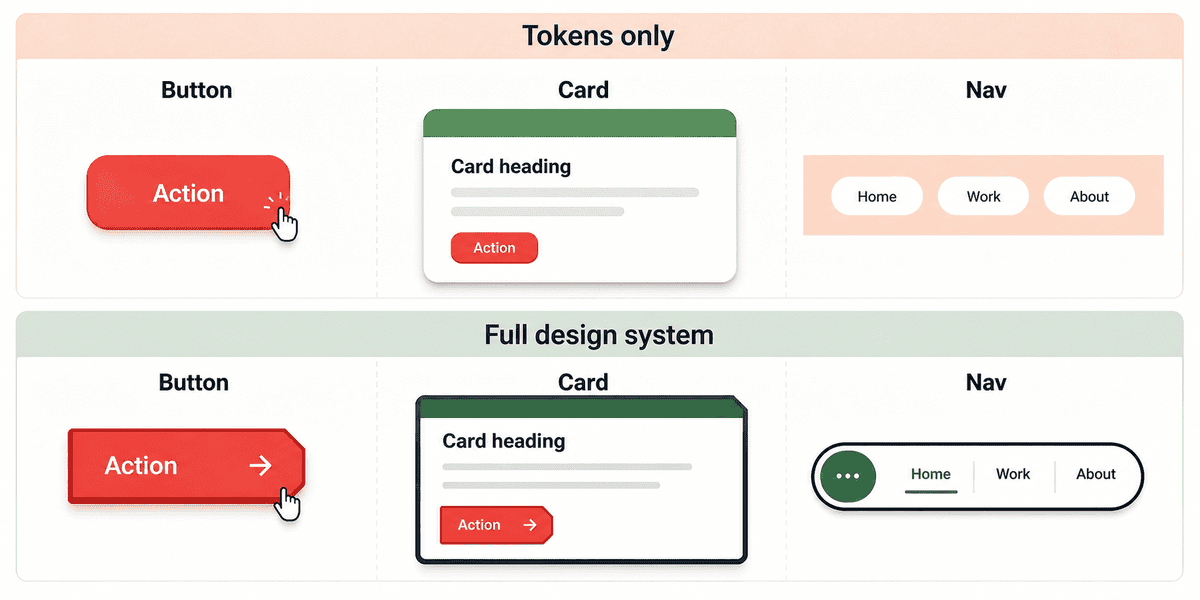
Cards came out with soft shadows instead of thick borders. The navigation stretched edge to edge where the original floated as a rounded capsule over the hero. The accent color showed up everywhere instead of the one or two spots where it actually belonged.
Same palette. Different furniture.
Last week, in I Taught Claude to Steal (Ethically) a Design System I Actually Like, I showed how to capture a site’s design tokens — colors, fonts, spacing values — and package them in a file a coding agent can follow. The approach works: exact values mean the AI stops guessing at shades of blue and rounding corners to the wrong radius. But tokens are the paint. They tell Claude what color the walls should be. They say nothing about how the furniture is built.
Imagine walking into a room that’s been repainted to match a showroom you love. Wall color, trim, floor tone — every surface is right. But the furniture is from a completely different store: chairs the wrong shape, shelves too tall, light fixtures from a different catalog entirely.
That’s token-only extraction in a nutshell.
This post fixes that.
One skill, one command, and you can extract a design system from a website — the paint and the furniture — in a package a coding agent can build from.
.
.
.
What Tokens Can’t Tell You
Think of a token file as a box of labeled paint cans and a ruler.
It tells you “use this shade of dark ink” and “round the corners this much.”
Useful.
But it can’t tell you how anything is built.
Here’s the thing: I ran a test — same prompt, same source site, tokens only — and watched the AI get four things wrong when all it had was the palette.
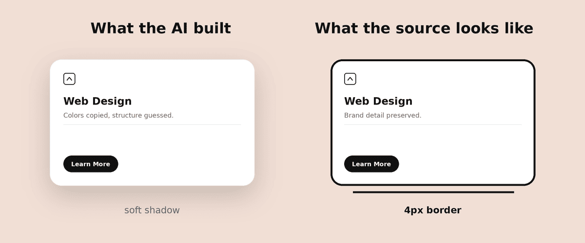
Cards. The source site uses a thick, bold border on every card — the kind of deliberate outline that makes each piece pop off the page. The AI defaulted to a subtle shadow instead. Same card shape, completely different feel.
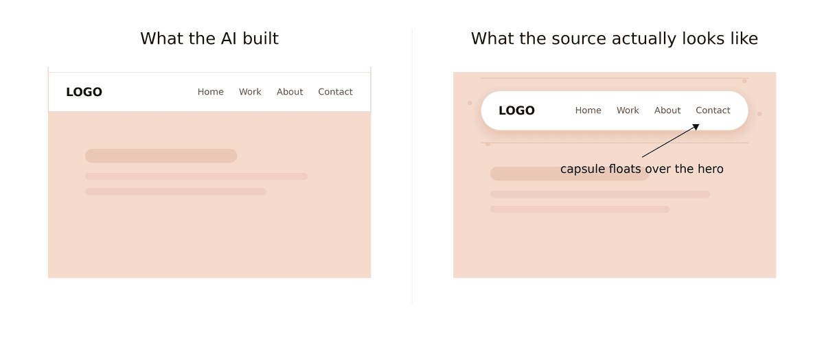
Navigation. On the source, the nav floats as a rounded capsule over the hero image. The AI stretched it edge to edge like a standard website header — a completely different structural decision that changes the whole feel of the page.
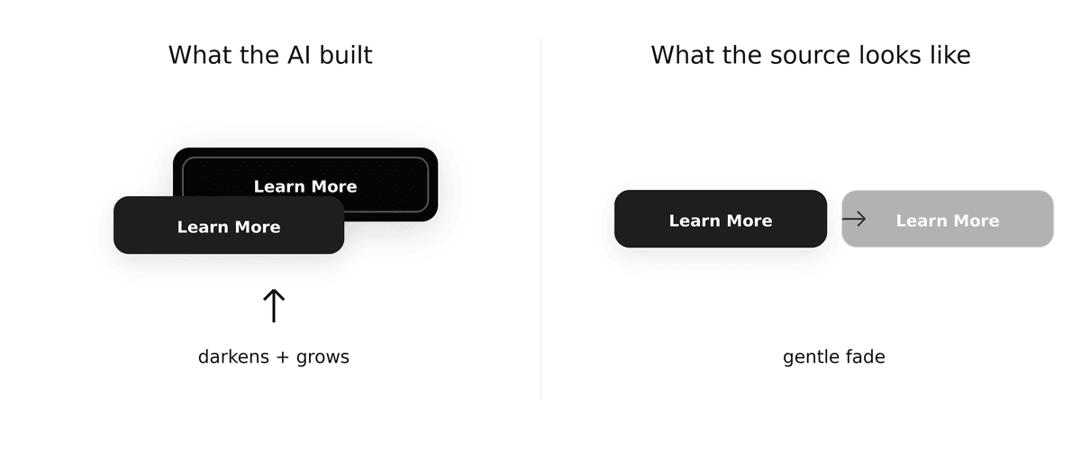
Hover behavior. Hovering over a button on the source triggers a gentle fade. The AI made buttons darken or grow on hover, which feels like visiting a different site entirely.
Pricing emphasis. One pricing plan on the source flips to a dark background to stand out from the rest. The AI highlighted it with a bright accent color instead — a different visual strategy for the same goal.
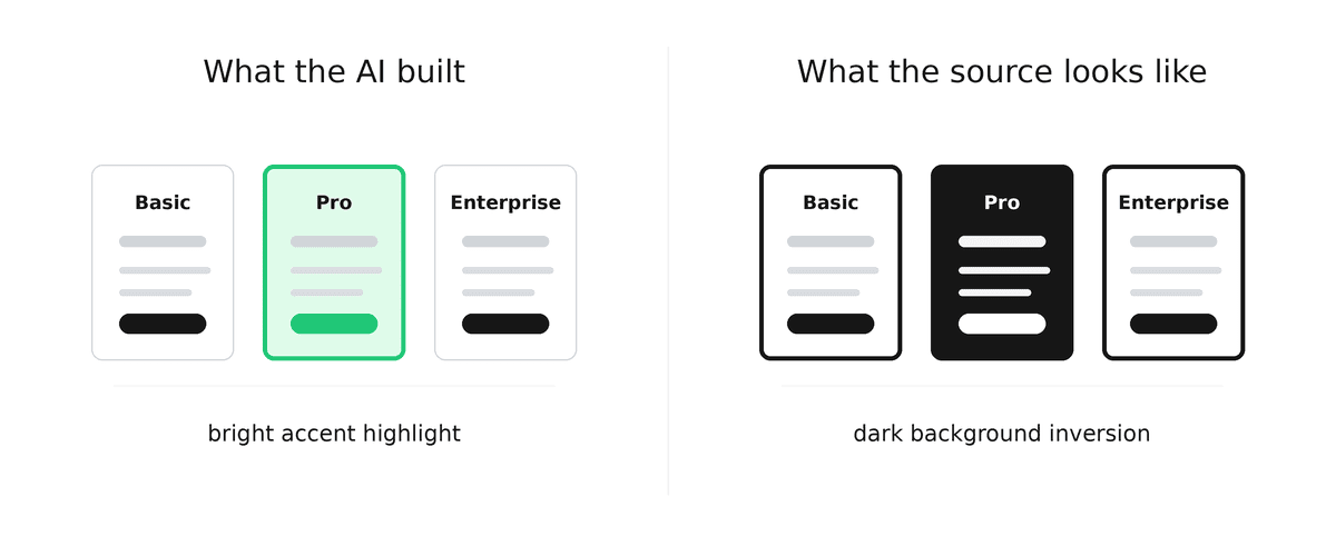
These are design choices — about how each piece is built, how it behaves, and where specific elements belong.
A palette can’t capture structure, behavior, or placement rules.
(If you’ve ever been pleased with a rebuild and then held it up next to the original — and felt that quiet sinking “oh, that’s off” in your stomach — you know exactly what I mean.)
Last week’s skill was designed for a different job: giving Claude exact values so it stops guessing at colors and spacing. And it does that well. But when you want the AI to build pages that genuinely look like they belong to the source — matching shapes and behaviors along with colors — you need more than a palette.
That’s what the new skill captures.
.
.
.
One Install, Same Setup
Stay with me — the setup is fast.
Two tools and one install, same as last week if you already set those up.
1. playwright-cli — the browser engine that reads the pages and captures screenshots. Install it once:
npm install -g @playwright/cli@latestplaywright-cli install --skills2. Firecrawl (optional but recommended) — gives the skill better page discovery, so it samples more than just the homepage. Without it, the skill falls back to thinner link detection. If you need the free setup, I covered it in How to Run Firecrawl for Free in the Cloud (No Credit Card, No API Keys).
3. The skill itself:
npx skills add nathanonn/agent-skills --skill extract-design-system --agent claude-code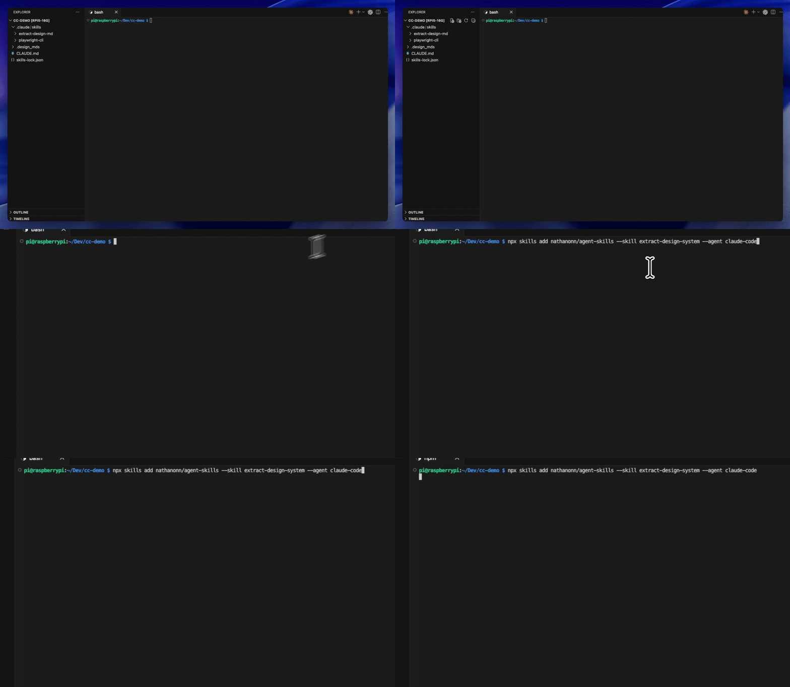
If you set up last week’s skill, the only change is the skill name. Same repo, same install shape.
This skill includes everything the previous one did — it still extracts colors, fonts, and spacing — and then goes further by capturing how every component is actually built. Use it when you want pages that match at every level; use last week’s version when you only need the color and typography reference.
(Three commands. Less than a minute.)
.
.
.
The Extraction: URL In, Design System Out
Let me show you what happens when you point it at a real site.
/extract-design-system https://doodler-landing.webflow.io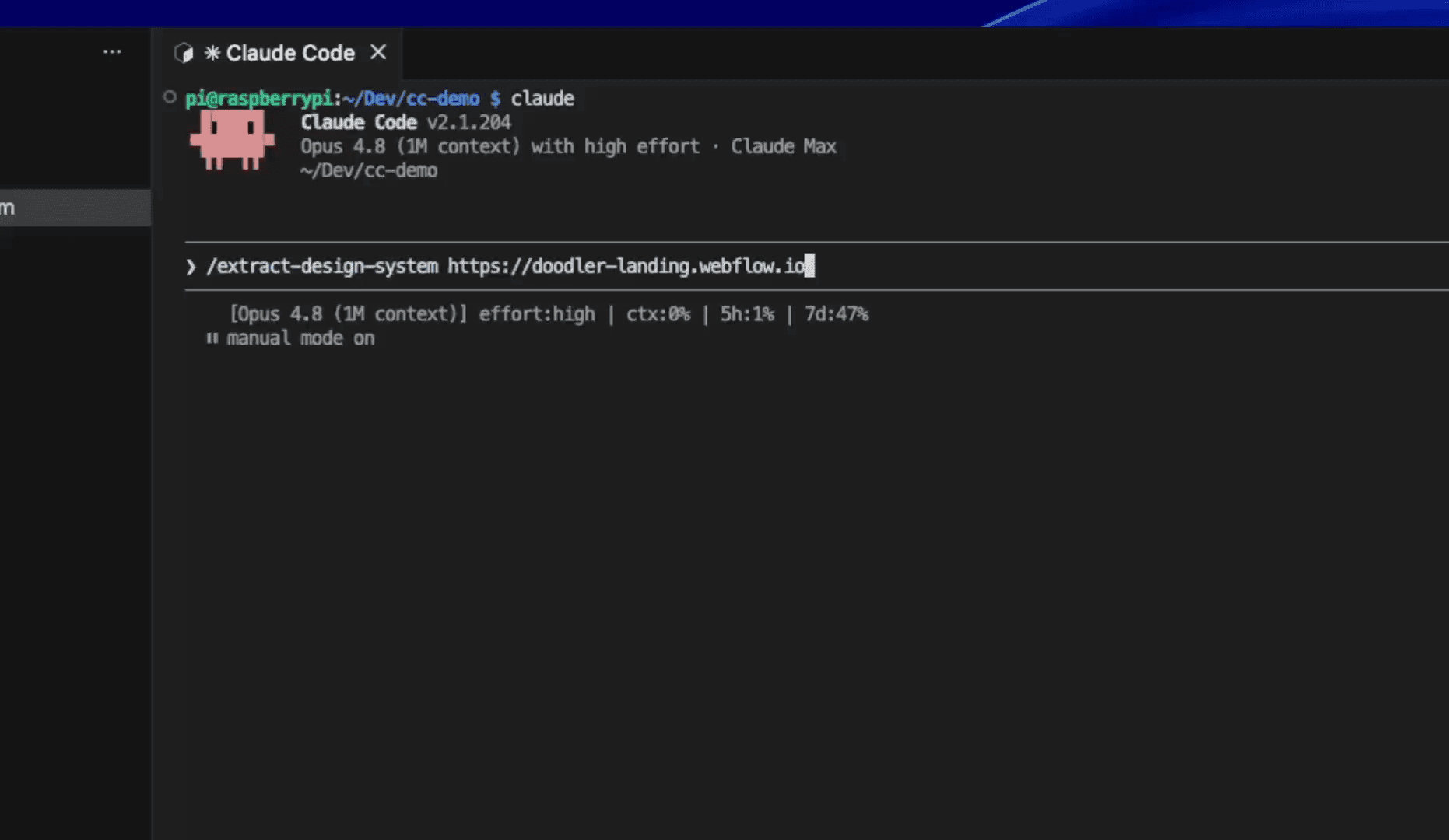
Worth knowing: Doodler is a Webflow cloneable template under a Creative Commons Public Domain License (CC0). We’re working with a freely licensed design here — no gray area about copying someone’s live business. You can clone the same template on Webflow and follow along if you want.
Here’s what happens after you hit enter. Five phases, each building on the last.
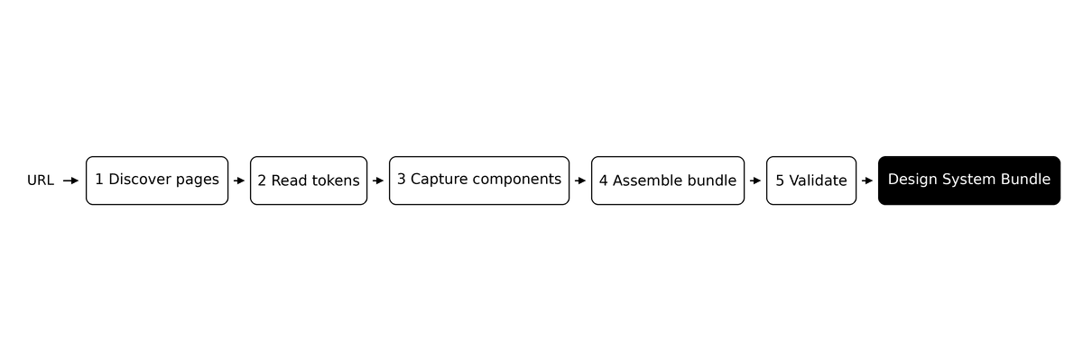
1. Discover — The skill maps the site and picks a handful of representative pages to study. The homepage alone won’t show everything — forms, pricing tables, and blog layouts live on other pages, and you need that variety to capture the full system.
2. Read tokens — Colors, fonts, and spacing values pulled straight from the page’s styles. This is the same foundation last week’s skill built. Exact values read from real CSS, nothing estimated from screenshots.
3. Capture components — Here’s what’s new. The skill goes through every sampled page and records how each button, card, input field, and navigation bar is actually built. What elements sit inside each one. What variations exist — a bold version, a subtle version, an accented version. How each piece behaves when you hover over it or click it. And any design rules worth preserving, like “that thick border is the brand’s signature.”
(This is everything that token-only extraction misses — the structural DNA of the design.)
4. Assemble — Packages the whole extraction into a single folder you can hand to a coding agent. Inside: a design reference, component blueprints, working code for each piece, and a set of instructions that tells the agent exactly how to use everything. The instructions are the critical addition — they turn a reference folder into something an agent can follow step by step.
5. Validate — Checks its own work before handing anything over. The design reference gets quality-checked. Example components get rendered and compared against the live site. And 71 test assertions ran against the actual source to verify color accuracy, component structure, and layout fidelity. Nothing ships until every gate passes.
The whole extraction — from URL to a fully validated design system — finished in under 20 minutes.
Nineteen minutes.
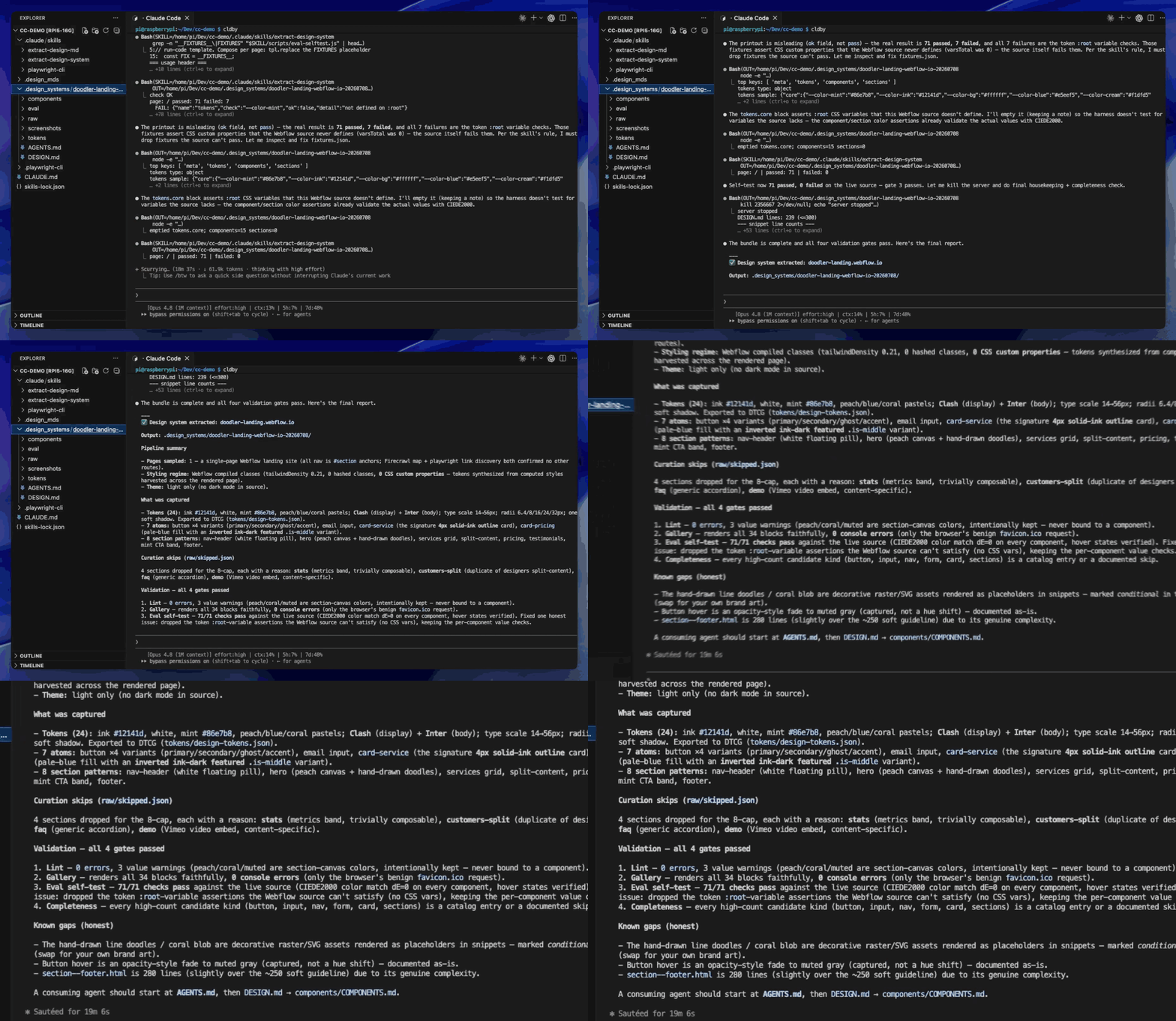
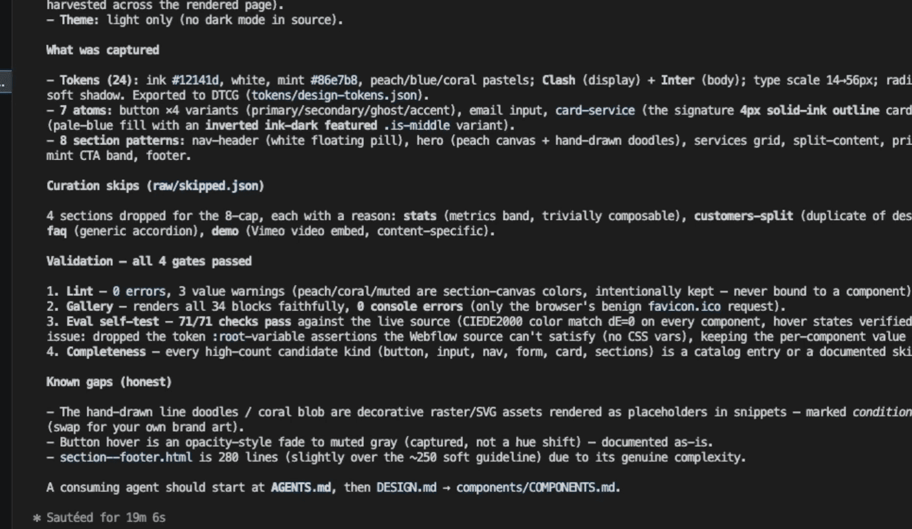
24 tokens. 7 component types. 8 section patterns. 71 self-test assertions, all passing. Ready to use.
.
.
.
What You Get: The Bundle
Here’s what lands in the output folder.
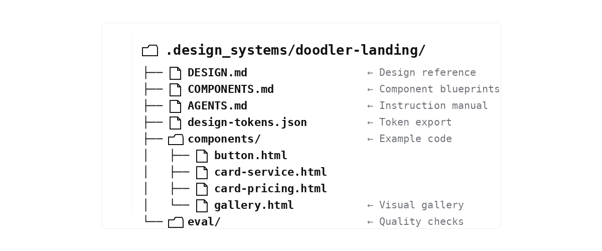
The design reference — everything from last week’s extraction (colors, fonts, spacing) expanded with a catalog of every component the site uses. The complete style guide, structured for a machine to follow. An agent reading this gets the same understanding of the brand that a designer would get from a printed brand book.
Component blueprints — for every button, card, input field, and page section: what’s inside it, what variations exist, how it behaves on hover and click, and which design rules are sacred. The blueprints capture things like “that thick border is the brand’s signature — never replace it with a shadow.”
Example code — working samples of each component, plus a visual gallery that renders them all side by side. This is the proof layer — you or the AI can compare against the source at a glance and verify that the extraction got the details right.
(I spent an embarrassing amount of time clicking between the gallery and the live site. They matched.)
And here’s the kicker: the instruction manual. A step-by-step protocol that tells a coding agent what to read first, what rules to follow, and which elements are non-negotiable. The agent follows a playbook — and in my testing, this single piece was the biggest factor separating “close enough” from “looks native.”
Token export + quality checks — the raw design values in a standard format for other tools, plus the tests the skill used to verify its own output — reusable for validating pages you build from the system later.
.
.
.
The Real Test: Build a Page From It
Time to prove it works.
I opened a fresh project — empty folder, no prior context — and handed Claude Code the extracted bundle with a simple request: build a SaaS landing page for a fictional product called Devlog, a project board that lives inside your repo.
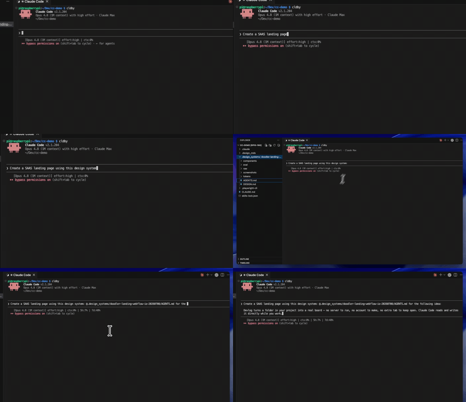
What happened next showed exactly why the bundle matters.
The playbook came first. The first time I pointed Claude Code at the bundle with the instruction manual, it did something I hadn’t seen before: it read the entire protocol — design reference, component blueprints, example gallery — before writing a single line.
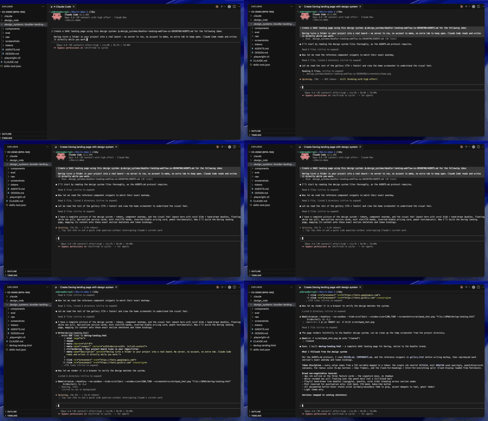
When the page came out with the exact same thick-bordered cards and floating capsule nav, I realized what had been missing all along. A plan — an actual set of instructions telling the agent how each piece was supposed to be built.
Blueprints shaped every component. Feature cards came out with the source’s bold border. The navigation floated as a capsule. The mint accent appeared in exactly the right spots. These matched because the agent had blueprints, with no guessing.
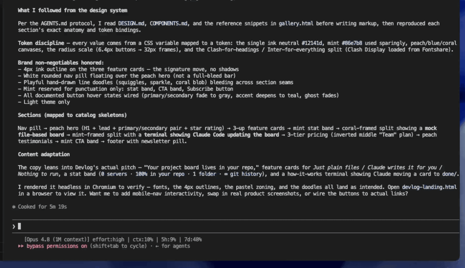
A self-report sealed it. The agent listed which brand rules it followed — thick outlines, floating nav, doodle accents, mint reserved for punctuation. You can verify at a glance that it matched the source.
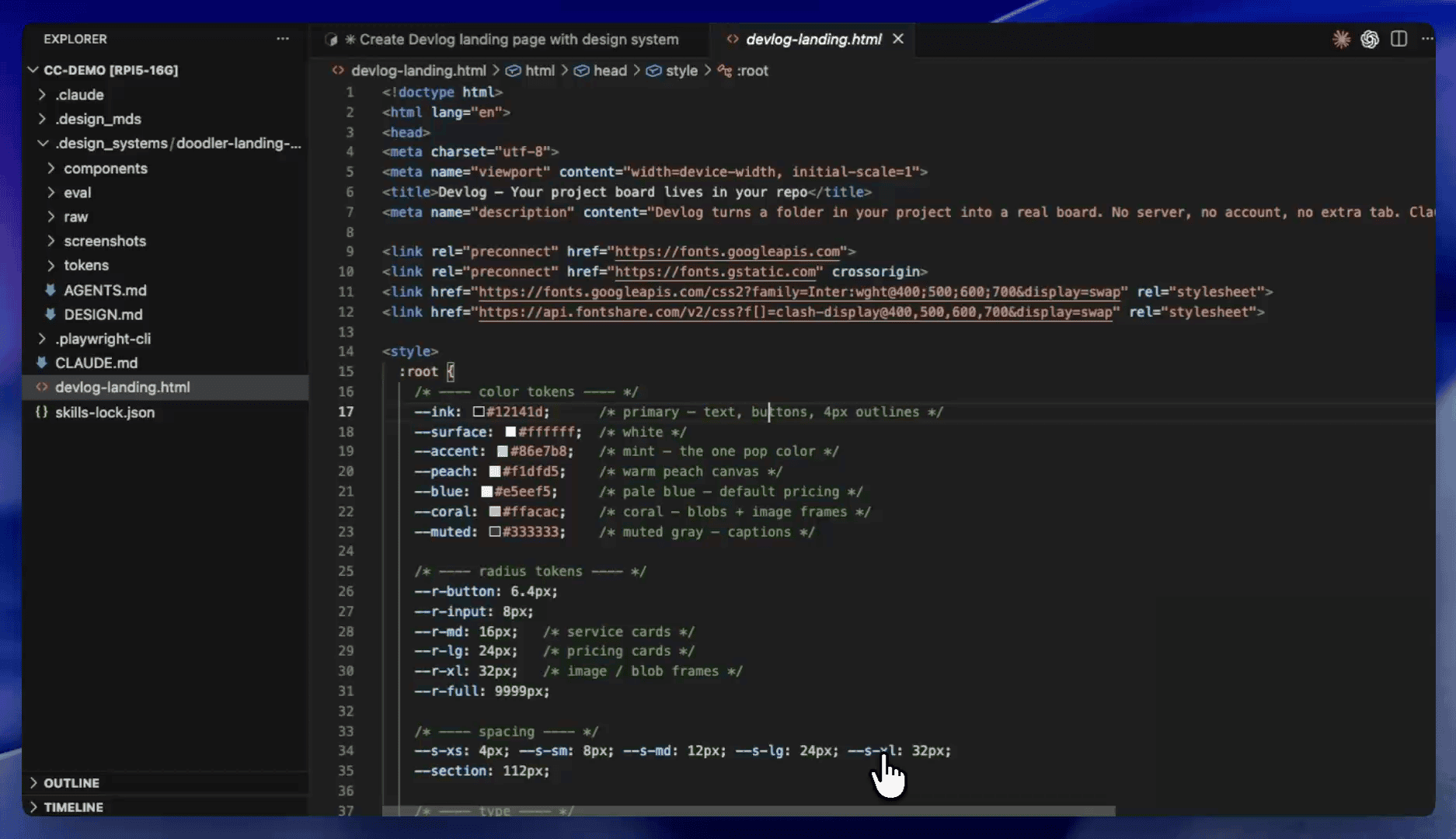
Under the hood, the extracted tokens landed in the generated page as real values — color names, radius values, spacing units, all pulled from the original site and wired directly into the source code.
And here’s the result.
A full landing page — hero, features, how-it-works, pricing, call to action, and footer — that looks like it was built by the same designer who built the original site.
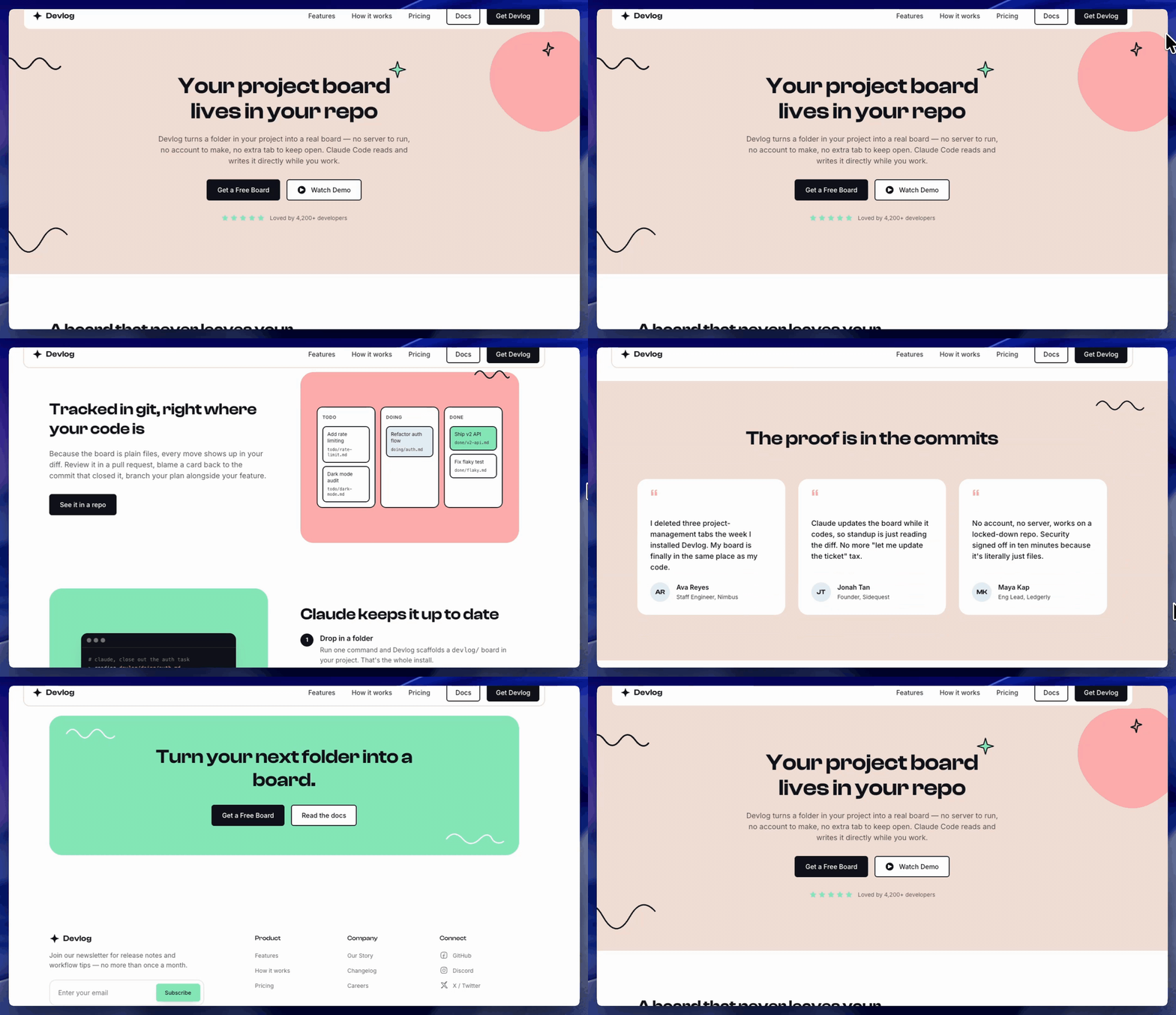
Every card has the right border, and the nav floats as a capsule. The mint accent shows up in exactly the right place and nowhere else. The page feels native to the Doodler brand, on a product that never existed on that site.
👉 That’s the distance between having the paint and having the furniture. Last week’s tokens got the colors right. This week’s bundle got everything right.
.
.
.
Your Move
Design has always made me sweat.
I’m a developer — logic and code, that’s my lane. My actual method for borrowing a look (ferpetesake) was embarrassingly manual: find a site I liked, open DevTools, and squint at hex codes until I got maybe 70% of the way there. This skill does in 19 minutes what I used to fail at in an afternoon.
Any time you want to extract a design system from a website you like, the process is four steps.
- Install the skill.
npx skills add nathanonn/agent-skills --skill extract-design-system --agent claude-codePoint it at a site you admire — one you have the right to reference. Same principle as last week: your own site, a client’s site, or a freely licensed template you plan to make your own.
Hand the bundle to Claude Code. Point the agent at the instruction manual and describe what you want to build. The agent reads the playbook, follows the blueprints, and reports what it honored.
Build something new that matches at every level. The buttons, the cards, the sections, the brand rules — the paint and the furniture.
The skill is open source at github.com/nathanonn/agent-skills — same repo as last week’s token extraction.
Here’s how the two skills fit together.
Last week’s post gave you the paint — exact colors, fonts, and spacing values that make a site look like itself. This post gave you the furniture — components, layouts, behaviors, and a set of instructions that tells a coding agent how to assemble everything.
Together, that’s the complete design system — captured from a real site in under 20 minutes, packaged for a coding agent, and validated before you ever use it.
If you tried token-only extraction and felt like the output was close but off, the palette was always right. The missing piece was how each component was built. Now you have both.
The Doodler extraction took 19 minutes. The landing page took 5 more. Under half an hour from a URL to a brand-native page — and zero squinting at DevTools.
Go extract one.

Leave a Comment