I Found a Better Way to Design Pages in Claude Code (And I’m a Little Mad I Didn’t Know Sooner)
You’re tweaking a landing page in Claude Code.
“Make the layout more balanced,” you type—feeling pretty clever about your prompt, if we’re being honest.
Claude adjusts the CSS. You refresh the browser.
Hmm. Not quite right.
“Actually, make the image section wider.”
Claude dutifully changes the grid. You refresh again.
Still off. (Why is this so hard?)
“Can you try pill-shaped buttons instead?”
And now you’re three iterations deep, squinting at your screen, no longer entirely sure what “right” even looks like anymore.
Here’s the thing: I spent an embarrassing amount of time in this loop before discovering there’s a plugin that makes the whole rigmarole unnecessary.
It’s called the Claude Code Playground skill. And it changes everything about how you approach design work.
Stay with me.
.
.
.
The Describe-Refresh-Despair Loop (A Love Story Gone Wrong)
Let’s be real about what’s happening here.
You have a vision in your head. A feeling of what the page should look like. Something about the proportions, the spacing, the way elements breathe together.
But translating that feeling into words?
That’s where the wheels come off the wagon.
The loop goes something like this:
- Describe a change in words (that you hope Claude interprets correctly)
- Wait for Claude to apply it
- Refresh the page
- Realize it’s not quite what you meant
- Try different words—maybe “airy” instead of “spacious”?
- Repeat 8-12 times
- Eventually settle for “close enough” while muttering under your breath
I burned way too many hours in this loop last week, redesigning a page. Every iteration felt like playing telephone with my own design instincts.
(Spoiler: I was the one garbling the message.)
The problem isn’t Claude. The problem is that words are a terrible interface for visual decisions.
.
.
.
Enter the Claude Code Playground Skill: Your New Best Friend
Anthropic built an official plugin—the Playground skill—that adds something radical to Claude Code:
A visual layer between your brain and your codebase.
Here’s how it works: Claude analyzes your existing page, then generates a self-contained HTML file with sliders, dropdowns, and presets that let you see different design directions instantly.
No code changes. No refreshing. No “what I said vs. what I meant” shenanigans.
Just a live preview that updates as you click.
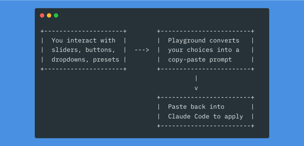
Once you’ve dialed in the exact design you want—with your actual eyeballs—the playground generates a natural language prompt describing your choices.
Copy. Paste. Execute.
One pass. Done.
👉 The key insight: You’re no longer translating visual intuition into words. The playground does that translation for you.
.
.
.
The Real-World Test: Redesigning a WooCommerce Product Page
Enough theory. Let me show you exactly how this worked on my LicenseWP product page.
The existing page was… fine. Functional. The kind of “fine” that makes you wince slightly every time you look at it.
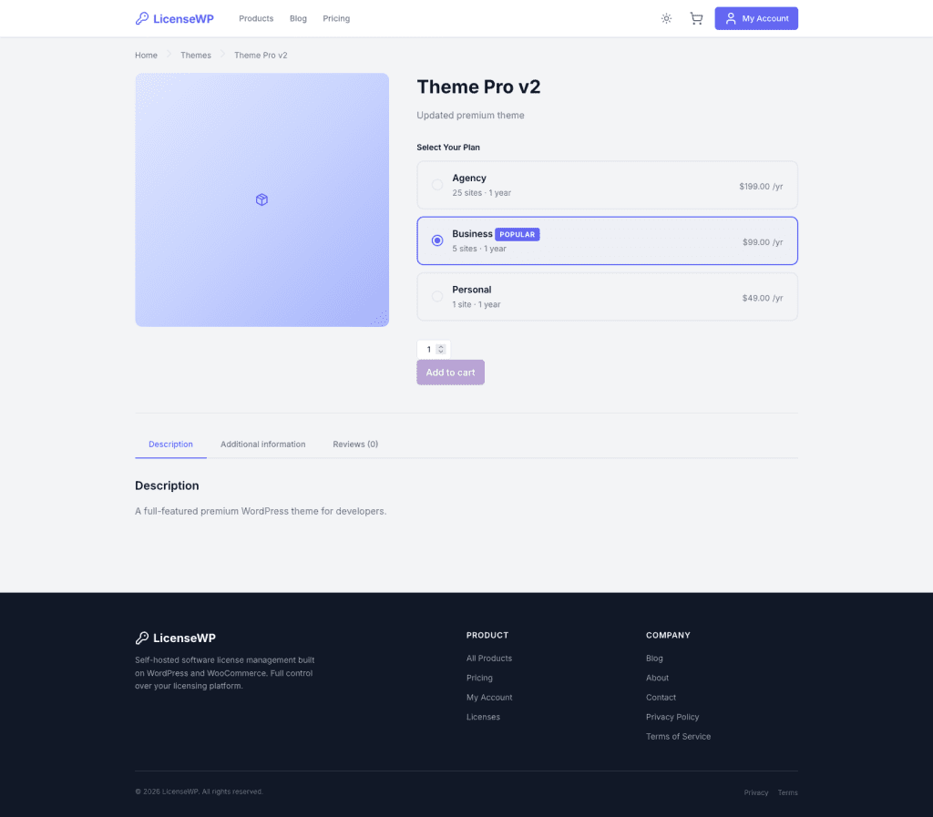
The image area felt cramped. The pricing cards looked squished together. The “Add to cart” button was doing its best impression of a wallflower at a party.
I wanted to experiment with different proportions, card styles, and CTA treatments.
The old me would have spent an hour going back-and-forth with Claude in text prompts.
The new me? Installed the Playground skill.
.
.
.
Step 0: Install the Plugin (30 Seconds, Tops)
First things first—you need the Claude Code Playground skill installed.
Run /plugin in Claude Code, switch to the Discover tab, and search for “playground.”
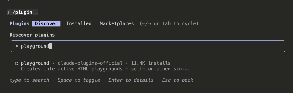
Hit space to toggle it on.
That’s it. Claude now knows how to build interactive design playgrounds. (11.4K installs can’t be wrong, right?)
.
.
.
Step 1: Send Claude to Do Reconnaissance
Here’s where the magic starts.
I gave Claude a prompt telling it to visit my product page, study the layout like an art critic at a museum, and then build a Design Layout Playground based on what it found.
Claude opens Chrome and starts analyzing—like a very thorough house inspector, but for web pages.
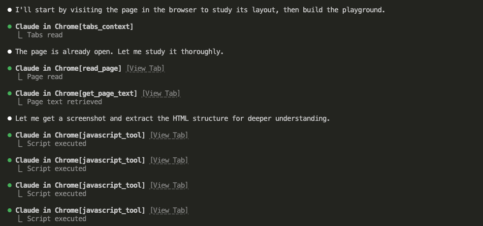
It reads the DOM, extracts text content, and runs JavaScript to pull the full HTML structure.
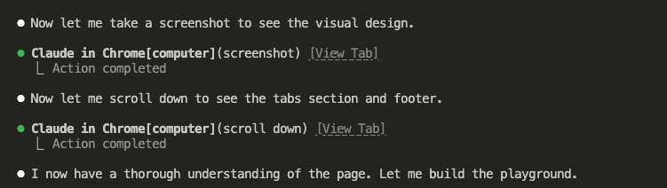
Screenshots. Scrolling. Full page analysis from header to footer.
(Claude is nothing if not thorough.)
.
.
.
Step 2: Claude Builds You a Custom Design Tool
Once Claude understands your page, it loads the Playground skill and reads the design template.
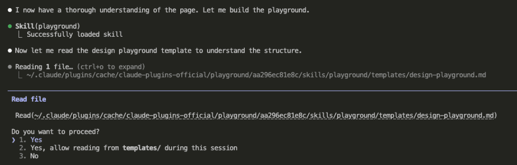
Then—and here’s the part that made me do a little happy dance—it creates a single self-contained HTML file with everything baked in.
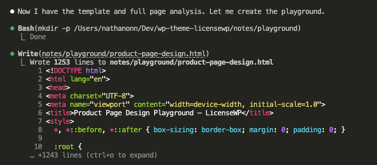
1,253 lines. A complete interactive design tool, built specifically for your page, in about 30 seconds.
Here’s what Claude built for me:
- 5 presets — each one a cohesive design direction
- 7 control groups — layout, gallery, typography, cards, buttons, tabs, colors
- Live preview — using my actual page content (real product names, real prices, real structure)
Ferpetesake, this is exactly what I needed.
.
.
.
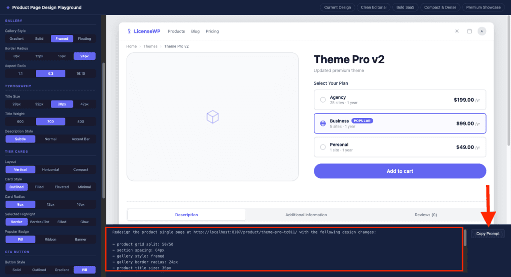
Step 3: Play With Designs Like a Kid With New LEGOs
Open the HTML file in your browser.
And then—I’m not going to lie—prepare to lose 20 minutes just playing.
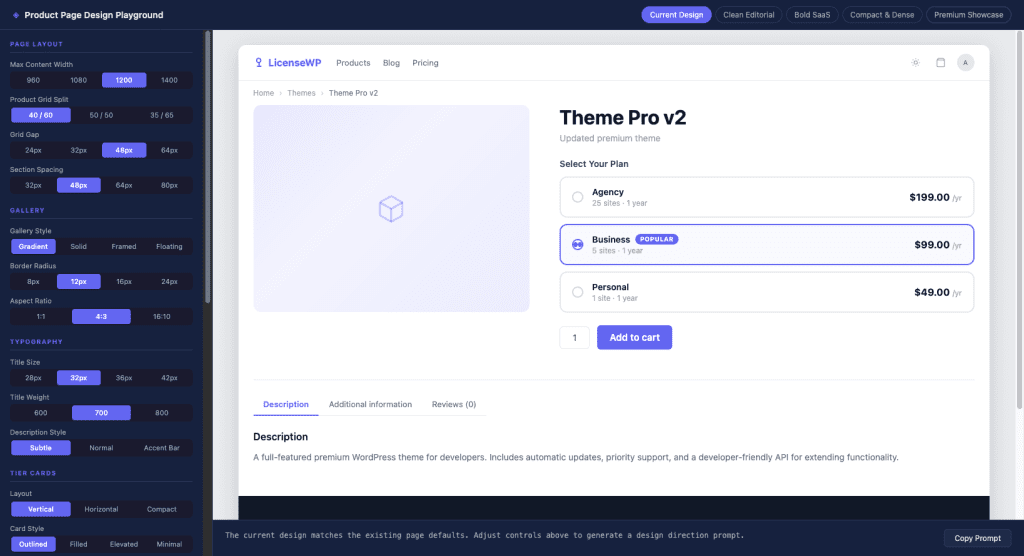
The left panel has all the controls. The right panel shows a live preview that updates instantly as you change anything.
(I may have spent an unreasonable amount of time just clicking the “Gallery Style” options back and forth. Don’t judge me.)
I started by clicking through the presets to find a direction:
- Bold SaaS — too aggressive for this product
- Compact & Dense — too cramped (we’re selling premium themes, not packing a suitcase)
- Clean Editorial — closer! But needed tweaks
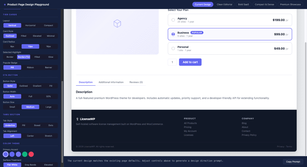
Then I fine-tuned individual controls:
- Grid split: 50/50 (equal width for image and details)
- Gallery style: Framed (light background with border instead of that gradient)
- Gallery radius: 24px (rounder corners, friendlier vibe)
- CTA button: Pill-shaped, full-width, large
- Tabs: Pill style, stretched across the full width
Every single change reflected instantly in the preview.
👉 Here’s what hit me: I wasn’t describing what I wanted anymore. I was seeing it. And clicking until it looked right.
.
.
.
Step 4: Copy the Magic Prompt
Once the design felt right, I scrolled to the bottom of the playground.
And there it was.
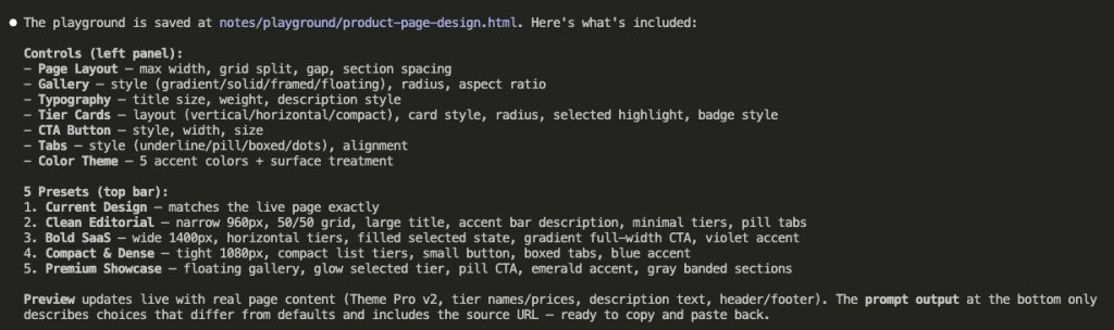
The Prompt Output panel had already written a clear instruction describing exactly what I chose—and only what differed from the defaults.
Redesign the product single page at http://localhost:8107/product/theme-pro-tc011/
with the following design changes:

- product grid split: 50/50
- section spacing: 64px
- gallery style: framed
- gallery border radius: 24px
- product title size: 36px
- tier card border radius: 8px
- selected tier highlight: border-only
- CTA button style: pill-shaped
- CTA button width: full-width
- CTA button size: large
- tab style: pill tabs
- tab alignment: stretch
No ambiguity. No “make it more modern” nonsense.
Just precise specifications that Claude can execute without guessing.
One click on Copy Prompt.
.
.
.
Step 5: Let Claude Do Its Thing
Back in Claude Code. Paste.
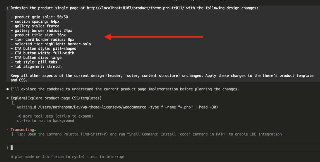
Claude immediately recognizes the design instructions and enters plan mode to explore the codebase.
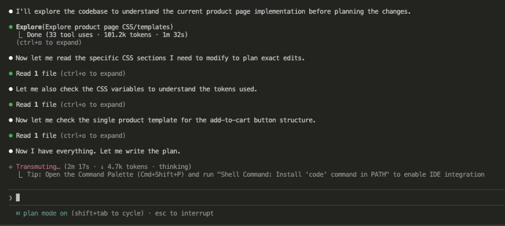
33 tool uses. 101k tokens. 2 minutes of thinking.
Claude reads every relevant CSS file, understands the variable system, and maps out exactly what needs to change.
Then it presents the plan:
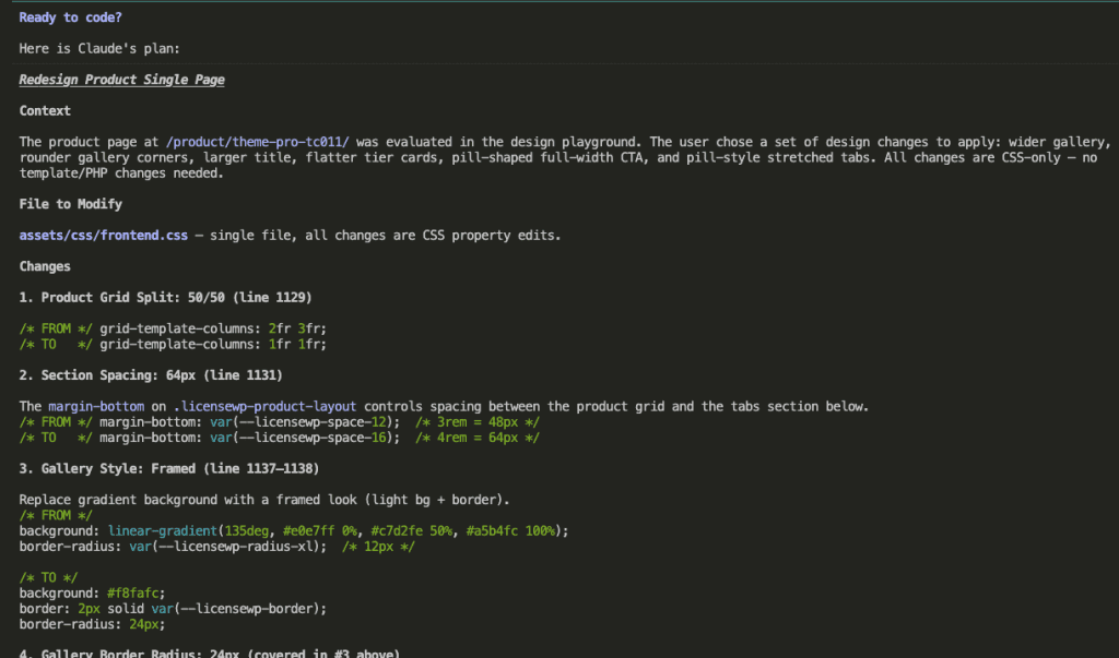
Every change mapped out. Exact line numbers. Before/after CSS.
(Is it weird that I find this deeply satisfying? Don’t answer that.)
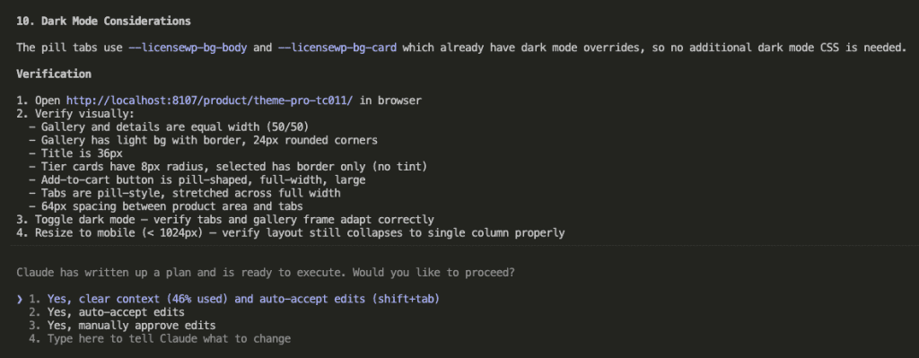
Verification steps included. Dark mode considerations. Mobile responsiveness checks.
I approved. Claude started executing.
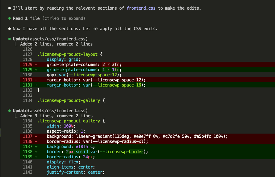
9 CSS edits. All applied.
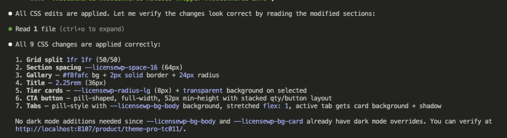
And… done.
.
.
.
The Result (AKA: The Part Where I Do a Victory Lap)
Here’s the final redesigned product page:
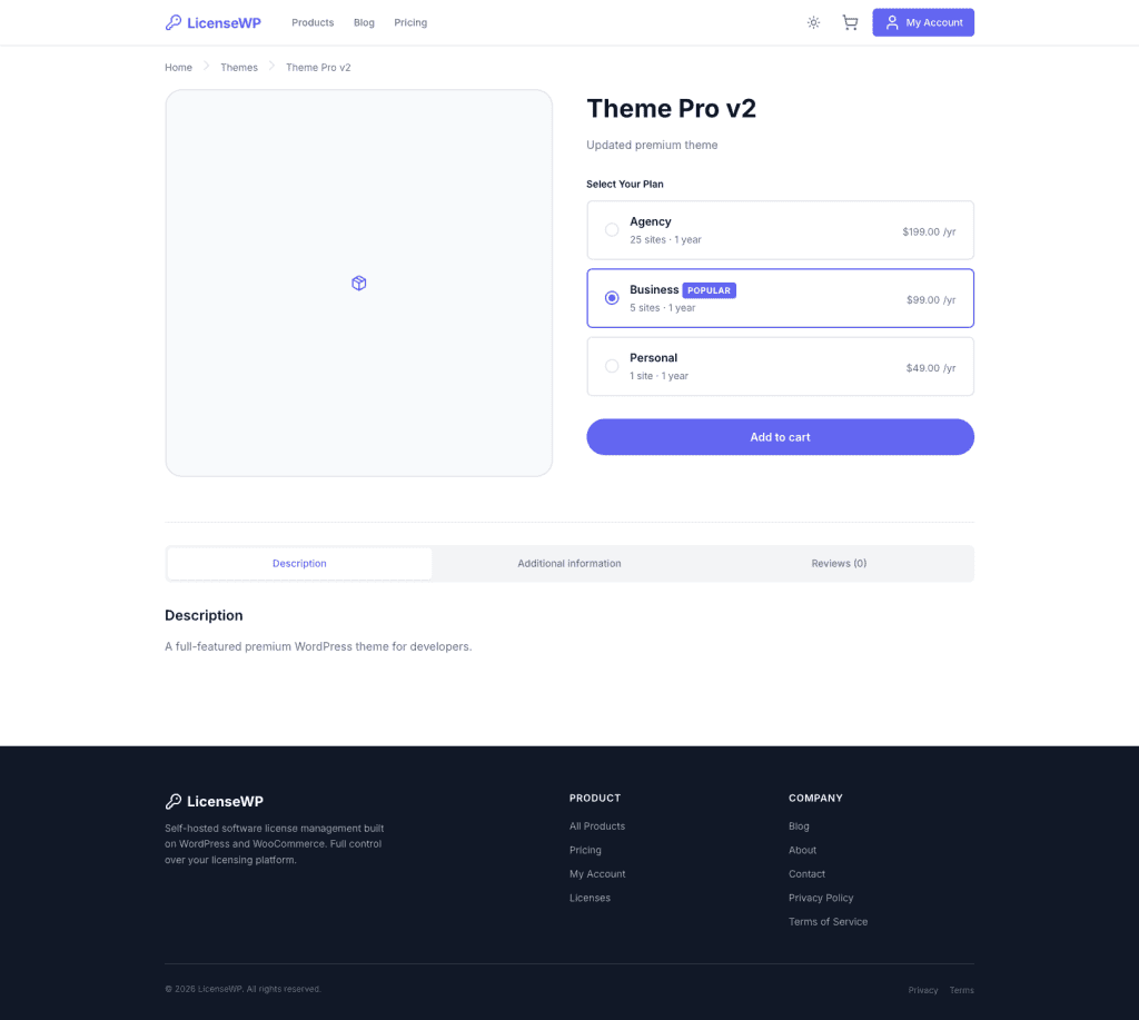
- Equal-width layout. The image and product details now have balanced visual weight.
- Framed gallery. Clean border instead of that dated gradient background.
- Full-width CTA. The “Add to cart” button finally commands the attention it deserves.
- Pill tabs. Stretched across the full width with a modern, cohesive feel.
The design matches what I saw in the playground preview—applied in a single pass.
HECK YES.
.
.
.
The Before & After (Because We All Love a Good Transformation)
| Before | After |
|---|---|
| 40/60 grid split (cramped image) | 50/50 split (balanced) |
| Gradient gallery background | Framed with border |
| Small inline CTA button | Full-width pill CTA |
| Underline tabs | Stretched pill tabs |
| 10+ prompt iterations | 1 pass |
The old workflow would’ve taken an hour of back-and-forth (and probably some mild frustration-snacking).
This took 15 minutes—and honestly, most of that was me playing with the controls because it was genuinely fun.
.
.
.
When the Claude Code Playground Skill Really Shines
👉 Redesigning existing pages. You already have something. You want to explore variations without breaking it.
👉 Client projects. Preview before you commit. Show options before you build. (Clients LOVE this, by the way.)
👉 Design indecision. When you don’t know what you want—and let’s be honest, that’s more often than we’d like to admit—clicking through presets beats describing in words.
👉 Reducing the prompt iteration loop. One visual session replaces 10+ text-based rounds of “no, more like… actually less like that… wait, go back.”
The playground acts as a translation layer between your visual intuition and Claude’s execution capabilities. You figure out what “right” looks like with your eyes, then communicate that with precision.
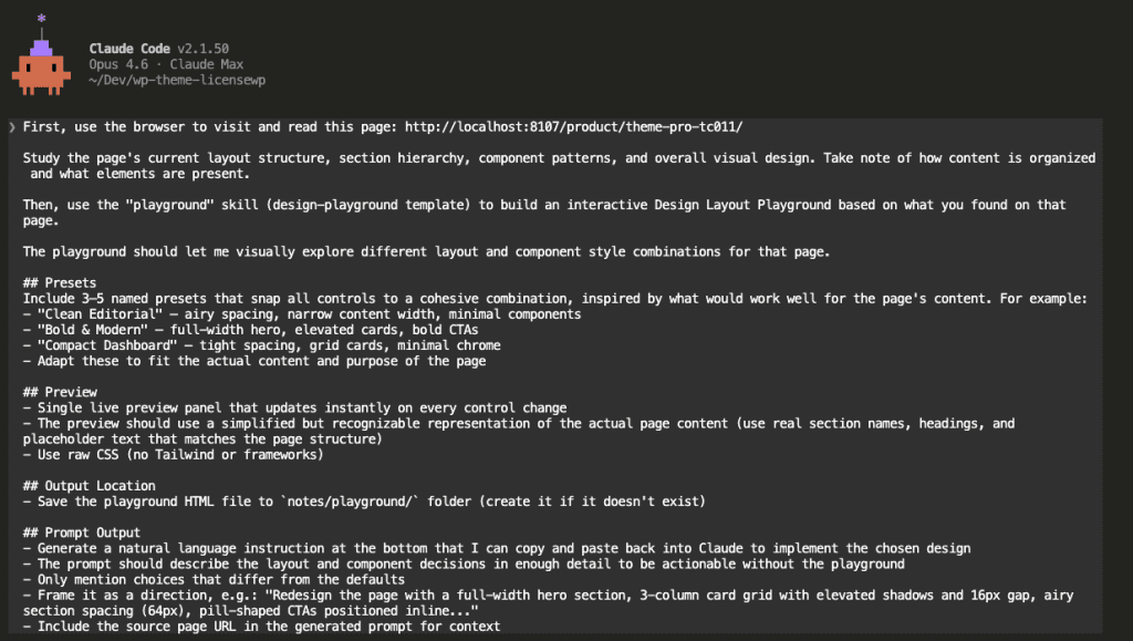
The Prompt Template (Steal This)
Here’s the full prompt I use. Copy it. Adapt it. Make it yours.
First, use the browser to visit and read this page: [YOUR_PAGE_URL]
Study the page's current layout structure, section hierarchy, component patterns,
and overall visual design. Take note of how content is organized and what
elements are present.
Then, use the "playground" skill (design-playground template) to build an
interactive Design Layout Playground based on what you found on that page.
The playground should let me visually explore different layout and component
style combinations for that page.
## Presets
Include 3–5 named presets that snap all controls to a cohesive combination,
inspired by what would work well for the page's content. For example:
- "Clean Editorial" — airy spacing, narrow content width, minimal components
- "Bold & Modern" — full-width hero, elevated cards, bold CTAs
- "Compact Dashboard" — tight spacing, grid cards, minimal chrome
- Adapt these to fit the actual content and purpose of the page
## Preview
- Single live preview panel that updates instantly on every control change
- The preview should use a simplified but recognizable representation of the
actual page content (use real section names, headings, and placeholder text
that matches the page structure)
- Use raw CSS (no Tailwind or frameworks)
## Output Location
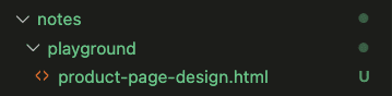
- Save the playground HTML file to `notes/playground/` folder (create it if
it doesn't exist)
## Prompt Output
- Generate a natural language instruction at the bottom that I can copy and
paste back into Claude to implement the chosen design
- The prompt should describe the layout and component decisions in enough
detail to be actionable without the playground
- Only mention choices that differ from the defaults
- Frame it as a direction, e.g.: "Redesign the page with a full-width hero
section, 3-column card grid with elevated shadows and 16px gap, airy
section spacing (64px), pill-shaped CTAs positioned inline..."
- Include the source page URL in the generated prompt for context
Replace [YOUR_PAGE_URL] with whatever page you want to redesign.
.
.
.
Your Turn
Next time you’re about to type “make it more modern” or “adjust the spacing” or “try a different card style”—stop.
Build a playground first.
Let your eyes make the decisions. Let the Claude Code Playground skill translate those decisions into words. Let Claude execute them precisely.
What page are you going to redesign with this workflow?
Go install the plugin. Run /plugin, search “Playground”, toggle it on.
Now.
(And maybe clear your schedule. Because once you start playing with those sliders, you might lose track of time.)
Leave a Comment